On Sale: GamesAssetsToolsTabletopComics
Indie game storeFree gamesFun gamesHorror games
Game developmentAssetsComics
SalesBundles
Jobs
TagsGame Engines
(+1)

softlocked myself while messing around on my second run in the obese section. maybe make the little alcoves for the buttons big enough to fit in, so you can climb back up?
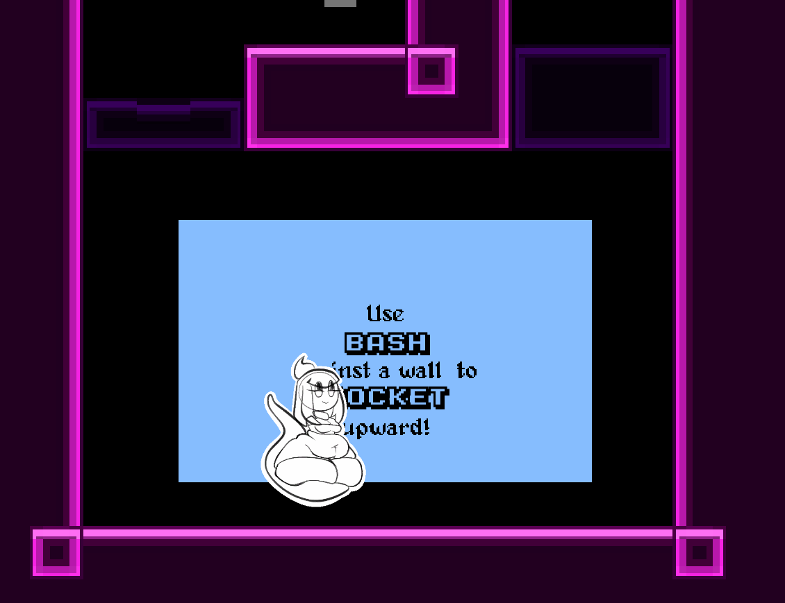
I would prefer if the screen was a little more zoomed out, since I found it a bit difficult to react to some things in time while going quickly. I would also like some way to remap keys, though it seems you're already on that. 

I otherwise have no complaints, as the various weight stages have very well polished movesets and feel suitably distinct when swapping. Base has the nice float and is good for precision, fat has the double jump and can snipe with fireball, and obese scratches the pizza tower urge to maneuver at mach 10. The sprites are cute, the level felt great to play, and the music fit the mood perfectly (will the regular and escape themes be posted somewhere?). This is some high quality work you've got here!

(+2)

Ah yeah that's an issue i was aware of going in. The tutorial explicitly guides you to not use the weight loss abilitiy up untill the point you learn it. I need to either factor in some kind of thing to appear when you do accidentaly use it, or just lock the input untill you get to the room where you learn it.

As for zooming the screen out, I find that a tough balance. I want Cann taking up a lot of screen-space (by fat hehe) so you can properly appreciate the spritework. In any case though, as we're adding more user control support n such. Perhaps a slider to adjust zoom level is a good idea.

Thanks for the rest of the compliments, I'm glad all the hard work is appreciated hehe. I'll be uploading the tracks seperately to my soundcloud sometime soon, probly later today. https://soundcloud.com/the-dip-sheet

(+2)

I'm a bit torn on the subject of screen zooming myself, since I only found it to be an issue when going really fast near the end. When platforming at a more comfortable speed it's perfectly fine, and zooming out would make it harder to enjoy all the spritework (like the smaller details of the ground pound, or the screen-filling heft of Cann's final weight stage). A toggle or slider would be a good balance between aesthetics and mechanics, though it's not something to worry too much about right now. 

Thanks for the soundcloud link, and hearing this feedback. It bears repeating that this is a very high quality demo, as the tight controls plus the adorable art style and fitting music made this a delight to play through. Can't wait to see Cann again in the future!