i agree with TheKbob
make it toggle instead of hold a or b.
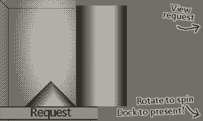
also the product they want in the compare-image that you can open up while you are making the piece is like a pixel or two higher than the piece you are lathing, making it a lil difficult to compare what you are doing.
good game though! I think with the toggle feature this game will be very satisfying
Thanks for playing! Yeah going for a 3-way toggle is the plan now: Normal, Fast, and Step.
Had a little look at the preview vs working piece positions, and I can assure you they're at the exact same vertical position, though there's some visual noise at the bottom of the working piece due to the background pattern that might be throwing you off. Here's the two side-by-side from overlaid screenshots:
I should probably add a little platform line to reduce this problem

