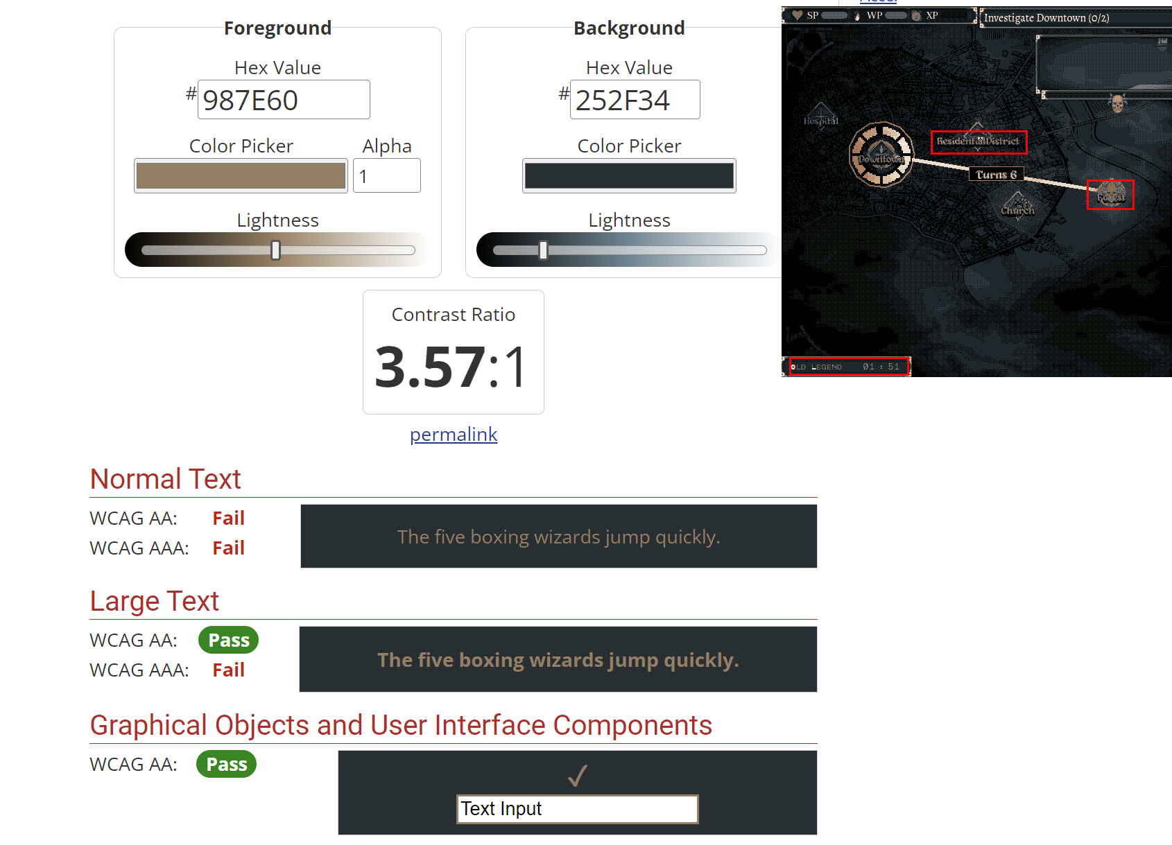
Love the visuals and audio, but text readability is a bit iffy to me. Likely some combination of the size/color of the dither, the font type, and personal preference.
167 days ago (+1)
Difficult decision. While I think the stylized font faces are the least readable, they also fit the game so well that it'd be a shame to replace them with some sans-serif/serif schlock.
Attaching an image of particularly egregious readability, I think. Games aren't required to be compliant, but those readability standards are still applicable to most things visual. I'd say avoid anything that's light on light like "Forest", increase font weight in places like the legend, and potentially tone down the yellow outline/turn up the text shadow everywhere?