
Balance Cultural Richness With Visual Clarity
We’re back with another behind-the-scenes look at the design journey for Clockwork Palace! This time, we’re exploring how we tackled one of the most exciting challenges in our cinematic screen design: balancing the intricate beauty of Mughal architecture with the need for visual clarity.
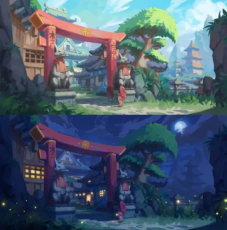
Artist’s Approach Mughal architecture is known for its stunning detail and intricate patterns, but translating that into a screen that’s easy on the eyes can be tricky. Here’s how our 2D artist approached the challenge:
"Mughal architecture is very intricate and busy. To give it visual clarity, I looked into Ghibli environments and how even the busiest scenes are balanced and clear. I discovered that the use of gradients and similar color dark lines helps create uniformity. Using the same color throughout also creates eye movement. From here, we decided a stylized art style would be the best."
By studying Studio Ghibli’s masterful techniques and focusing on gradients and color harmony, we’ve developed an art style that blends cultural richness with an intuitive, polished look.
Why Stylized Art? Choosing a stylized art style gave us the freedom to simplify without losing the essence of Mughal design. This approach ensures that players can enjoy the cultural depth while staying focused on the game itself.