
What role did color palettes and patterns play in conveying the cultural narrative?
In Clockwork Palace, every detail has a story to tell, and the color palettes and patterns are no exception. They were thoughtfully chosen to reflect cultural richness and deepen the narrative of this intricate world. Let’s take a look at how these elements came to life.
Artist’s Insight
Here’s what our 2D artist Zoha had to say about the role of color and patterns:
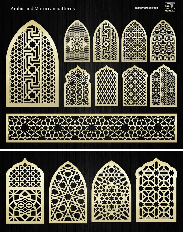
"The color palettes were inspired by the richness of Mughal art and architecture. Deep reds, golds, and earthy tones were used to ground the design in history, while accents of turquoise and teal added a touch of vibrancy and intrigue. These colors also helped align the cultural aesthetic with the mystical and steampunk elements of the game."
"Patterns were equally important. I referenced intricate jali designs, geometric motifs, and floral patterns often found in South Asian and Mughal architecture. These were simplified and stylized to fit the art direction while retaining their cultural essence. Repeating patterns like arabesques provided rhythm and harmony, tying the visual elements together seamlessly."
Why It Matters
The deliberate use of color and patterns does more than beautify the world—it immerses players in a setting that feels authentic and alive. By balancing historical accuracy with modern artistic techniques, Clockwork Palace captures the essence of a time and culture while remaining visually engaging and accessible.
Note: The designs we’ve shared here are part of our ongoing creative process and are not yet featured in the Pre-alpha build. All art in the current version is placeholder. These detailed and culturally rich designs will be included in the Early Access version of Clockwork Palace. Stay tuned, something truly exciting is on the horizon!