Indie game storeFree gamesFun gamesHorror games
Game developmentAssetsComics
SalesBundles
Jobs
TagsGame Engines

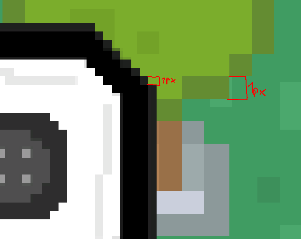
This is what I mean. See how one pixel of the UIs Sprite is waaay smaller than one pixel of the background. This is what makes it look kinda off. You did it right with 90% of the game but there are some examples like this, where the pixels should be the same size but aren't.
(+1)

Ah! I understand now. Some art was hand made and a few things I got from Kenney assets. Didn't pay too much attention to matching the pixel size, super important and will be watching for that from now on. Thank you!