Super cute! Really great job for your second Unity game, there were a few issues with clipping through walls but I think that wouldn't be too hard to fix. I have a couple of suggestions that I think would make the game more user friendly.
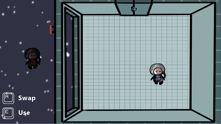
Have the controls on screen, or at least the two buttons that you use (E and R). They won't take up much space, and will be a reminder to the player that they have the option to interact with things, and swap.
Also if you have some sort of indicator as to which character you're currently controlling. Maybe make one a bit lighter, or have an arrow above them? Just something to make it easier to keep track of in the players head.
Perhaps something like this, what do you think?

Great job, keep it up! ^_^
(-Joe)

