Indie game storeFree gamesFun gamesHorror games
Game developmentAssetsComics
SalesBundles
Jobs
TagsGame Engines

I had no idea what I was supposed to do besides click and walk around. Atmosphere was there in terms of sound effects and music but the confusing UI and lists of actions made me unsure what to do. I walked around for a few minutes through the scenes and doors before finally accidentally clicking on the elevator. Went to another floor and it just looked like the same room so I quit.

You've got the base there for an adventure game but I'd definitely recommend cleaning up the UI and making instructions/point a bit clearer.

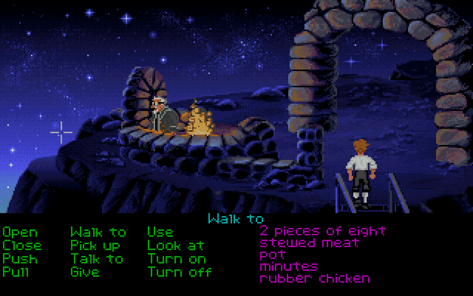
Thanks for the feedback. I think I was going too much for nostalgia with this one. The interface is quite retro, originating with the Commodore 64 games Maniac Mansion and Zak McKracken from the 80s. The UI is probably most similar to The Secret of Monkey Island from 1990, shown below:


Something like that is what I was going for, but I know that games haven't used something like this for 30 years.

I ran out of time a bit with regards to what the goal was. My plan had been to have an intro of some kind that explained things. In the end I put that Note in the inventory that explains things to some degree, but I know it wasn't perfect.

Regarding the levels looking the same, there are two reasons for this: The first is that I ran out of time. I did plan to make the rooms look a bit different on each level, at a minimum maybe change the hue as suggested in one of the comments. The second is that after realising I probably wouldn't have time to make them look much different from each other, I went with the idea that this was deliberate, that this is a deep space colonisation spaceship filled mostly with humans in cryo sleep pods. The engineers had no reason to make the levels look different from each other, since the ship would be travelling for a 100 years without anyone walking around the halls. 😊