On Sale: GamesAssetsToolsTabletopComics
Indie game storeFree gamesFun gamesHorror games
Game developmentAssetsComics
SalesBundles
Jobs
TagsGame Engines

Thank you very much for taking the time to give us your opinion, it's really important for us ! I am glad you liked it, and I agree it's a shame we don't meet all the LI so we are working hard on a new demo including the 4 commons chapters and so all LI's ! 

About the castle feeling empty, are you looking more about those shadows images for NPC or you were just talking about seeing more important characters ? Or maybe people being drawn in the background like on the market place background ?

Also, we agree it's a pretty standard UI for renpy, but it's also a very ergonomic one. I would love do something more original, but I don't have any ideas right now to make it stand out more and keep it easily readable for players ! If you knows games with incredible UI don't hesitate to share with us ! We love to learn from our senpai o/ 

And yeah, we are progressing slowly but everyday, so we like to share this improvment, thanks for your awesome support <3 (The april devlog is late tho, but it is coming soon XD)

I'm talking about the description of activities! It is the castle. Won't MC look around though? Seeing servants doing their duty, or seeing knights practicing, or anything. Take time to describe the surroundings I mean! It will let readers to feel like they're "there". You can add shadowy NPCs too. It's for an immersive playing.

Oh, Royal Alchemist is just released a while ago, so it is constantly in my mind! It has a gorgeous UI design, imo. It may not be the most unique, but it certainly looks neat and professional!

(1 edit)

Oh I loved royal alchemist so much (Aurelius <3<3<3<3)! It's true they have a beautiful UI but still pretty standart for renpy no ? (I mean except the stat rising part of course).

And I know about what you mean for the atmosphere it should be better with more content then ! ^^ Since the Chosen One barely stepped outside of her room it's normal she didn't assist to daily life scenes yet :p And even later, her presence will kinda disturbed the servants since they will be shy and fly when they see her but it will come in time <3

Aurelius yes Aurelius! X.X What an intense boy he is haha

Uh... I think I misled you there with my chosen term. Well, I couldn't find the term describing my ideas the most, so excuse me for my limited vocabulary in English XD Forget what I said about 'unique' then. What I meant is neater design?

Yes, yes ^^ Okay, you can find something that suits you more, developers!

No worries, we have a limited understanding on english too so communication is always more complicated, but in the end we manage to understand each other and that's the most important !

 There is some plan to redesign part of the UI such as the notifications, maybe it will make some difference in the end ? I don't think we can redo all the UI, but if you have specific things you didn't liked in the UI it could help us to know what we should improve in priority ? (Like the main menu ? The textbox ? The quickmenu in game? The choice menu in game ? The notification ? The credit page ? The encyclopaedia ? The saves/load page ? The preference settings ?) 


Thanks again for taking the time to give us your opinion anyway ! 

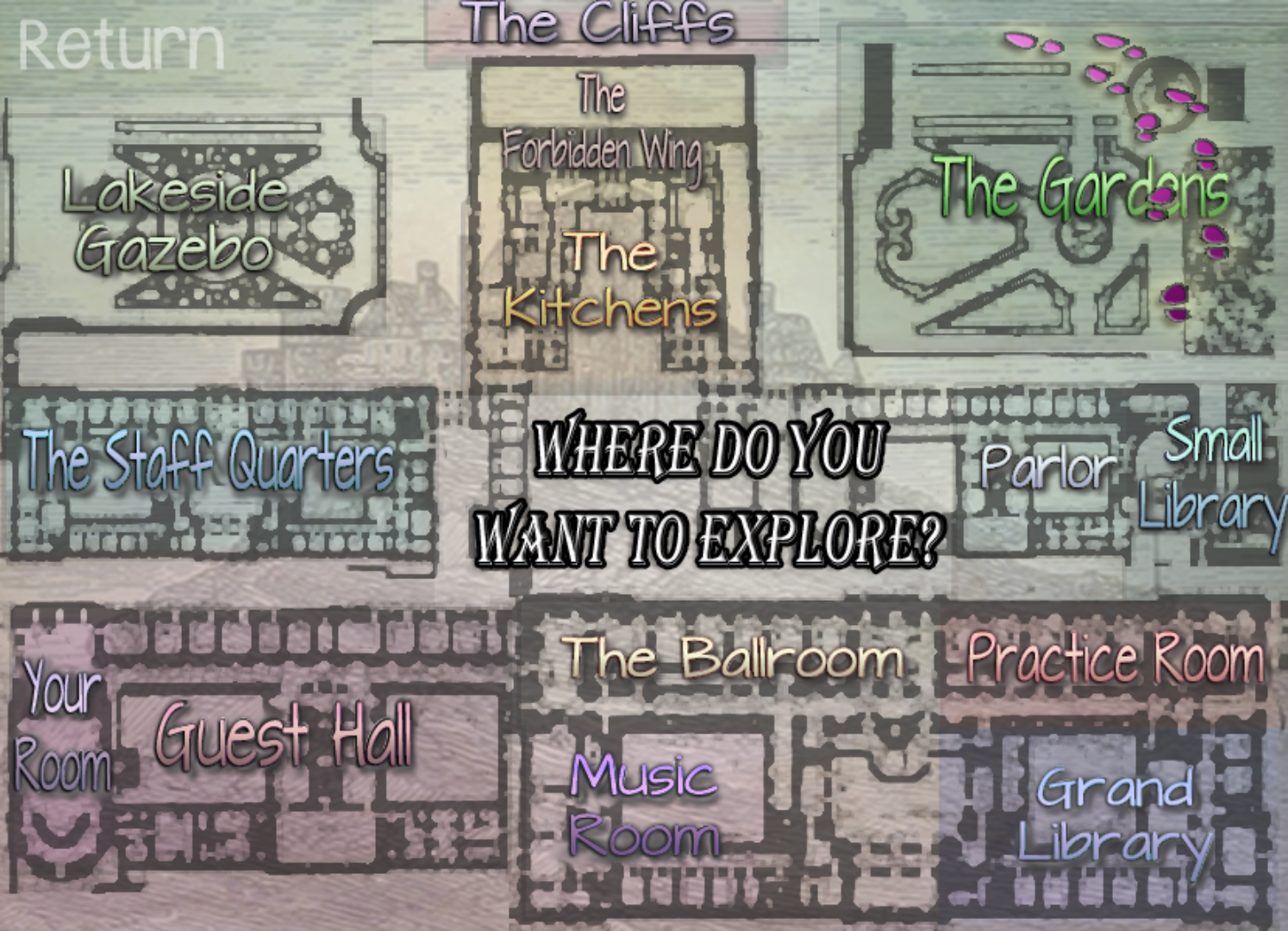
Maybe PangHerHeart means that a UI surface for our daily activities would be neat in the future. Kinda what Seven Kingdoms: The Princess Problem (7KPP) did. At this point I must note that the 7KPP demo is still in progress and the old UI bits need to be revamped.

Sorry I don't know about this game, and I am only finding their KS page when I look at it. That said I am a little bewildered by the "daily activity" stuff, I mean there isn't any stat rising of managment part of the game, so I really can't see what it could be ? 

Something like this:


It's a interactive map, but if that is something that serves no purpose for your game then you really don't need to have one. Oh and I misunderstood the stat raising part of your game. My bad. Sorry.