Spoilers below, please dont read if you haven't played the game.
So a bit of feedback,
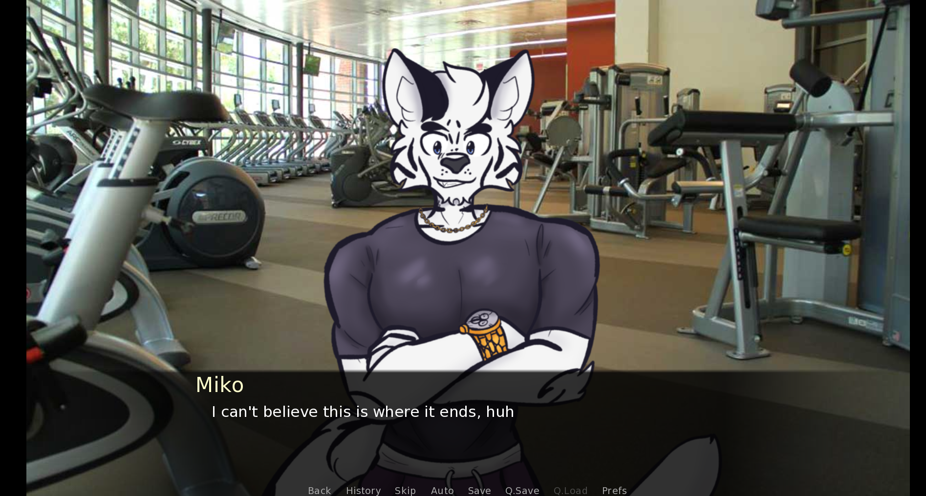
It would be better if you blur the background images that aren't drawn, similar to other VNs, the humans in the images tend to interrupt immersion.
Artstyle is really cute, though Ed and Cypress's heads might be a tad small compared to their bodies. Also from what I feel and see, every characters necks seem too thin, try and thicken them a bit.
In terms of dialogue, I would say place the MC's thoughts into italics or something to indicate that they aren't being said out loud, can be confusing even if there are quotes on vocal dialogue and none on thoughts. Like :
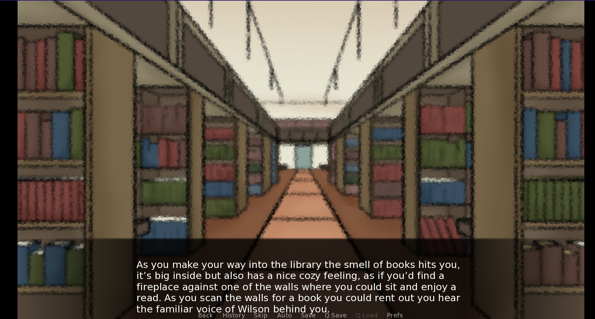
Also for certain sections of dialogue, it gets rather close to the menu, I think limiting each section to 4 lines would be better. For instance :
In terms of grammatical fixes :-
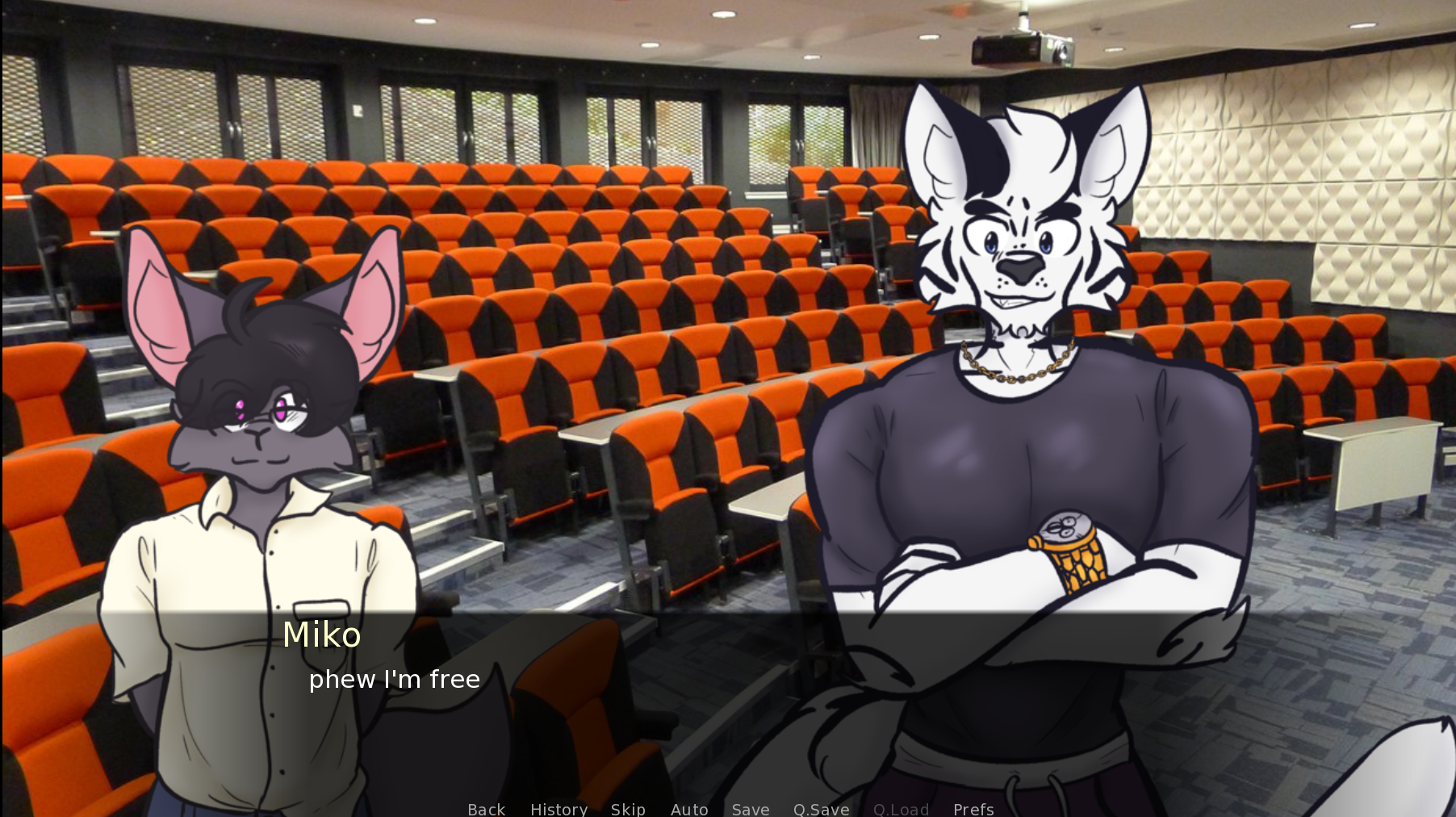
I believe the "phew" in the sentence should be capitalized.
There are few more sentences that aren't capitalized, after the gym section.
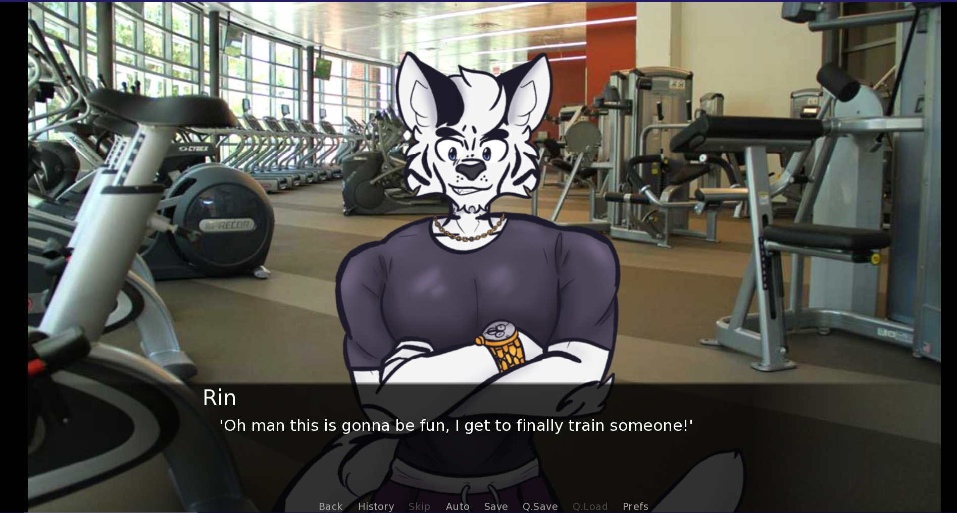
It should be "I finally get to train someone!"
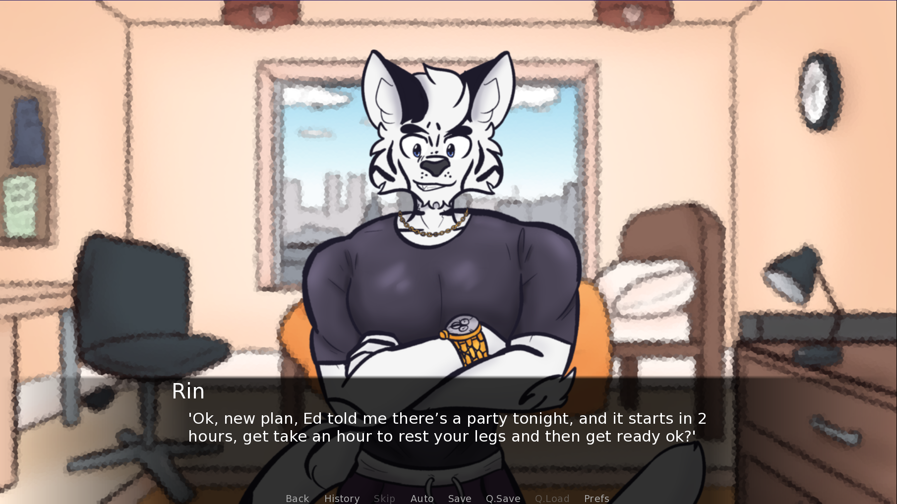
The "get" before "take an hour" shouldn't be there.
There are a few more, but they all happen after the choice of destination after the orientation.
So far that's all I've picked up, I'll update you if I find anything else, assuming you would like it.
Take care!

