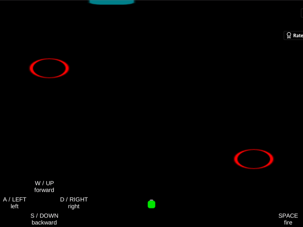
Thanks for following up and for the screenshot! That's really interesting—it shouldn't look like that. I attached a screenshot to this post of what it should look like. I'm really curious what would explain the difference. I tested in Chrome, and it looks like you're running Safari, so I thought that might be it, but I tried in Safari (and Firefox) and it still looks right for me. Now I wonder if it's Retina vs. non-Retina. Are you running on a Mac with a Retina screen? I'm using an older Mac without Retina. So that could be it, or maybe just the different resolutions of our screens (I'm at 1440 x 900). The game objects in your screenshot still look the right size and in the right location, so perhaps this is an issue that only affects UI elements. Definitely something to learn...
What it should look like (minus the "Rate" banner in the upper-right):

