
Nice, thanks for confirming the issue; I really appreciate the follow-up. If you get a chance, check out my reply to Jknapp's screenshot further up in this thread. I'd love to figure out what's causing the discrepancy (so maybe I can avoid it in the future). The text definitely wasn't meant to be tiny or hard to read in any way.
4 years ago(+1)
Okay, I've revisited it and found that the blue gate is in the display (at the edge), but the Unity player on for this game is exceeds the height of my browser's visible display. It can be mitigated via the web browser's zoom-out (Cmd -) and scrolling. I'm playing on Chrome web browser on an MBP 15".
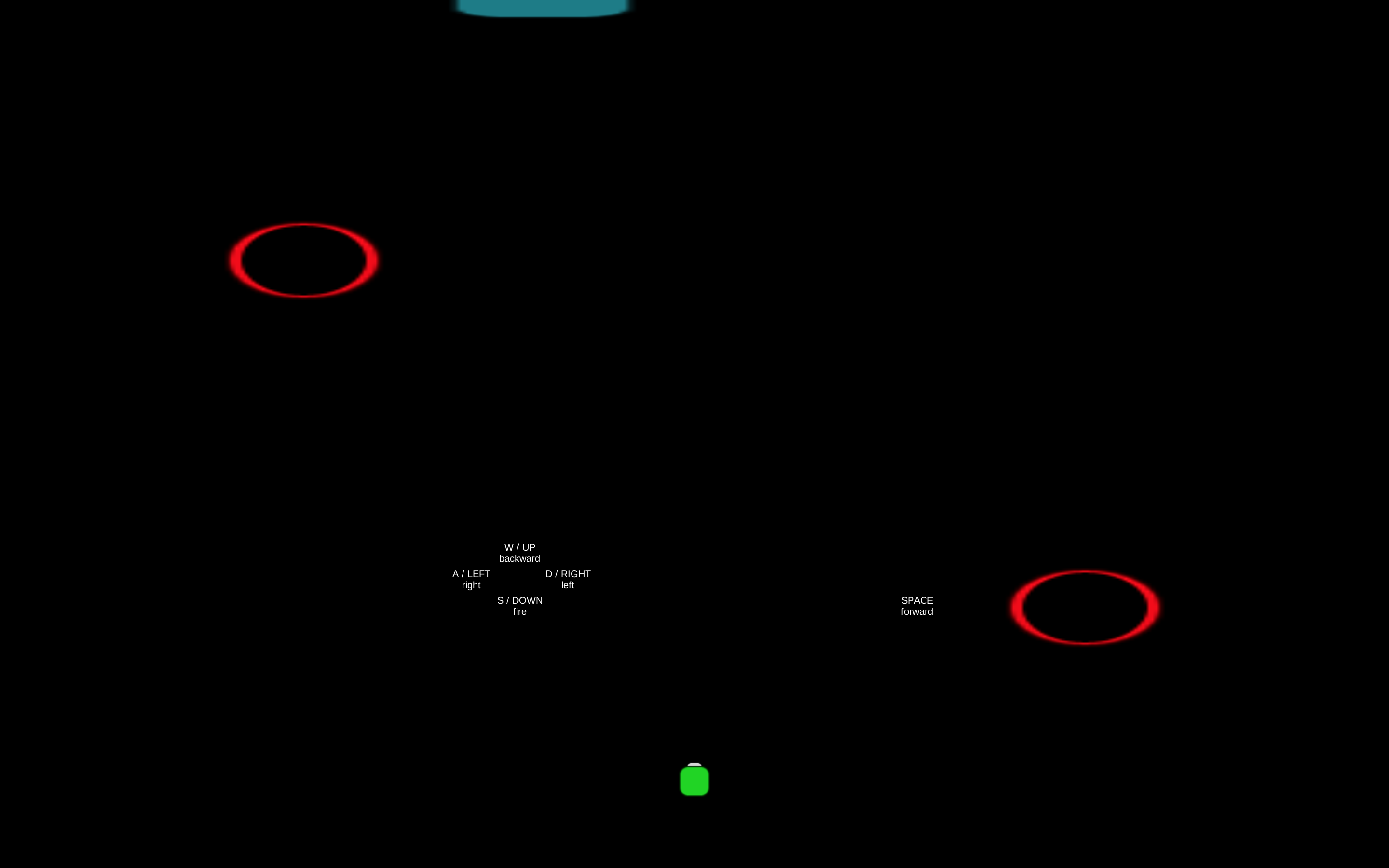
I've taken 3 screenshots for your reference: in-browser as is, in-browser zoomed-out, and full-screen Unity Player. The text's font size & displacement from the intended position can be observed here, too. Note, however, that the control-text being closer to the center of the screen in this case makes them much easier to glance at compared to being at the bottom corners as intended (though I personally would prefer a cluster at the top-right, where HUD stuff is often placed).
[ As Is ]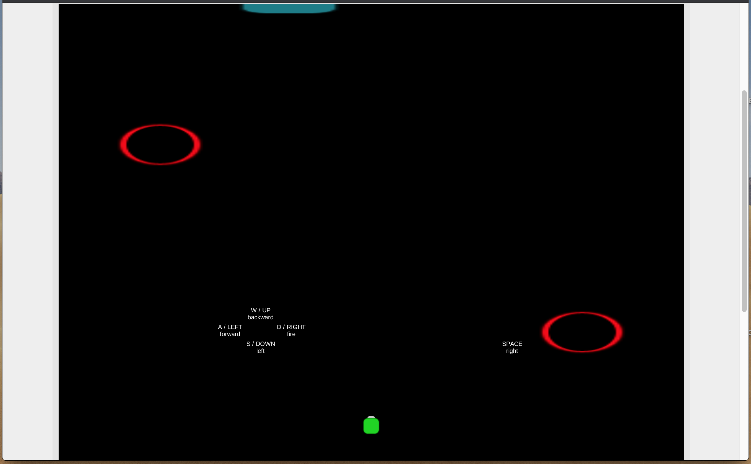
[ Zoomed Out ]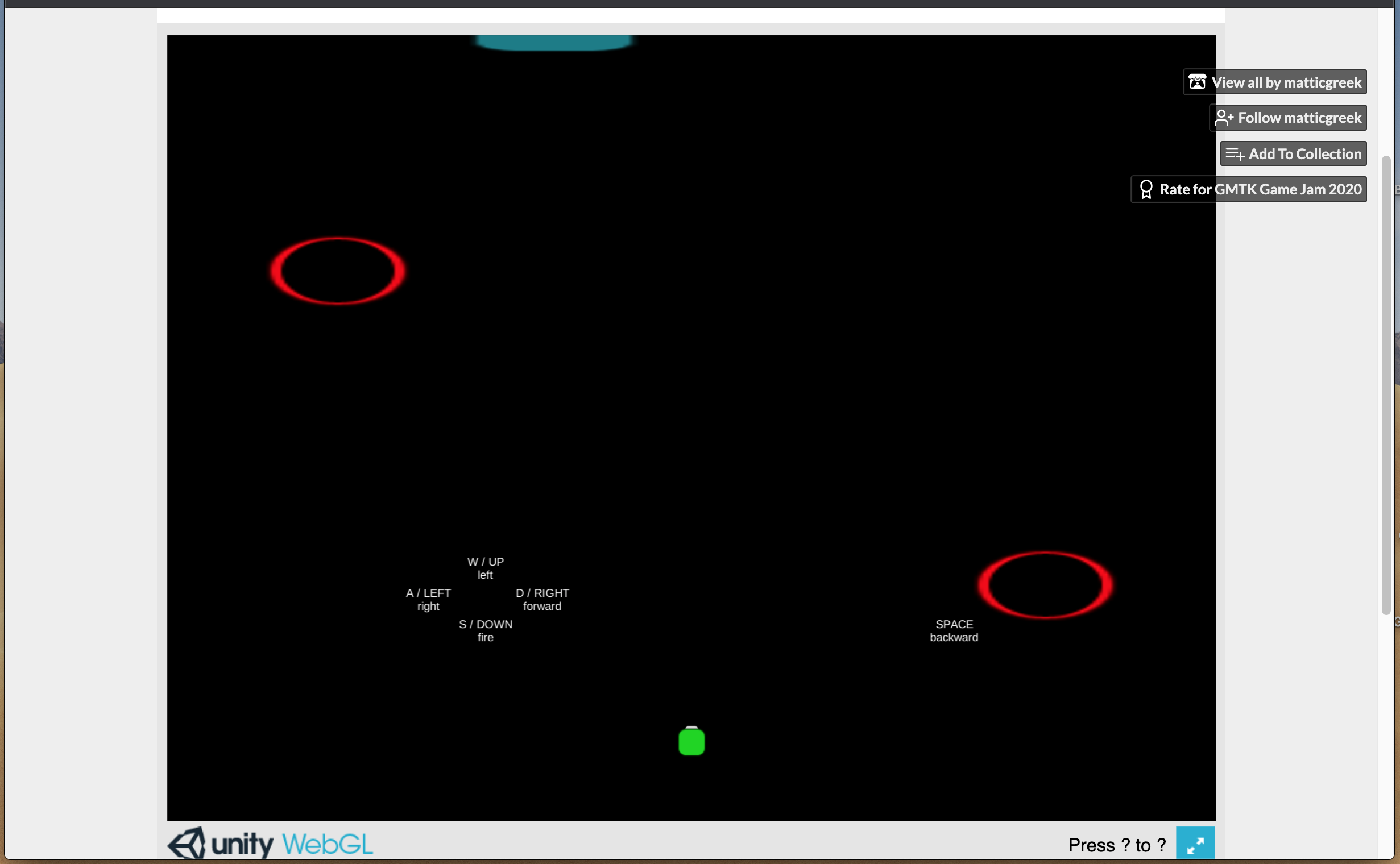
Hope that helps.
(Please excuse the size.)
4 years ago(+1)
Thanks so much, that does really help. Looks like the height of 768 may have been too tall to be practical. I have trouble fitting it all onscreen at once in the default view, too. Good to know for next time. Appreciate the feedback on the text placement, as well.