I realized at the end of writing this that I MIGHT have written more than I needed to write, but I'm hoping this long critique helps your game in the future.
I really like the visuals that this game has. The game almost has some TRON-like aesthetics with a twist since it's using a hot neon palette, rather than the regular neon palette that TRON has.
I also enjoy the hand animations that play out throughout the game; it's small details like this that make you feel like you're playing a human-character. Perhaps in a future update, you could add more hand animations for the jumping and sliding to give it some variety.
One of the notable hazards I liked was the thin wall that moves either to the left or the right. The reason being that it stops the player from just constantly spamming the rewind button in order to win since they could potentially rewind the wall right into their face. I find this to be a great design choice.
I'm not sure if I'm a fan of the walls and ceiling having the same grid, it's giving me a bit of tunnel-vision looking down the path with all the squares surrounding me. I personally think the walls and ceiling could be either darker colored, or not colored at all while keeping the grid on the floor. This is so the hazards can pop out more easily, and so players don't get sick looking down the end of the hall with a repeating texture.
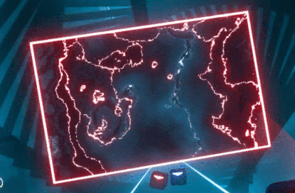
There also seems to be a few moments where it's hard to tell how far away the hazard are. Perhaps if there were some small dust particles floating around that glow near the obstacles, it would reinforce the 3D space of where the obstacles are placed. It would also be helpful if the hazards had some sort of texture on them, it's hard to tell how far away the hazards are from my face if they remain as one static color the whole time. I would suggest having some sort of wavy static effect as a texture for the walls, similar to the walls used in Beat Saber:
The floating orb really doesn't seem fit with the square-styled look of the game. Everything in the game seems to have a rectangular shape style to it, and the roundness of the orb seems to stick out like a sore thumb. It's also kind of distracting having a random spot sticking out within a game that involves a lot of visual reactions. One suggestion I have for is to remove the orb, and instead have rewind action involve the player's hands doing a quick clenching animation (or any kind of magical hand gesture) to show that the running character is using their powers.
It would also helpful if there was a visual representation on what section of the grid the player is standing on. It would be helpful if the section of the grid that the player is standing on changes to a different color so the player can visualize if the oncoming hazards are going to hit them or not.

