When I first played and saw the dialogue, since the text wasn’t proceeding automatically, I thought the first line of the dialogue was all the scientist had to say, and I didn’t see the “continue” or “skip” buttons since their text colors blended in with the ground. If there was a little pointing down arrow near the dialogue box, then I would have seen that’s not all the scientist had to say. A little arrow that slightly moves up and down like this should be enough:

It is a pretty cool effect to watch all the missiles travel back into their previous starting position. It would be cool if the missiles’ positions + movements were designed in patterns to make their rewind effects look even cooler.
The graphics look okay, but a bit inconsistent in game style. It’s like the game can’t decide if it’s trying to be retro or modern since the text graphics are smooth and have gradients added to them, while everything else is pixelated. There are even moments where the game directly mixes smooth details with pixelated graphics, which does not seem to fit one another. The pixel ratio is all over the place with some pixels either being tiny or large. The ratio of the pixels should usually remain at one static size so that the player is given the feeling and illusion of playing an older pixelated game. If the pixels of the graphics are constantly different from one another, then that illusion is killed and the player just sees that the game is TRYING to be retro, but it really isn’t.
The one thing I did like about the graphics was the color palette of the dark blues and greys. It really gives the player the feeling that there’s something dark and mysterious about this place. However, I’m not sure if the colors of the red + orange missiles seem to fit with the environment’s dark blue color palette. Perhaps you could change the orange flames to blue embers, and change the colors of the missiles’ bodies to a bright grey-ish blue color with the tip being a regular blue (I know nothing about color names, lol). Here’s how I would imagine it to be colored:

I would suggest using the Pixel Perfect Camera addon; it snaps the pixels of sprites perfectly into place on a low resolution grid which helps keep the illusion of a pixelated game.
Here's a guide to get you started on how to use it: https://blogs.unity3d.com/2019/03/13/2d-pixel-perfect-how-to-set-up-your-unity-p...
The pacing of the story in the beginning is kind of awkwardly paced. I would have liked a moment to gain my bearings before having text immediately showing up on the screen. Perhaps show a scene of the character slowly getting up while looking dazed and confused to enforce the feeling that the character has no idea where they are and that this is not the kind of area they’re used to. After a few seconds, you could have the scientist start talking from a telecom acknowledging that the character finally woke up .
I’m not sure if I’m a fan of the character’s walk cycle. His front foot seems to constantly slide back and forth while his back foot constantly flies up and looks like he broke his leg:

The legs also never seem to pass through one another, which kills the illusion of this being a walk cycle.
If you do not know how each aspect in an animation works, then it’s hard to be able to depict the motion right because even the slightest detail being off can make everything look unnatural. That’s why it’s important to have references in animation and art in general. Here’s the reference that helped me learn how to make walk cycles for my characters:
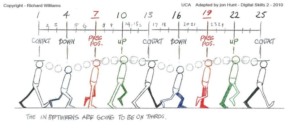
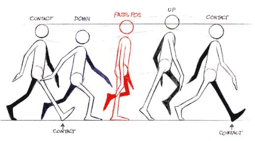
Notice how the height levels of the head and body changes each time depending on how much weight is being pressed down. Also notice how each leg has the same movement cycle: the legs in the first frame and last frame are exactly the same with the only difference being the timing they’re set to.
There was one level I couldn’t beat because of the ridiculous amount of missiles there were. I tried to use my abilities to get the missiles to move out of the way, but since it controlled all the missiles at once with no cover anywhere, I could not find a way to beat the game.
Try to make the game more loose and give the player options to avoid the missiles by using the environment around them. Let the player use a wall to block the missiles, have them hide under floating platforms to use as an umbrella from the rain of missiles, allow some smaller objects to be thrown at the missiles to have them explode early, etc. This would make the game not only easier, but much more varied for the player to have different options to avoid the missiles. It would also make the stages much more unique instead of it just repeating the same flat area multiple times.

