12 SEP 2020:
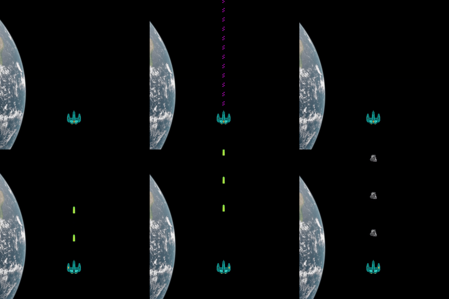
This is the new look of the player ship!

I fixed the symmetry of the wings, added a transparent glass texture to the cockpit, changed the color palette and made lots of other changes to the mesh. What do you think?
After much thought I've concluded that the game is more fun when the player decides when to change the weapon. In addition, I've integrated little "indicators" into the ship's design to clue the player which weapon is selected.

Next, I finally added a feature that has been much-requested in Scrapship: Full screen mode!
Finally, I fixed a bug where there was a missing frame in the opening animation where the player ship drops down.
That's all for this week! Don't forget to check out my Instagram for daily progress and motivation!

