Indie game storeFree gamesFun gamesHorror games
Game developmentAssetsComics
SalesBundles
Jobs
TagsGame Engines

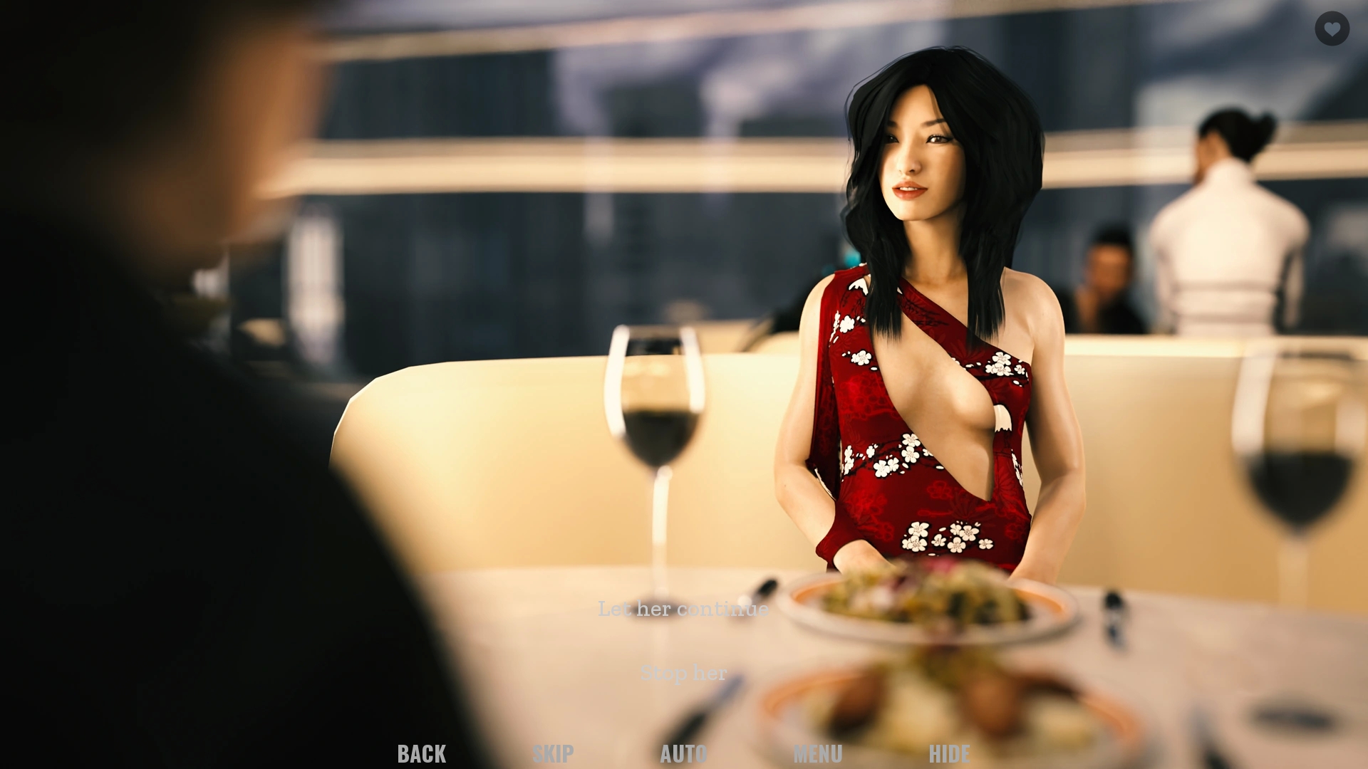
Hi.... 0.5 edition was awesome... the story line is good and keeps me wondering what is coming next... One suggestion... Could you please make choices options text color with border black or something else.... Sometimes in white background reading the text becomes difficult...

Thanks a lot! The choices should appear as semi-transparent black rectangles with white text in them. Do you perhaps have a screenshot of how they look on your end?

I hope this screen shot will help... One of the choice is "stop her" but it is difficult to see with background... I actually have seen one of the choice with white background... There is it more difficult to see the choices.

That's weird and not how it's supposed to look. Are you playing on Android perhaps?

Yes, I am playing on my android phone

Thanks. The styles for Android are a little different, I'm going to look into this.