Hi,
I played your game though I have to say I am not an experienced platformer player.
Very nice art and sound. I also like that everything can be controlled via keyboard :)
Do you have controller support (haven't tested it)? - forget I asked, just read that indeed you do support those (shame on me for not reading it all).
Some of my feedback will be critical, so I hope you don't mind. It's meant to help describe my experience, not diminish your achievement with your game . What I am trying to say, don't take it personal ;)
1) The scrolling text in the intro may be a common thing in your genre (not sure) but I think I once read that it was originally done in old/handheld games because of restrictions like screen size. You don't suffer from these restrictions. Don't scoll your text, it makes it hard to read. I constantly have to reposition my eyes to follow it.
Another "issue" would be speed of reading. Some people read faster, others solwer. Your game assumes a constant reading speed which you defined for all your players. I would rather have more lines on one screen with a "press X to resume" button. I for one found it too slowly timed, yet hard to read (hope this makes sense).
I like that scrolling background (trees!).
Just and idea but: if you have most screens with multiple lines of text and just at the end a screen with only one line, then this gives that lonely sentence a feel of importance. If you do it for every line then that's no longer true. I suggest to keept the tool of the lonely sentence in your box until you need it for the last intro screen.
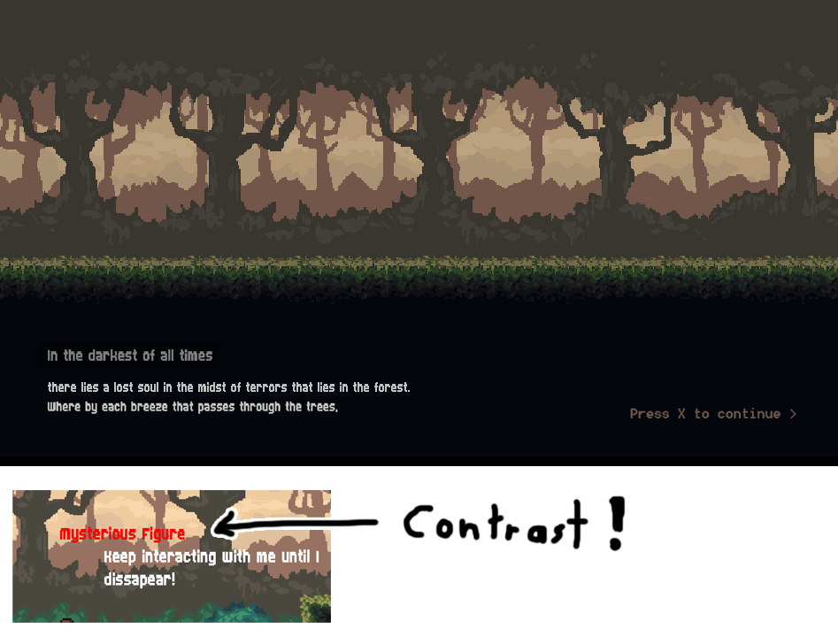
One more (sorry): If I press any key the "Hold space text" flashes ALL THE TIME through the intro. I know it's meant to grab your attention but again this distracts from reading your text. And I think it's an attempt to fix the "skip/reading speed" issue which could be avoided. In addition: it is hard to look at the text while something is flashing below. I have compiled a screenshot of how I would have prefered this at the end (just an idea ^^).
Also the font feels a bit heavy on a fullscreen monitor. I am not sure if you are targeting some smaller devices, so maybe it's necessary for legibility but maybe another font for the big screen might be an option? I spend so much time on this because your game seems to be a story heavy one and then you should make reading as pleasant as possible (imho). Also, why not use (Escape) as the default "skip" key? Or maybe just pause the intro when escape is pressed. Think of people being distracted unexpectedly (or slow readers).
2) Not sure if a game with an installer is the best for people to try it out. Can you make a WebGL build? I assume you would get more people to try it out with a web build.
3) Love the Desktop Icon :D - It looks cool!
4) The Menu does not support mouse clicking - maybe hide the cursor then. Found myself trying to click. Gotta say: I tabbed out a lot to take notes, so maybe not an issue for "real" players.
5) I don't like the invisible wall on the left at the start. It breaks immersion immediately. Can you put a rock or something there?
6) How are those jumps timed? As I said I am not a platformer player but it feels like the character falls very fast. I remember reading once that super mario kind of defined 1.# seconds as "the" duration for jumps (I assume you already know :). Maybe it's spot on, not sure, felt quite fast to me. I would have liked to jump with "space" but that's just my personal perference.
7) Please put your controls into the pause menu or somewhere into the game. I had to browse back to itch to find it (it's not on the download page therefore I really had to got "back"). I know the figure teaches it but hey: I didn't know how to jump because I am lazy and don't read all the text on your itch page (I am exagerating of course, or am I?). Why am I picky about this: well not many people will do what I did. Instead they will just rant about the controls (unjustified) and quit (have seen it happen). - I like that tutorial character btw. :)
8) The contrast of the red text could be better (have scaled it down in my collage at the end to make the effect more visible). It's hard to read.
9) Sadly I failed at the wall jump. I got it once, jumped down to retry and never made it up again. It's just too difficult for me (call me a noob if need be, I can take it ^^). Those timings are surely doable but it takes practice I assume. I am a firm believer in that a hard game should never be hard because of the controls. Yet again, I almost never play platformers so maybe it's just me. Here is a nice gdc talk regarding "make forgiving controls". Maybe I can persuade you to watch it: https://gdcvault.com/play/1026606/Forgiveness-Mechanics-Reading-Minds-for
Sadly I am out of time for this one. I hope my feedback was helpful.
Btw.: don't listen to what I say. I am just one random player.
I once read that you should not cater to the wishes of your testers but rather look for the root cause and fix that (if needed). After all, you know your game best :)
Thanks for making this and putting it out into the world.


