Greetings!
I tried to play your game and the gameplay itself is fun and great. The graphics look simple and fun as well. Great job!
But I noticed some few problems in the game
Let's start with your itch site:
What I like:
- The preview looks great and I like how you added border lines like a frame
- Your game cover looks great, I have no problem with that.
Suggestion:
- You should try to be a bit creative like add a game banner and a background.
- I recommend that you introduce at least one in your screenshots. Also, the look of the page would improve with a large logo and background, like in these other games:
https://ko-op.itch.io/dep-nocturne
https://terrycavanagh.itch.io/dicey-dungeons
Game View
What I like:
- Main menu
- graphics
What I dislike:
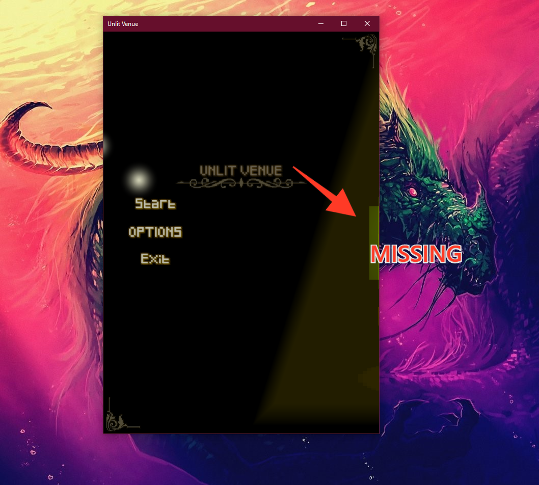
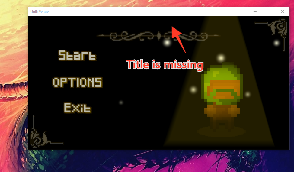
- When you tried to resize the window, the resolution gets shrinker, until there will be a missing parts in the game view itself, such as the game title getting missing and an animated character in the right side of the screen.


Suggestion:
- Since you already have a resolution, and a fullscreen settings, i think you shouldn't make your game window into resizable
Game Settings:
What I like:
- The format of your settings is not bad.
What I Dislike:
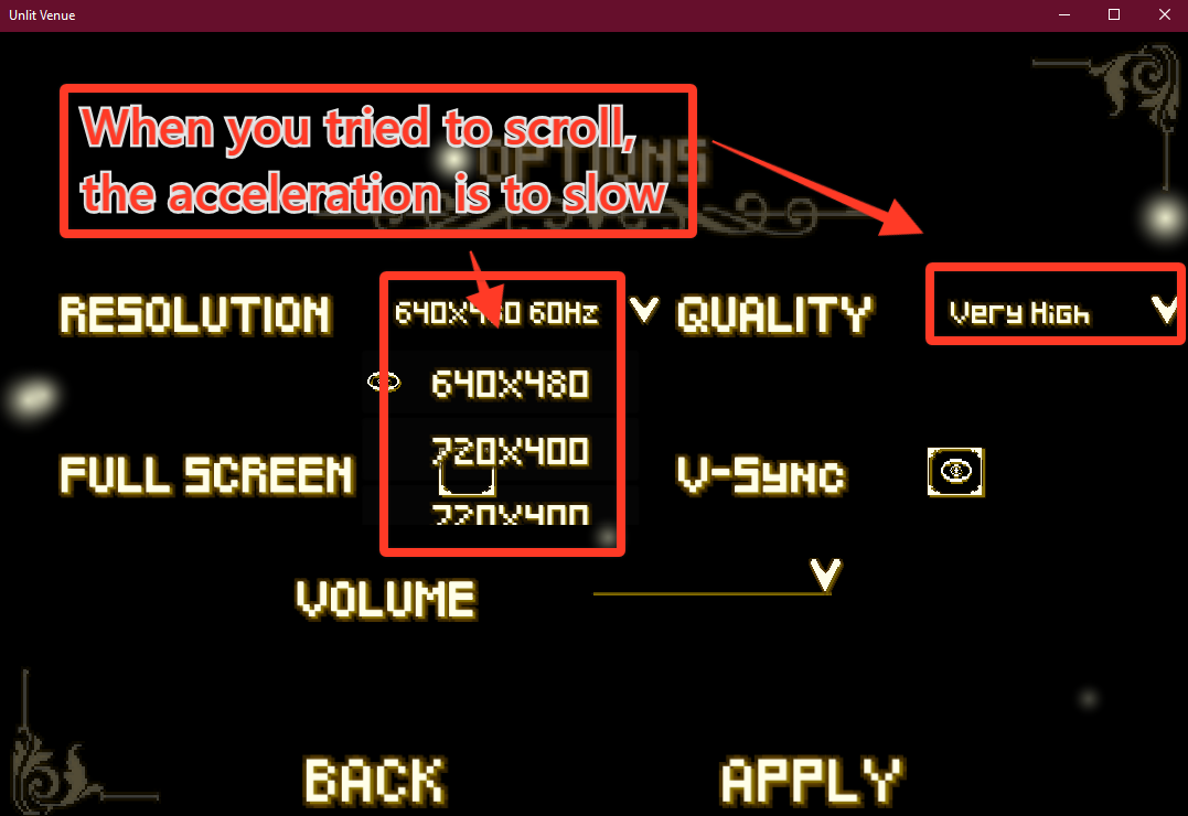
- When you are trying to pick resolutions or graphics in your settings, the acceleration when you trying to scroll is too slow.

Suggestion:
- I think you should make the acceleration when you are scrolling, a bit faster.
Gameplay
What I like:
- The movement of a character is smooth
- I like the controls so I have no problem with it
What I dislike:
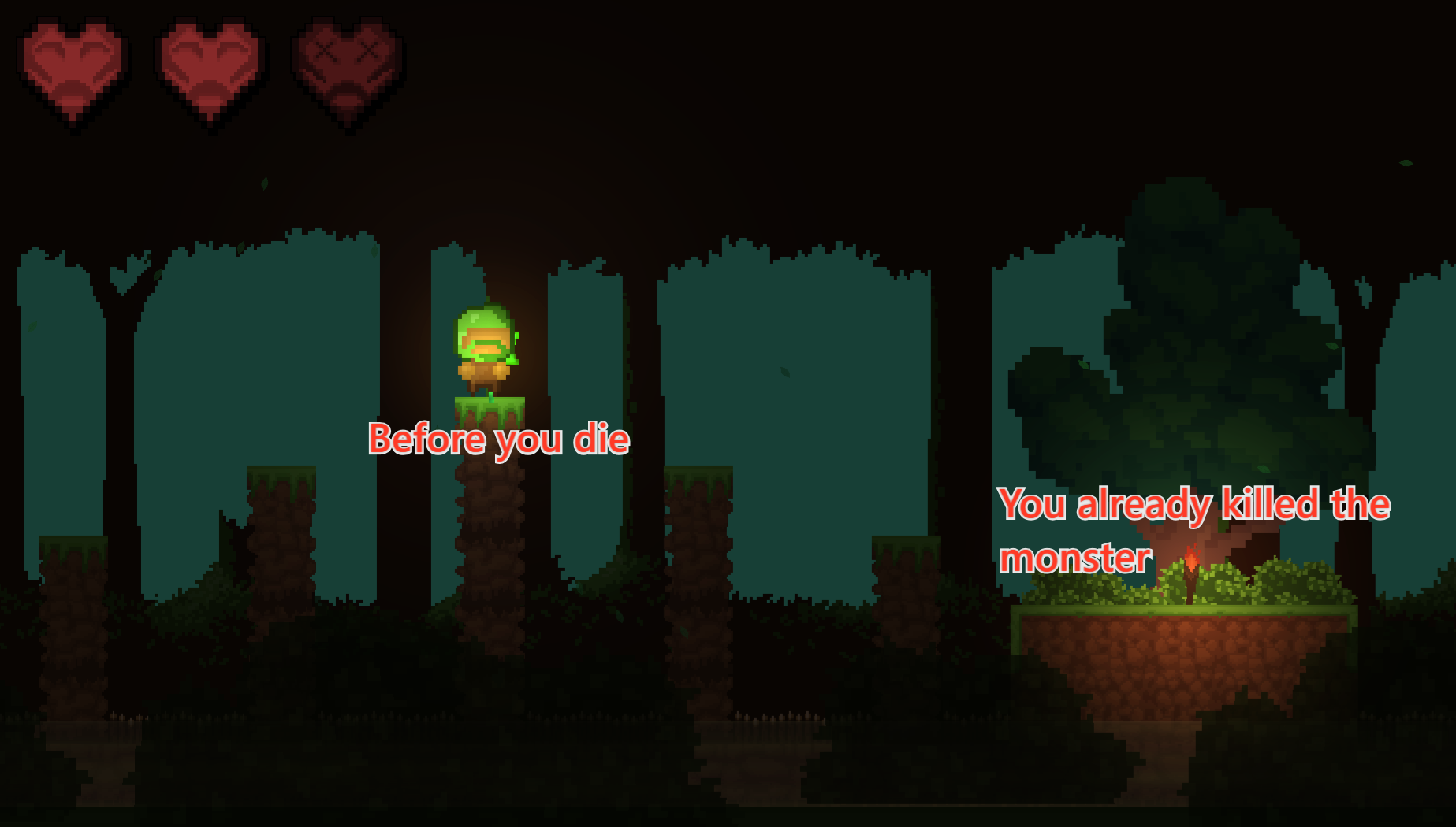
- If you died and go back to the checkpoint, the monsters which you have already killed are still at the same spot


Suggestion:
- I think you should also add a function when you paused the game by pressing the "esc" button, you can resume it by pressing the "esc" button again.
Conclusion:
Well, judging by your game, it's still in-development. It can still be improved though. Other than that, the game looks great!

