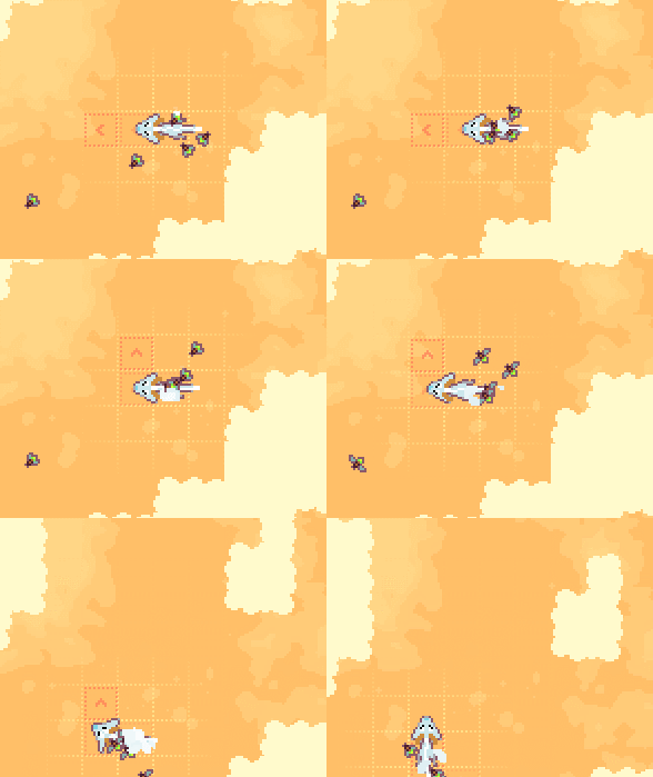
I think the indication of where you're going to move would just have to be clearer and more stable somehow. For example if you put your nose onto an arrow and turn, the next tile appears in the wrong position for a moment:

I'd might also help if the tiles that are "committed" for moving looked different than the last tile(s) that predict where you'll go if you continue. It's hard to tell what key you need to press to go onto a particular direction especially when you're already turning, and what key to press to go backwards. In puzzle games you probably want to be able to move fast like the Monster's Expedition style so it's easier to explore puzzle solutions. I don't mean to sound like I want you to work on this game more though, just posting thoughts. ´v´

