I purchased Autonauts when it was version 4, because the core concept is very charming.
But with automisation being the key feature, I find it frustrating that the code doesn't fit the window as soon as loops are added. This is becoming more of an issue now with nested loops. I understand that you have lots of plans and that you can only ever do one thing at a time. But isn't coding the bots the main point of the game? Wouldn't you agree that legible code matters more than anything at this stage? Even if the current graphics for it are a placeholder? A wider window would take up too much room. But you're wasting so much valuable space inside that window with clunky graphics. Screen space is a very valuable commodity!
And the red "recording" background is strenuous. Imagine, you'd have to write your code on a red background and you'll get the idea.
Flashing is also strenuous and should be reserved for messages which require immediate attention. The flashing icons over the cows are an example of bad use of a flashing message. The milk icon is quite sufficient to inform the player.
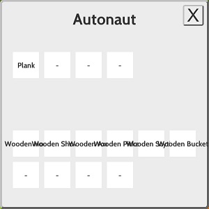
And you have beautiful icons for every item. Wouldn't they be a good means to avoid this sort of mess in the inventory?

Sorry about sounding "bossy". I don't mean to. I'm just trying to be clear and explain my opinion well. It's nevertheless just my personal opinion.

