Indie game storeFree gamesFun gamesHorror games
Game developmentAssetsComics
SalesBundles
Jobs
TagsGame Engines
(+1)

andddd just to document the stuff we've been talking about in Discord, if you want to style the "quicklink" hooks and the regular passage links, you'll want to open up the custom CSS page and pop this in:

tw-link, .enchantment-link { 
    CSS rules go here! eg: changing colour, font-weight, font-style, etc.
}
(1 edit)

Yep! Though I think this may be overridden in the case of hover & already-visited links, since those are "more specific" conditions again.

So the full set (bear in mind this is based off something I C&Pd from some page somewhere, but it does seem to work, and I'm fairly sure I see why):

tw-link, .enchantment-link { 
    color: red;
}
.visited, .visited > .enchantment-link {
      color: pink;
}
.enchantment-link:hover, tw-link:hover, .visited:hover {
      color: green;
}

(I put some colour formatting in for testing purposes so someone can see this working in their own project.)

Be warned that there are some weirdnesses here, the second selector should give you a clue that something odd is afoot!

1. If there is only a single tw-link on a page (this is the natural [[target]] type of link) then it will have the class "visited" if it's already been visited, and you can target it with .visited {}

2. All links which are instead done e.g. via the (click:) macro, that is, links identifiable using the class .enchantment-link, never acquire a "visited" class even if they have been visited, so you have no way to format these specially if they've been visited.

This means you're better off accepting that you should format links & visited links the same way.

3. Should you have a page containing both tw-links and .enchantment-links, that is, both [[target]] and (click:"target") links, even the [[target]] links are formatted differently to if they stood alone on a page. This is why I also added the second clause on the visited links selector.

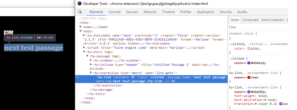
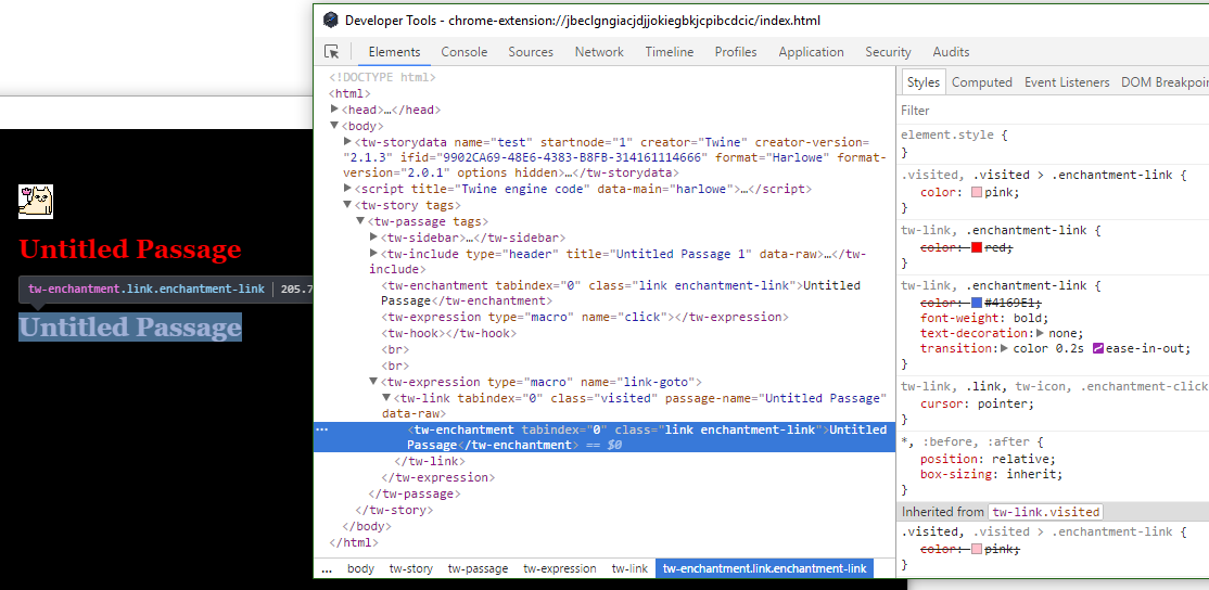
A view from the inspector:

This is a [[target]] link by itself on the page, linking to a visited page. See the element type tw-link and the class "visited" visible in the inspector.


This is a page containing a (click:"target") link followed by a [[target]] link. As you can see the first link is red, it hasn't picked up any pink formatting. This is because if you look above the highlighted line to the first tw-enchantment element, there's no "visited" class.

BUT! Even the link which was visited doesn't have a "visited" class on the element itself. Or rather, it does, but the link text is contained in a child element which has its own enchantment-link. This means your visited formatting will be overridden by your non-visited formatting unless you also tell CSS to format something as visited if it has a parent which is visited.

All in all, I don't recommend trying to format visited links as different to non-visited. It isn't worth it. However, you should include the section above, just set the formatting as the same as your non-visited links.

(2 edits)

if you take my advice, you only need two selectors:

tw-link, .enchantment-link, .visited { 
 color: red;
}
.enchantment-link:hover, tw-link:hover, .visited:hover {
 color: green;
}

(or format them however you want)

Without that last .visited on the first selector, you wind up getting a different colour for your links to already-visited passages, if those are [[target]] links which don't share a page with (click:) links (the conditions may vary from this, but these conditions are sufficient). That's a specific & weird enough situation I gave up the first time I tried to solve it!

(the reason for this is that Twine default CSS has a selector for .visited, and this is considered more specific than tw-link so it overrides you)

You're a legend! I had some of this stuff in my CSS, but not just .visited by itself, I was using tw-link.visited. I think your way is neater :)