CRAFTING THE MAP SCREEN (PART 2)
The map screen will continue to evolve throughout its development. I took three days to implement the map's directory in Unity, so here are some gifs, where you can already see that transformation beginning:
Day 1 - Basic Screen and The List
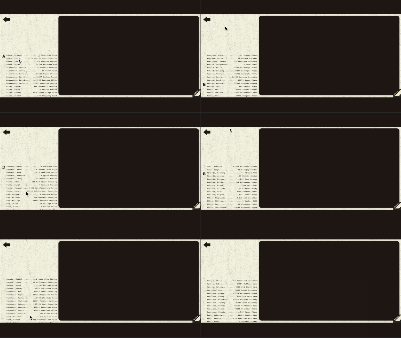
At the end of the first day, I had the "map" implemented as a static screen. I populated the map screen's directory with names from a mock address book generator, and I made the list scroll:

You can see the implemented directory is on the opposite side of the screen from the mock-up. I made this switch because of the Notes button in the bottom right corner -- I thought it might be confusing if you wanted to click on a name but accidentally clicked on the Notes, or vice versa.
Day 2 - In-Game Functionality
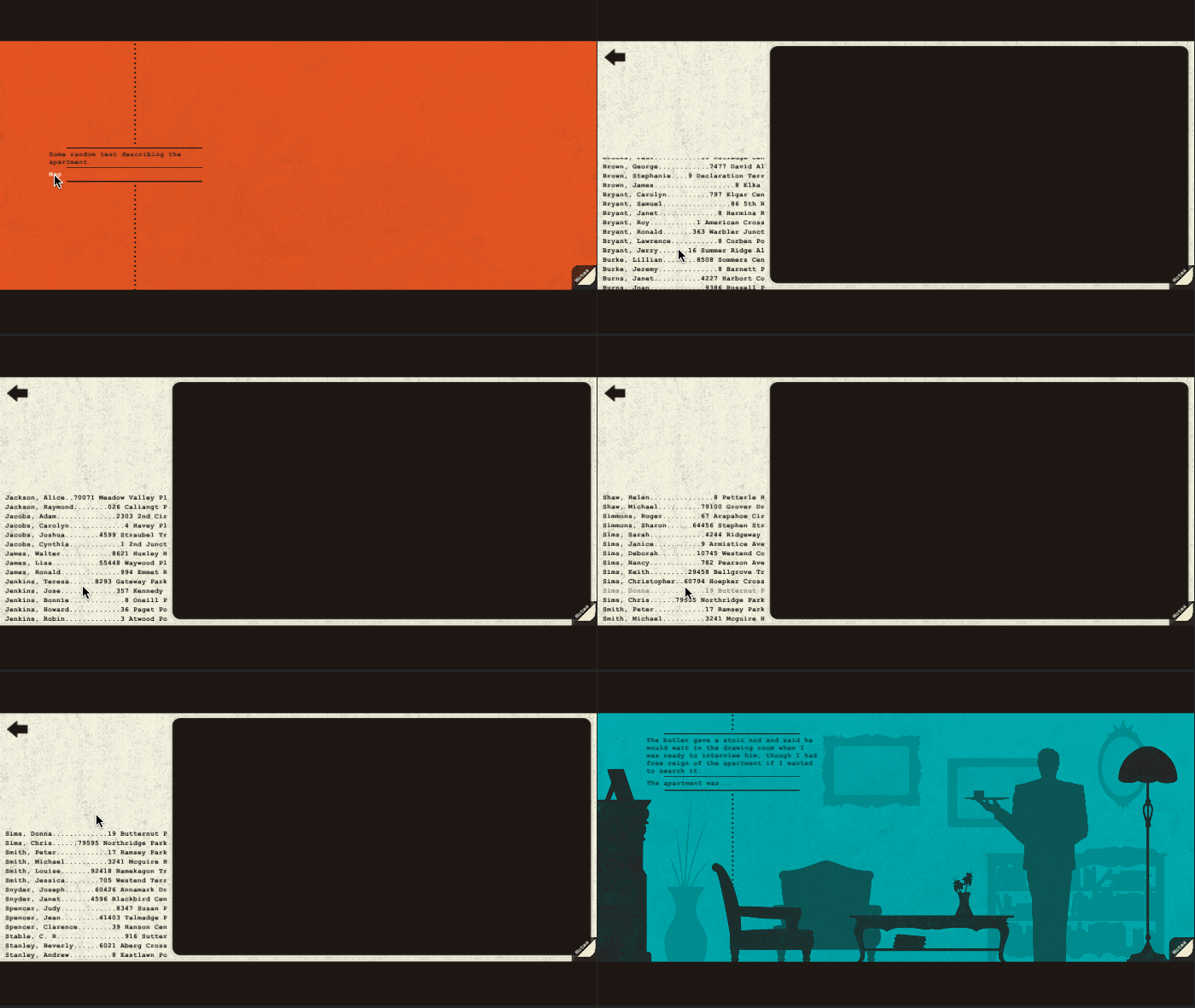
The second day was all about getting it to work. I had already created a "travel" concept in my Twine story, so I just had to represent it with the Map screen. I created a temporary starting location, then used a basic link to open the map. From there, clicking the name "C.S. Stable" takes you to Stable's apartment:

I again strayed from the mock-up by making the directory's headings in-line with the names. This allowed the names to be larger (easier to read at a proper resolution -- don't worry that you can't read them in these compressed GIFs).
Day 3 - Search Implementation
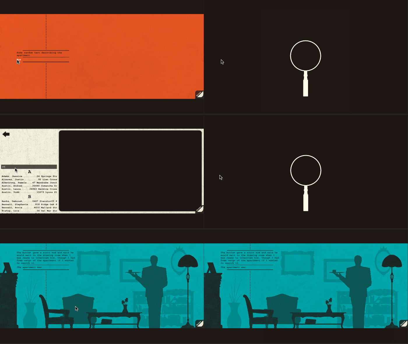
Scrolling through that list sucked! So on the final day of implementing the directory, I created a search feature for easier navigation. This required almost an entire rework of how I had set up the heading/list generation, and exposed a bug with Unity's button hierarchy, but I still managed it all in a single day, and I was pretty proud of that!

Future of the Map
The Directory is now fully functional! But the whole thing looks ugly as sin! Next week the directory will get its proper assets imported, and I'll even make the map of San Francisco in the to stick in the background!

