
I got my menu added for when you click the Item. Now I need feedback on appearance. I think the text reads well as far as explanation and direction. Now I'm not sure if its missing something.
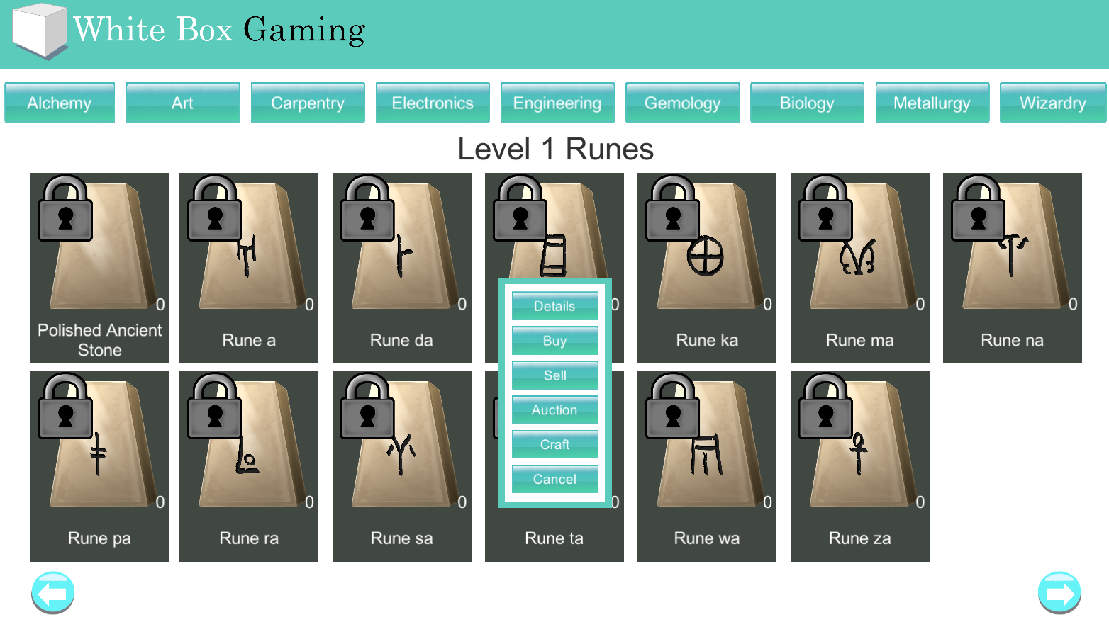

- Are the buttons too big?
- Should I use Icon instead of plain Image behind text?
- Should I use only Text?
- Is the button image too much? Should I use solid color instead?
- Should I change the layout? Vertical to Left & Right or something else?
- Should I add more graphics?
The main difference here is "Items" can be crafted and "Scrolls" are for reading to unlock a crafting Recipe