
I'm working on Highlighted: My artist said no to figure 1, so I made figure 2. What do you guys think?
figure 1:
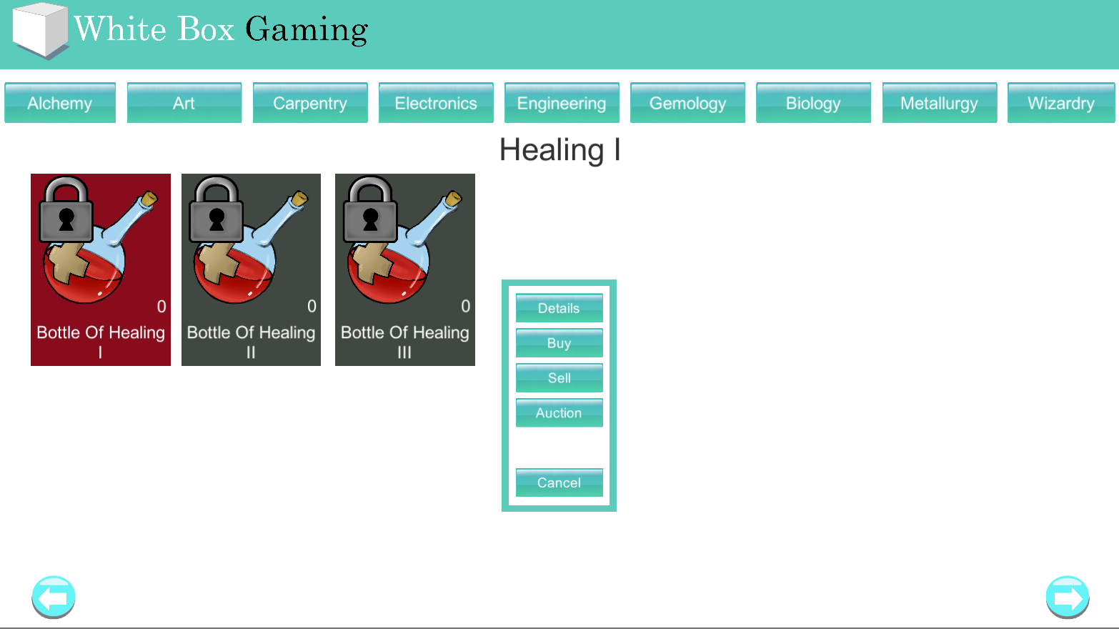
figure 2:
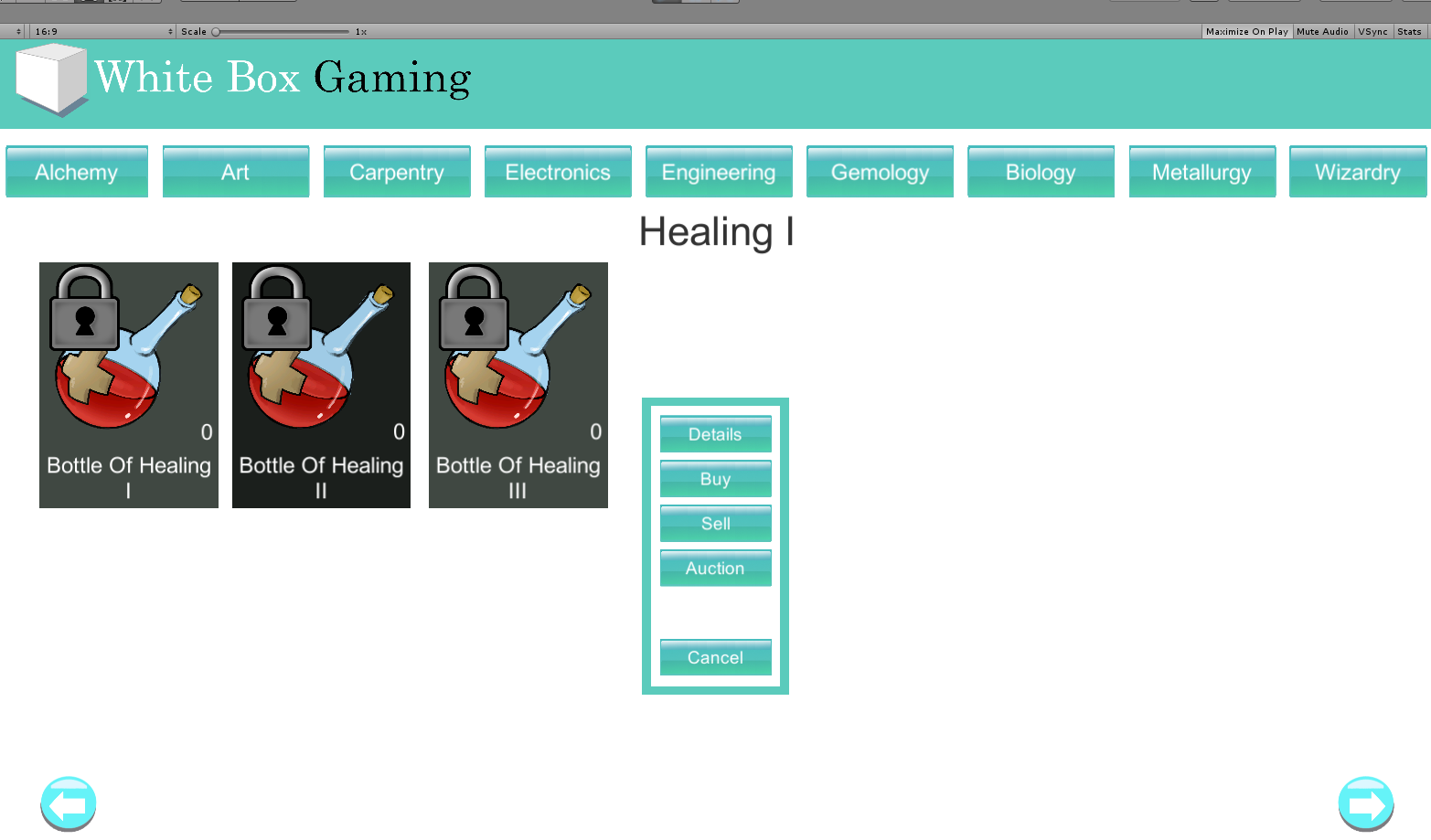
I picked red originally because most App stores ask you use red when highlighting buttons. My artist asked I use a different color. So I went darker. I like it but not sure what's best.