Day 2

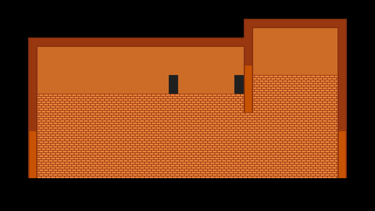
I worked more on Photoshop to develop the other parts of the lodge, and after about a half hour of work, the lodge is starting to take shape! The color palette that I chose kind of makes the game look like an NES-era game, but I mostly chose this sort of color scheme to give it more of a lodge feel, though this design is bound to see some adjustments down the line.
I also worked a bit on character movement as well, in which I put together invisible walls to set boundaries for the player. Since this game is done at a slight perspective, I shifted the bounding box of the character to only cover the "feet" part of the sprite to better suit this perspective.
Although the basic design of the "one room" is finally finished, there's just something missing...like, oh, I don't know...furniture and decorations.

