I don't have much to say since everything I thought of has already been said.
1. What did you think overall?
I really enjoyed it.
2. Which character are you most excited about romancing?
Rafael is my favourite so far.
3. Did you find any bugs/typos?
No.
4. What would you like to see most in the full game?
Uncovering more of the story and learning more about the characters.
5. Other comments or suggestions?
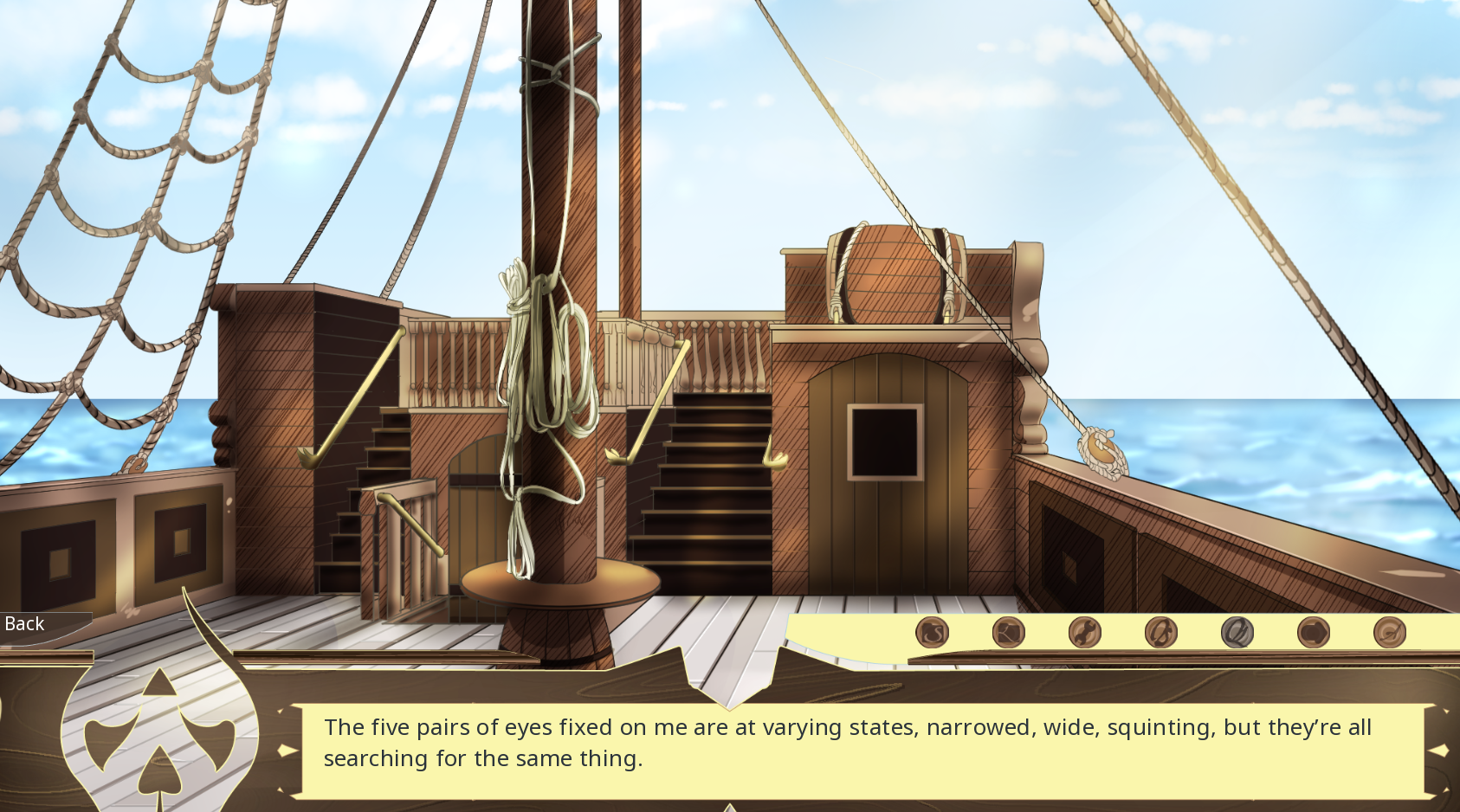
One problem I had with the game was the font used. I found it difficult to read because the letter "d" looked like an "o" with an accent over it to me. It took me much longer to read everything because I kept misreading words. Another thing that slightly bugged me was how confusing all the options were. It was hard to know what I was selecting when there was only an image. Maybe there could be some text by the options to make it easier to understand? For example, when Ash teases Braums about forgetting their name, the text for that option could say "snarky" or something like that. Or if you don't want to have text, maybe use images that are easier to understand.
Edit: I saw your comment about having a tutorial to show the different meanings of the symbols and I think that would help greatly.


