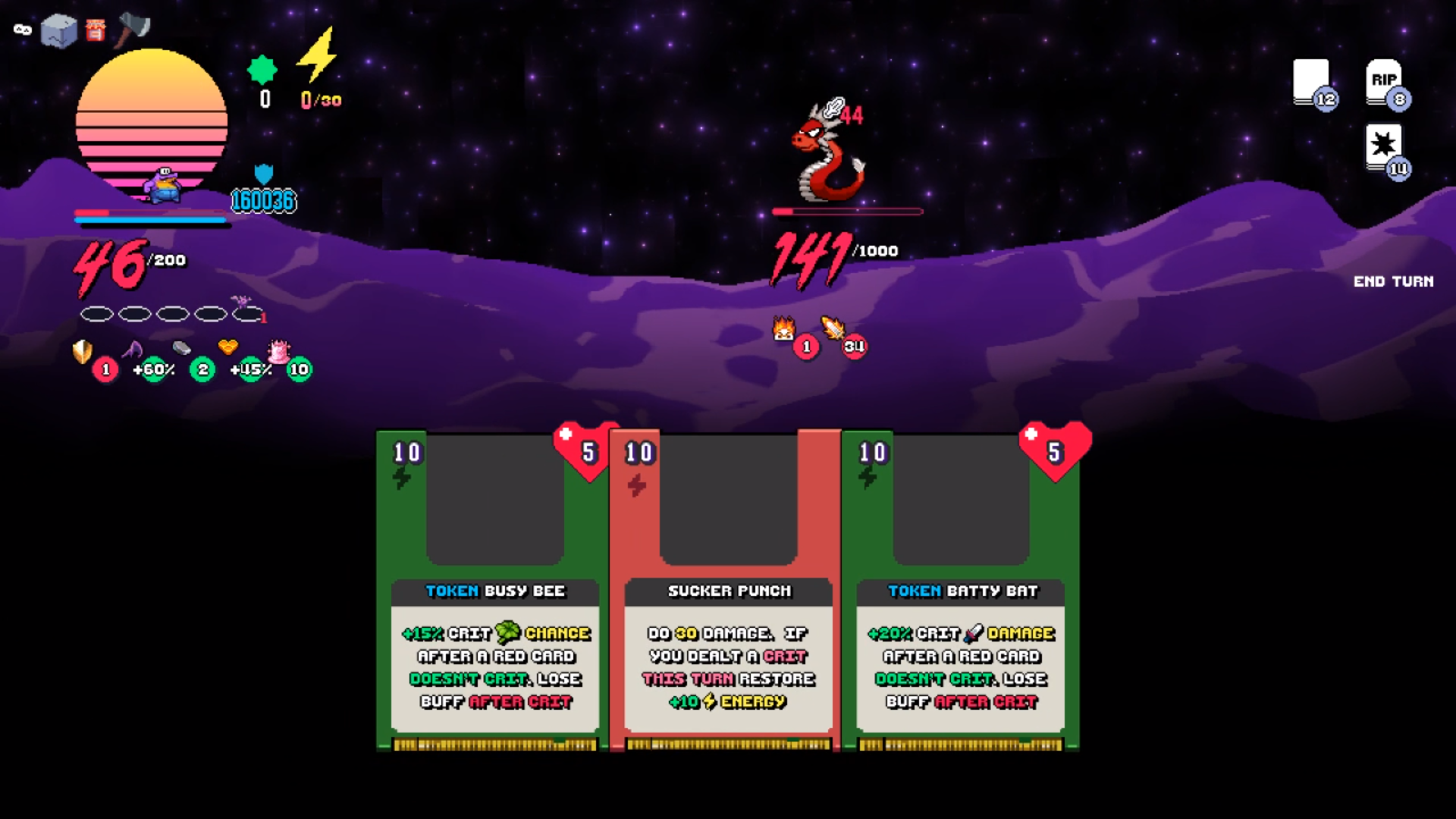
I had to play this game after my friend said it was a blast. I ended up playing it for 90 minutes haha. Though I guess I also had a really hard time finding the boss! Anyway, it was super fun regardless and incredibly polished. I have never played slay the spire before for some context.
Have some little nitpicks on this game. I really loved it so these things are pretty minor and nitpicky.
UI Related Issues
- Heart symbol on how many turns the token will last is a little confusing. The heart made me think of health rather than turns. Maybe something like an hourglass would read better
- Had issues with dragging the card. Several times I thought I had dragged a card but I did not. As the card itself does not actually drag, it is also doesn't read quite well. When you drag the card, the targeting is not super prominent either so it is easy to be mistaken. Would almost prefer clicking a card and then selecting a target though I guess that can be seen as less immersive.
- In the shop, the "Buy" sign looks like a button you can press. It did not read as a question, I think because the borders surrounding it look identical to the borders surrounding the "yes" and "no". In the store, I had clicked "Buy" a few time before clicking on "Yes". I think having the action be the button would read faster to most people. Their thoughts being "I want to buy something", and then seeing the "Buy" button. Think this is also trained because lots of online shopping website would have "Buy" as the button to press. Maybe just have the button read "Buy -40 gold" or something like that and the other button be "cancel" or "go back"
- It's a little hard to tell if the map would expand. Sometimes I would see a monster on what seems to be an island with no other paths to it. It looks like a deadend. So some indicator of maybe fog or arrow indicators that there will be more to the island would be helpful. I nearly missed a path because of this.
- Wish the sprites were a bit bigger
Balance Issues
- Went a total shield build (ended up with 16K shield and 46 health) haha. That card to make the shield permanent with double shield is super powerful. I didn't see much a reason to stock up on health because of how easy it was to get lots of shield.

Performance Issues
- This is probably solely on my end but the overworld was lagging for me. Not sure why but lots of games in this jam have been performing poor for me .... I have a nice laptop but the current theory is that gamemaker games are running on my integrated graphics card on default for some reason
Things I really loved
- Music was great! I spent such a long time in the game and didn't get a headache from it. It sounded good and worked well. I love the orchestral stuff in it. Really well done. It fit the game vibe well.
- Building up crit was a TON of fun. Really went wild on the tokens and gave such a sense of reward.
- Final boss variety? I think I had a different boss from what my friend had and he played the game twice over as he really liked it.
- the background effect on the battle screen was super cool.
- Love the meep moop sound when there's no energy left haha
- The screen that indicates a battle is starting is absolutely awesome
- The floppy disc cards are a neat little touch that work well into the theme
When it comes to this jam, I think this game ranks one of the highest if not the highest on fun. What a blast with an addicting loop. Can't wait to see this expanded! If you do, are you sticking to this theme? Or branching out once the jam restrictions aren't in place?
Honestly, super blown away by what you made in the jam timeframe.

