Oh please you don't have to apologize <3
I am photosensitive, so I face these kinds of issues in many other games too.
=^.^=
So for the general text, in my case the "Simple" Font worked perfectly to negate the eyestrain effect for the textbox this far. I'm so happy you had this option in your game.
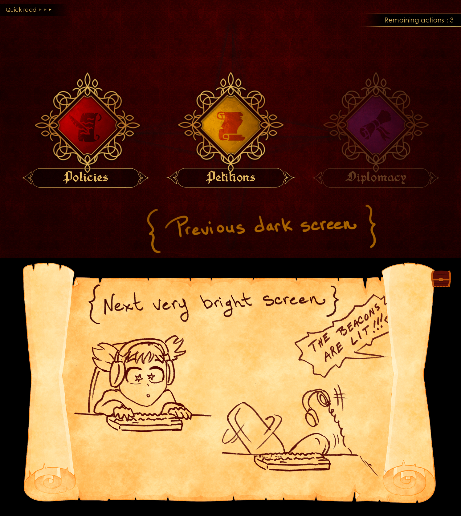
As for the Petition Parchment, in my case the issue is that it's following a very dark screen, so when it appears it's like a "bright beacon of light" ;) (sorry, couldn't help with this LOtR meme)
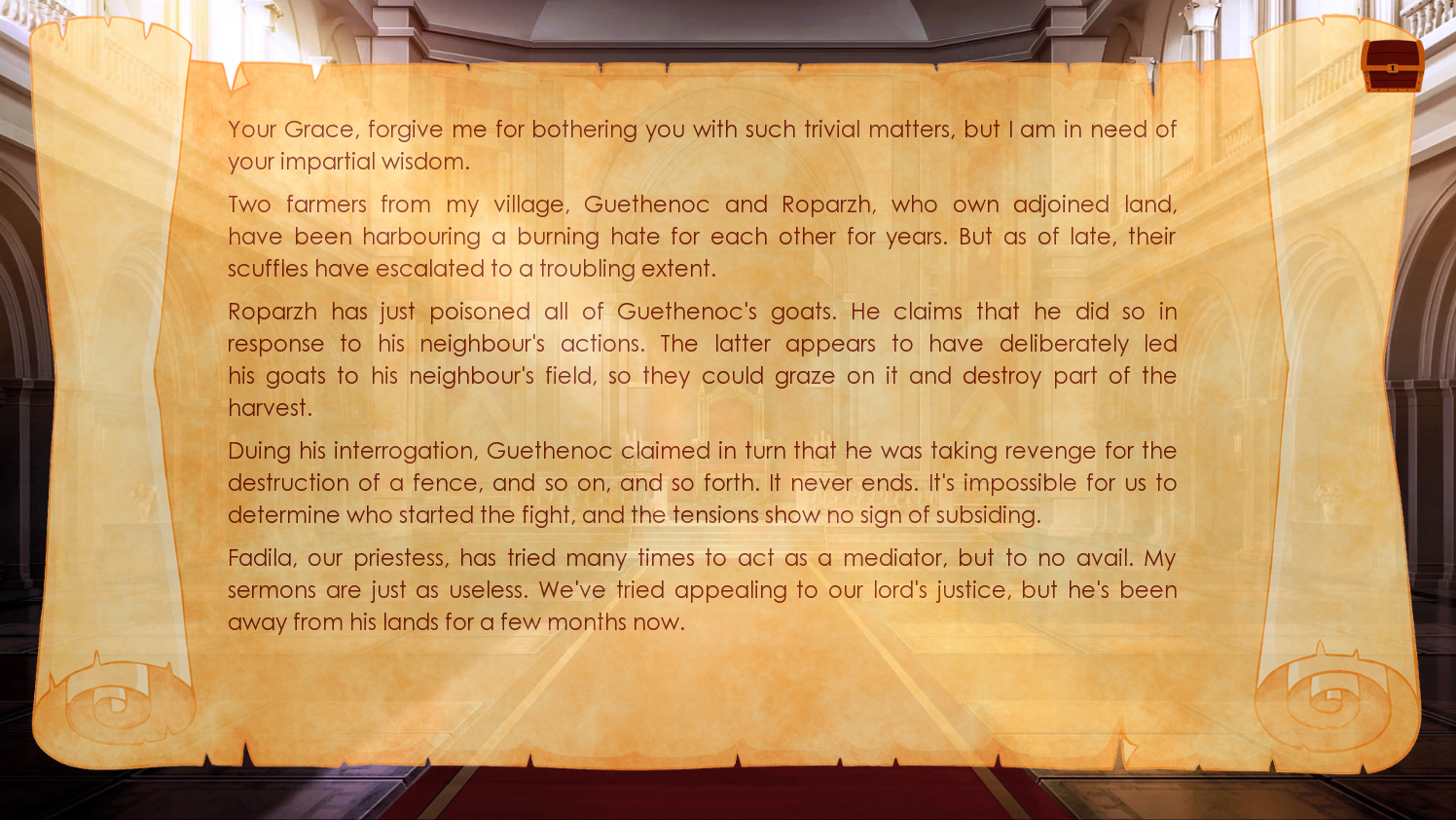
If I may be so bold to make such a suggestion, the appearance of the Petition Parchment could be a bit less "visually disruptive" if we skip the black background altogether and immediately switch to the throne room, and since we're at it, we could also give the parchment a tiny bit of transparency, this way it would cut on its brightness and also making it fit a bit more with its following "Petition Response Options", which are also semi-transparent. 
In any case, the appearances of the parchment are predictable in the game, so early on in the demo I could easily guess when it was time to "squint away" because a petition was coming ;) hehehehe
You guys are doing a great job!
Keep it up !!!
<3

