Welcome, dear readers, to a somewhat belated bimonthly dev log ~<3 (and thank you ever so much for your patience)
Before we get started on our main topic for today, I'd like to share some very exciting news:
1- Our beta readers have officially received their first version of the game, and have begun testing! It's only been a couple of days, and we've already received valuable feedback and made changes for the better. Personally, I can't wait to hear some final verdicts so we can really make the story as engaging as possible!
2- Those of you who have been following us for a while probably remember that in our last dev log. we referenced a personal matter concerning one of the members of our team. Unfortunately, our original composer has now officially stepped away from the project.
We are, however, already working with a new composer, who I would like to briefly introduce:
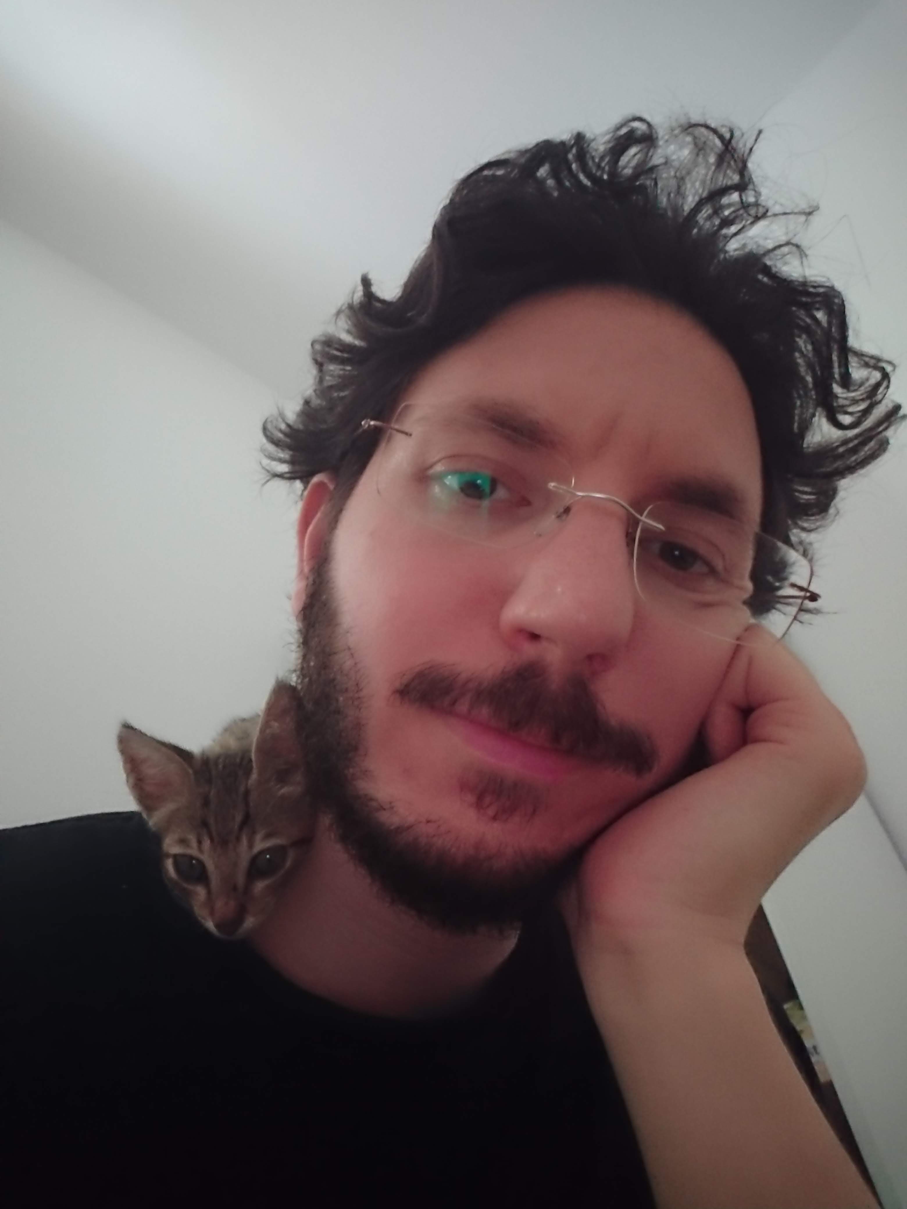
Mickey Hoz is a programmer by day (specializing as a Unity dev) who has also been composing on and off for the past 16 years. He is pictured here with one of many foster cats!
Welcome to the team, Mickey~<3
As to the rest of our dev log? Today we'd like to address a topic that I've been relatively quiet about so far:
What is the process behind the artwork for The Inverted Spire?

Now as some of you may already know, I am both the writer and the artist on this project. I've been talking a lot about the writing side, because it's my personal opinion that despite the significant visual component, a visual novel still lives and dies by the quality of its writing.
In the case of TIS, the additional challenge of a complex branching narrative makes for some very unique battles that are absent from a more traditional single-story experience.
Consider that worldbuilding, characterization and narrative must all come to revolve around the possibility that the player's choices may cause them to pivot in a totally different direction at any time! (Pen-and-paper roleplay enthusiasts in the audience, you also know of what I speak)
However, the reality is that this challenge extends to the art as well.
For example~
Unlike a cast of real-life improv actors, the fictional characters of TIS are limited to a series of preexisting sprites and facial expressions to convey their development. This is , of course, a pretty consistent challenge among visual novel creators in general.
How do you, on the one hand, limit your character art to what is realistically doable (without exploding your workload into the outer regions of the galaxy), and on the other, actually convey the emotions of a dynamic, living, breathing person?
And so, because of the many interesting ways this intersects with my writing challenges, I think the best way to transition from discussing writing to art is to begin by talking about those character expressions.
(It's also the fun part, ngl)
Step 1~Reference

Prior to quarantine days, I have long been an avid sketcher-in-public-places. Just me, my brush pen, and a surreptitiously balanced coffee wrestling to keep a line straight on the subway train, or while silently jamming to lofi at the local bookstore-cafe.
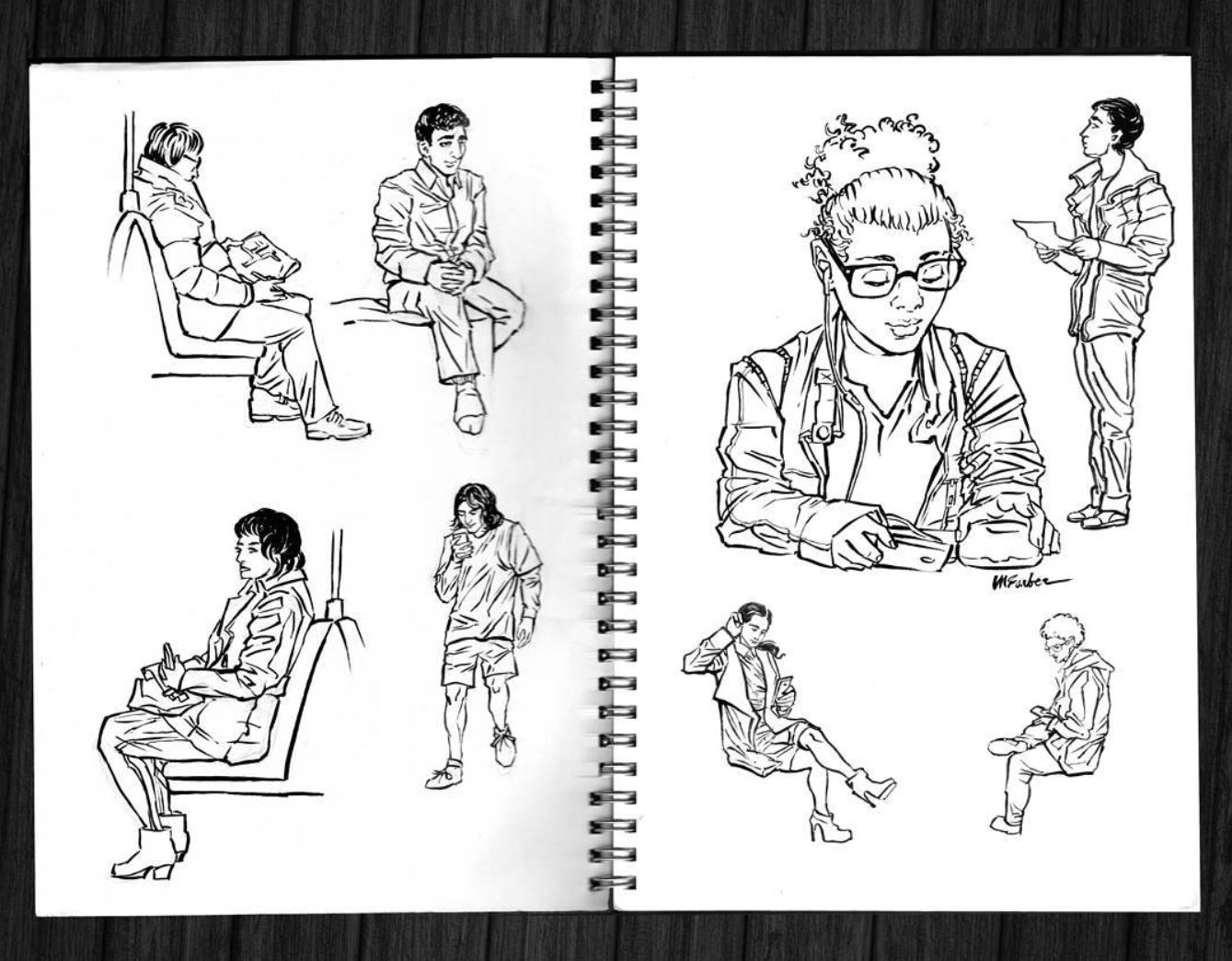
Some of my Toronto brushpen sketches from ye olde 2017 (I'd share a more recent page, that would involve busting out my scanner ^^) Especially attentive readers may notice that I use my old signature here, before distancing myself from a certain estranged last name.
In addition to these regular sketch routines, I occasionally earned a bit of extra cash doing fast-paced portrait commissions at fairs and other outdoor events. Roughly 10-20 minutes per portrait, in an adjacent same semi-realistic linework style (now with crosshatching and white gel pen highlights!)

Here's an example of one of the more involved outdoor booth commissions, depicting four friends from the Barrie Pride Festival.
Now the advantage of being able to go out and draw people in public was that it gave my mind a silent film reel of reference material for drawing character faces that seemed unique. Face that looked as though they were based on real people, but were actually an exaggerated mishmash of features from various real-world sources I'd seen over the past several days.
Failing that, I would have an unfortunate tendency to backslide into basing character faces on slightly distorted versions of my own reflection in the mirror.
As the pandemic ground my public drawing activities to a halt, I found myself relying more on meticulously assembled Pinterest boards. The new challenge here was trying to achieve a similar mixture of real-world features, without surrounding myself exclusively with the most magazine-cover ready faces adorning the internet. I admit I was not always successful at escaping golden ratio perfection with my selection of models, but to my credit, I did try.
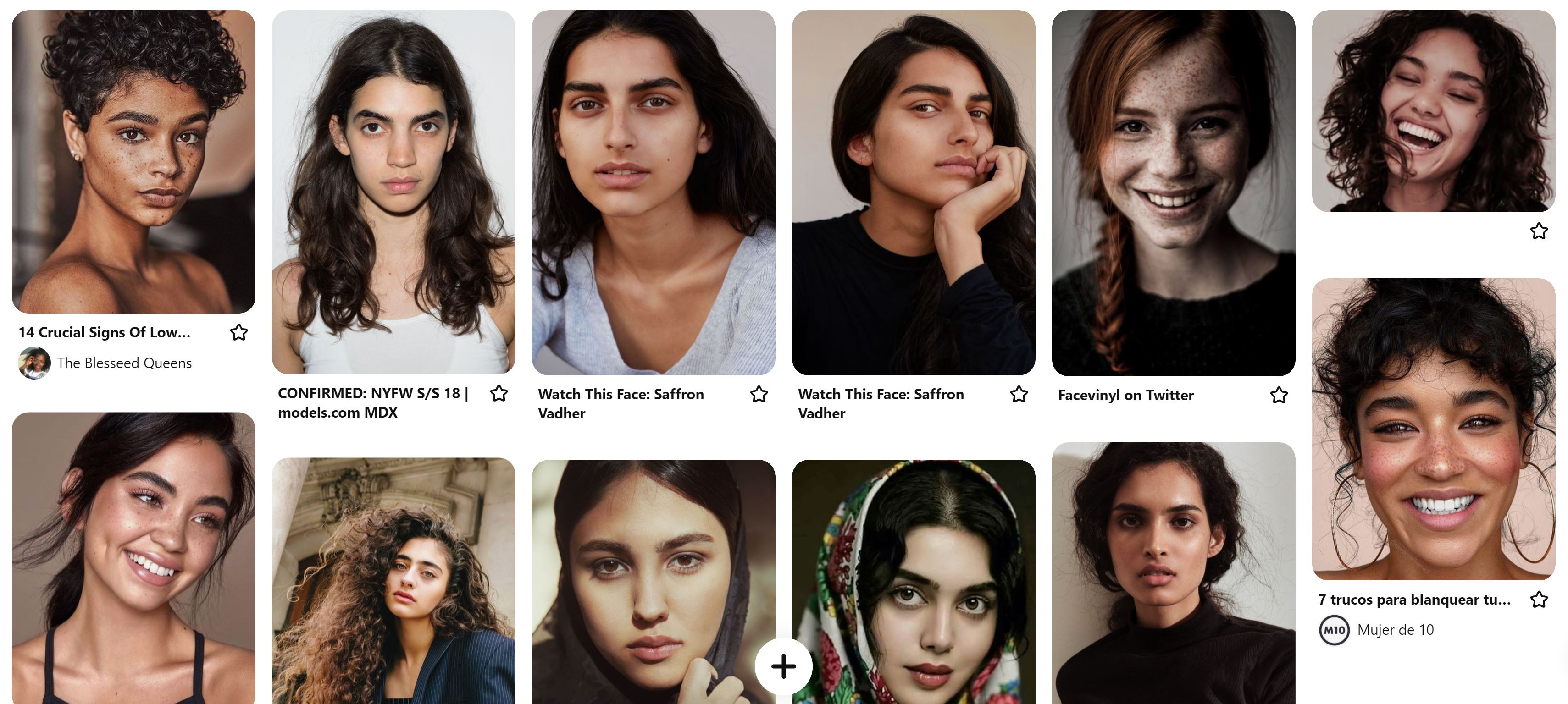
A fraction of a Pinterest board of portait references used in creating the new face of ONE/Vekon Iskra, the protagonist of The Inverted Spire.
And for immediate comparison, the result:
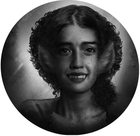
It is perhaps worth noting here that in this particular case, many of the Pinterest board references may appear femme-aligned, but this is actually only a small selection of the reference materials that were used across the absolute mess of folders devouring my harddrive space. In general, great care was taken to use a roughly equal mixture of 'masculine' and 'feminine' models (as well as many whose appearance was more explicitly ambiguous) in designing the appearance of each individual goblin.
Although this topic probably deserves an entire dev log of its own, I feel it is also worth mentioning that both mixed gendered cues and ethnic ambiguity were intentional features of the goblin design. Just as the history of the goblin nation-state and old faith religion were written to avoid any direct real-world parallels, this feature was important to me from the outset.
Of course, there is a greater conversation to be had about what constitutes 'ambiguity' in any of these categories. The short version, in my opinion, is that it's extremely context-dependent and may vary from one individual's perception to another. However, there are also greater societal factors at play that inform our (often invisible) biases.
What is ambiguous to me may be clear-cut to another.
I have even experienced this in my own life, with how different people perceive my 'ambiguous' features through the lens of their personal background to make assumptions about my ethnicity, gender and sexuality (frequently in opposite directions). The results can be unintentionally comedic on a good day, and deeply frustrating on a bad one.
But now you're probably wondering how I proceed from the reference material to the finished product, so let's dive into that next~
Step 2~To the Canvas!

Much like the brushpen sketches you see above, my first steps involve tight (but nonetheless hasty) line art:
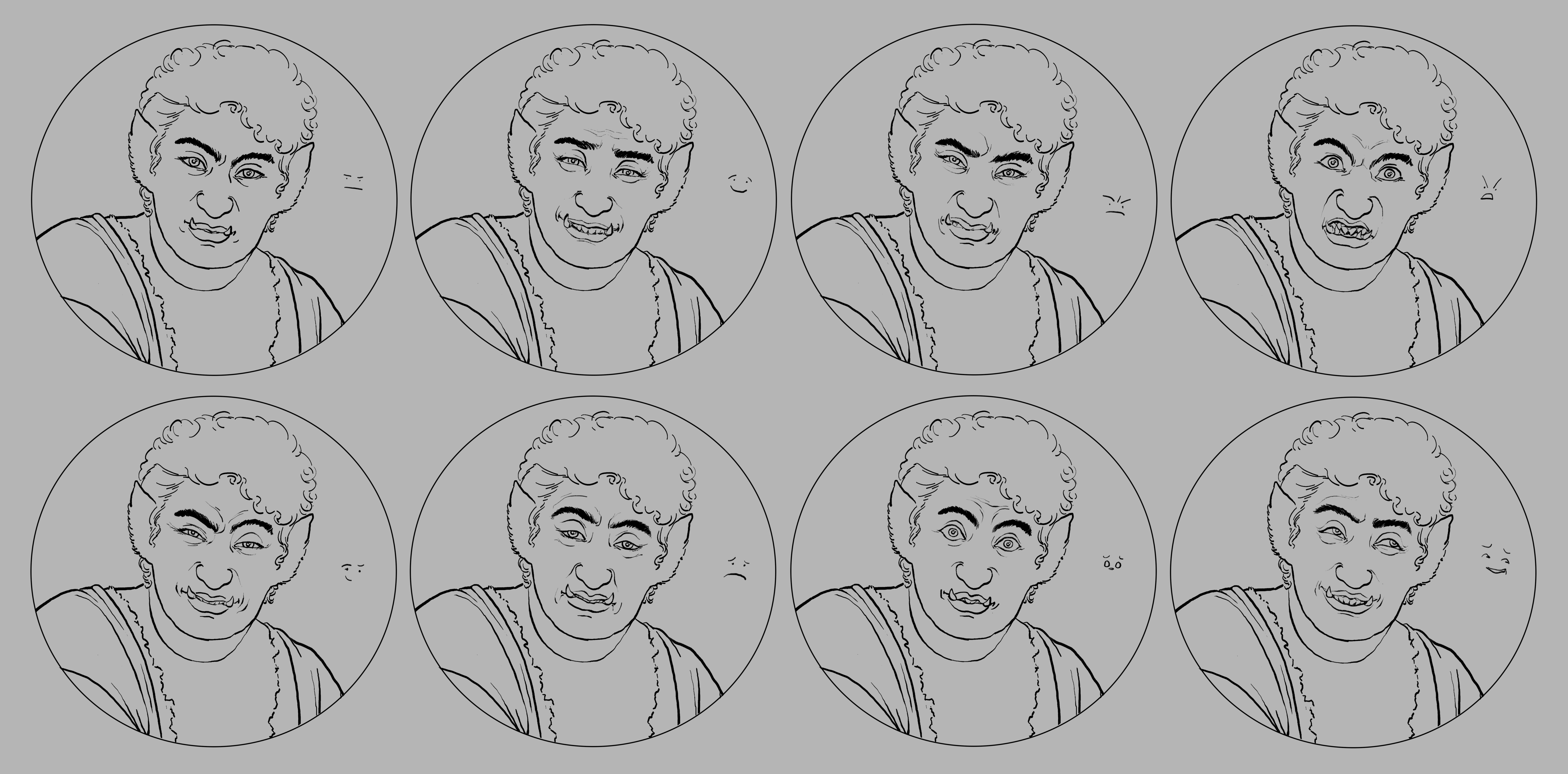
If you look closely, you can see the tiny emoji faces next to each of the expressions above. When my mind is in 'drawing mode' I tend to find these more helpful than verbal descriptors like 'encouraging' or 'suspicious' (those come in later).
However, the emojis really only tell half the story.
What I am really looking for when I start giving life to a face is the emotional range of this particular character, expressed as succinctly as possible. This is where my theatre background comes in. I will read the lines from the manuscript back to myself, acting out the character's facial expressions into a mirror or webcam as I go. Occasionally I will take pictures of a facial expression frozen in time.
My goals here are the reverse of an ideal profile selfie. I don't want the face I get to look too pretty or polished. I want it to have volumes of personality, exaggerated to a theatrical extreme that makes it easily recognizable.
No, you don't get to see the pictures.
Well...alright, maybe. Why not? But only if I receive enough requests!
(Let's cap it at an arbitrary 10 comments, all from different people, requesting that I show my cheesy webcam photos to the world, and I promise to update this dev log with several truly entertaining photos, juxtaposed against their in-game portrait equivalents. I'll even leave it to the commenters to choose a particular character if they want.)
Of course, once I start painting these portraits, significant changes will ensue.

Midway through the partially-painted face of FOUR here, you can see all the underlying texture brushes that give their skin that "porous" look, as well as remaining fragments of linework.
I use photographic references very heavily to capture minor details, like the folds of their neck or their tiny lip creases. This is all made possible by working on a digital canvas of 30 by 30 inches (yes, it's ridiculously oversized compared to the portraits you see in the final game).
At this point, those webcam photos I mentioned become exceptionally useful in making sure not to polish over the minor details that give these expressions their personality. Little 'imperfections' like wrinkles, or the way facial muscles distort a person's features (sometimes to the point of unrecognizability) must be retained as much as possible.
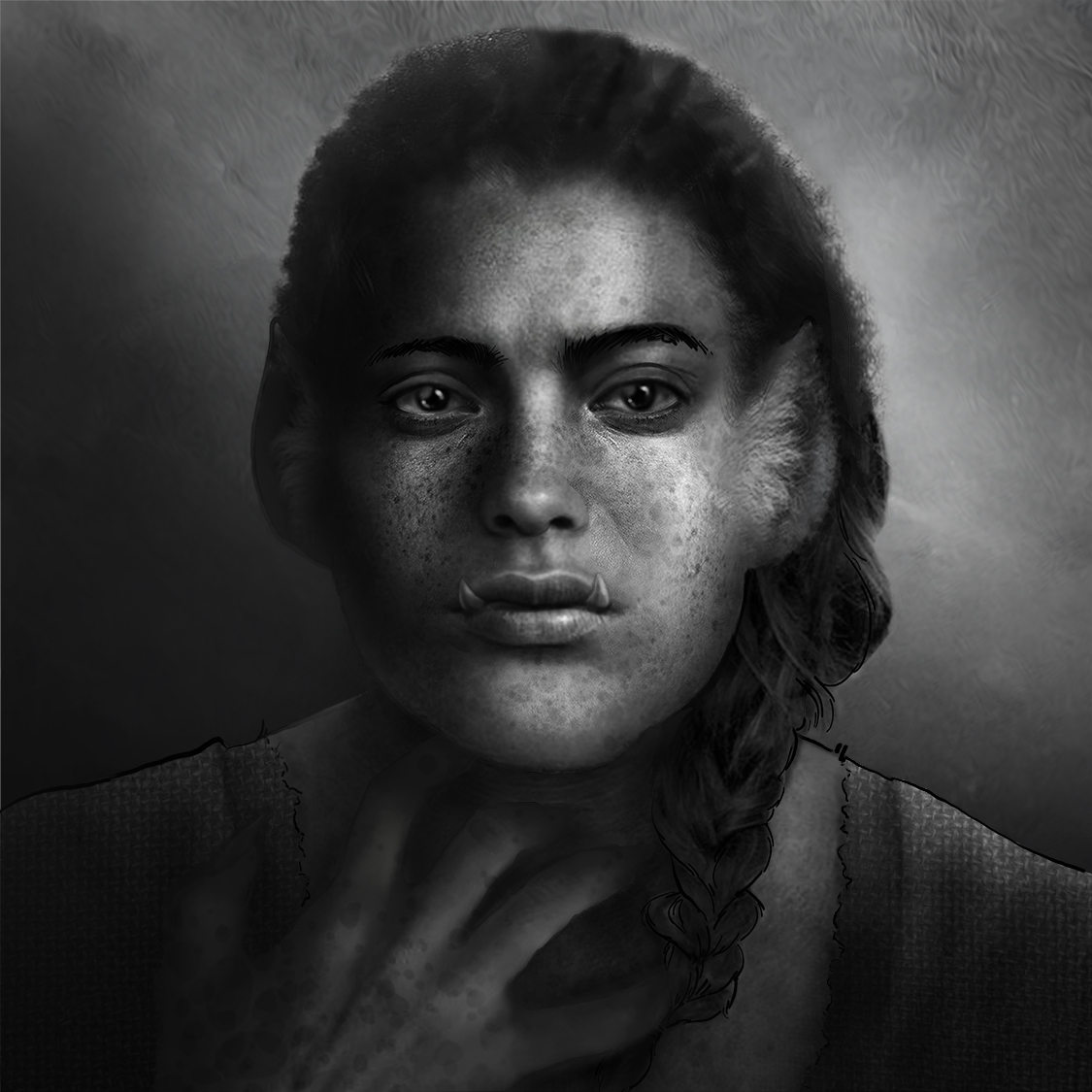
A later version of the portrait above demonstrates my use of layering textures of increasing complexity to give the face an even more lifelike appearance.
You can also see I painted a hand that was removed from the final composition. The truth is many of the goblin portraits had hands painted in to start with! I ultimately left the hands out, feeling that they were too distracting, and in some cases, just didn't vary enough between portraits to justify their presence.
Another difference you may notice is the vivid contrast between shadows and highlights. I will often begin by painting these shadows and highlights on a separate overlay layer. Then I will continually reincorporate them into the base layer. I employ this technique to retain their transparency in relation to the photorealistic textures, as well as keep the transformation gradual before the contrast becomes too strong. This is actually a reversal from how I would work on a traditional oil painting (the source my digital style evolved from) where the absence of removable layers would mean that the contrasts have to come first.
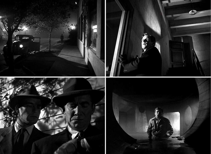
A series of film stills from this deeply insightful 2006 post by Waitsel Smith.
In general, shading in all the goblin portraits takes cues from the aesthetics of film noir—a style characterized by low-key lighting and strong black shadows. This is used to enhance their emotional affect (you're probably noticing a theme).
My favourite finishing touch on any portrait is to add tiny pinpricks of light around the eyes, nose and lips. Something about this moment feels to me like the threshold between life and unlife. The moment those pinpricks are in, I feel as though the character is watching me as I paint, making silent demands on my brushstrokes as they tell me what they ought to look like.
Once I've obtained a satisfying base portrait, it's time to go back to that emotion reference sheet I sketched out earlier.
Due to the complexity of these portraits, simply replacing features (as I might do with a flatter or more cell-shaded drawing) doesn't work. Instead, I have to use a combination of image-distortion techniques and repainting to creates entirely new faces over top of the base 'neutral' expression.
The upcoming release of The Inverted Spire has 9 unique portraits per character with added 'blinking' variations for each. That's about 64 unique character portraits, each individually painted in the style you see above!
Some characters also have additional painted overlays, such as variations with their hair down. These are tied to specific in-game events.
So let's put it all together so see what happens to FOUR:
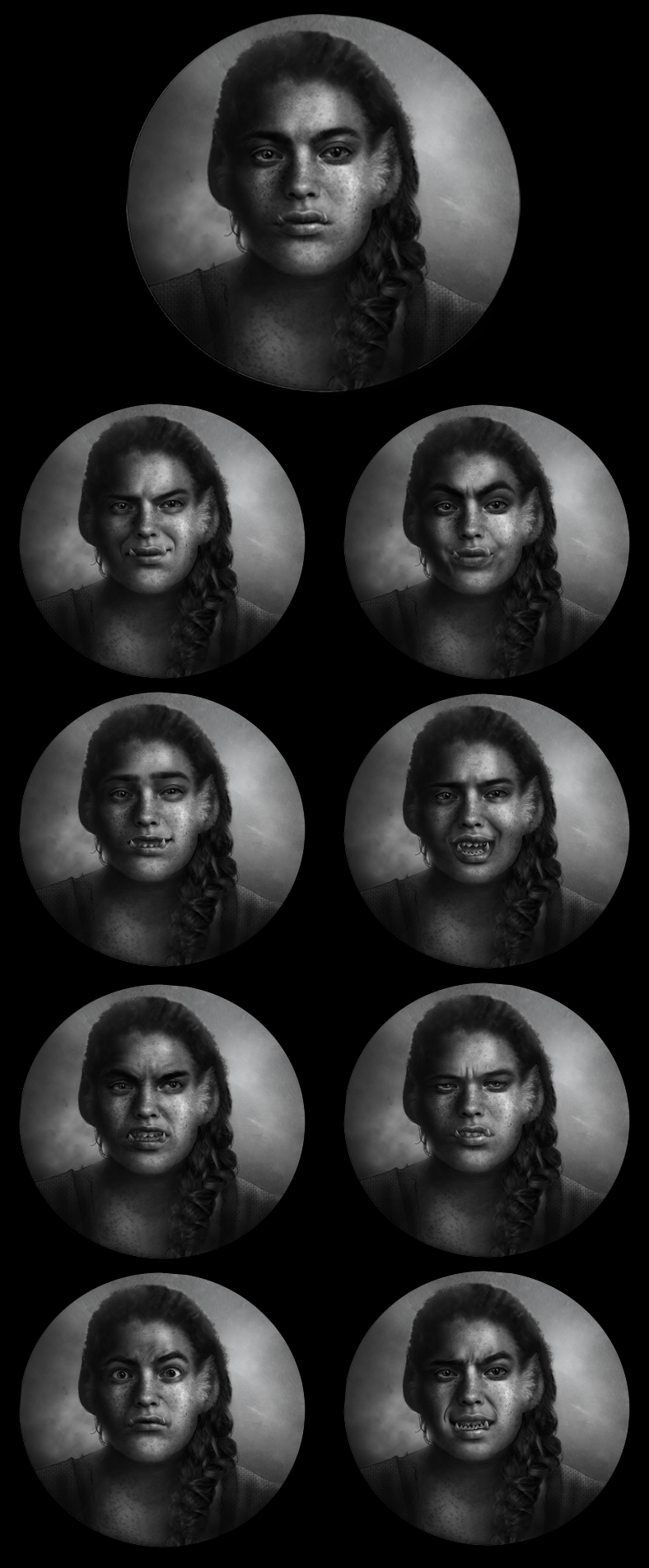
FOUR is a pretty stoic goblin.
Even their most exaggerated expressions are muted compared to some of their companions. They keep their feelings close to their chest, resulting in a few ambiguous faces that can be read many different ways (though some are not ambiguous in the slightest).
While they're more open about anger and frustration, FOUR is especially cagey when it comes to expressing positivity. Their kindest smile is still tempered by a hint of irony, which may leave you wondering whether they're expressing genuine support or just teasing for a laugh.
They're also not especially good at reading a room, which can lead to some awkward encounters. This is only made more difficult by FOUR's tendency to cope with challenges through some heavy compartmentalization, meaning the emotions they do express don't always betray their true feelings (and frankly, I'm not sure FOUR knows what their true feelings are half the time).
To give you a better idea of how acting my way though a character's lines leads to some radically different outcomes, here's the emotional range of a character who doesn't know the meaning of subtle, and has probably never withheld a feeling in their life:

It would not be doing THREE justice to say that they're the life of a party.
THREE is the entire party.
Oh yes, you may think you know how to party, but inviting THREE will elevate your event to cataclysmic proportions.
THREE has a lot of opinions. And you are going to hear every single one of them. They have a raucous laugh that cuts through conversation like butter, and they will personally take every single one of your exes—in a fight—at the same time (even if you beg them not to).
They will probably lose this fight. And they will still love every second of it.
Looking at the expression charts of these two characters side by side, you can probably begin to see some of the creative decisions that went into making them so radically different from one another.
THREE has a very mobile face that stretches to accommodate howls of laughter and blistering rage in equal measure. FOUR keeps their jaw tight, even when they're practically growling.
THREE's happiness is as intense as their misery. They are a creature of extremes. FOUR is always slightly sarcastic and withdrawn, even at their most earnest. Where THREE's eyes contract and widen to almost cartoonish proportions, FOUR usually carries a slight squint. Where THREE's mouth stretched into a variety of shapes, FOUR retains the same basic rectangle with mild distention.
Both characters can be quite intimidating, but in very different ways.
FOUR is a dominating presence. They exude an aura of confidence bordering on arrogance, and make it very clear that they are not be crossed. Exerting control over their own face is just one part of maintaining their atmosphere of command.
THREE's confidence is simply an emergent property of their exuberance. While FOUR masks their insecurities (often badly) THREE wears them all on their proverbial sleeve. They are intimidating only because they know exactly who they are, and are so completely unapologetic it gives them the aura of an unstoppable force (even if the only goblin they pose any real threat to is themselves).
Adaptable characterization in the manuscript leads to adaptive decisions in the character art, which in turn feeds back into how each spoken line is interpreted by the reader.
This is how art and writing in The Inverted Spire become closely interweaved, all in service towards the greater story.
So what's next?

Our next dev log is scheduled for October 15th.
In the meantime, are there any particular questions you have related to the artwork in TIS?
Would you like to hear about backgrounds? Perhaps the intricate user interface?
Maybe there's more about the artistic decisions behind our characters you'd like to learn, or even a tutorial you'd like to follow along with?
Whether its your thoughts on the artistic process, or suggestions for new logs, we'd love to see them in the comments!
See you soon, dear reader~<3

