On Sale: GamesAssetsToolsTabletopComics
Indie game storeFree gamesFun gamesHorror games
Game developmentAssetsComics
SalesBundles
Jobs
TagsGame Engines

dang this is a really thorough list of ideas and design in  your document so far! also i loooove the personality in your concepts already so far. it might be helpful to flip them so viewers don't have to turn their heads sideways to read the labels haha--i think if you upload to imgur it gives you some basic image editing options like rotation.

the trello looks great so far! i'm intrigued by the "primary quest" vs "secondary quest" labeling. i'm guessing this is a priority labeling? it's a cute naming convention haha. i had a quick suggestion for the board: i think it could be really helpful to think of your priorities in 3 tiers--something like high, mid, low, and the colors red, yellow, green which are really easy to read and understand at a glance (and the way trello organizes labels, red, yellow and green will actually show up /before/ the other colors--which makes appear first on all cards and even easier to read down a list).

(+1)

Tnx J!

We really appreciate the feedback. The team has really cliked on the idea and everyone is pitching in on all fronts.

Even though the Trello board is public it's mostly to track our tasks and make everyone feel acomplished and on the same page.  So primary quest = anything that needs to be included in the main game, so all tasks here are HIGH :) and everything else is secondery until we finish the main objective of having a functional fleshed out game. Could you send us an example with a board that looks like you are suggesting it will help me understand what you have described in the suggestion :))

Thank you for the helpfull suggestions and thank you for keeping up with the community :D

sure!

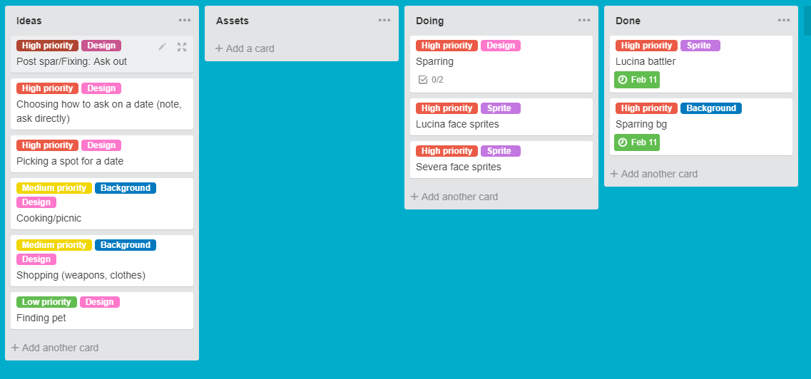
mostly i suggest the red/yellow/green coloring because a lot of people already associate those colors with priority (look at stoplights, notifications for websites, etc.) here's the setup on trello: notice that the priority labels always appear as the first label.

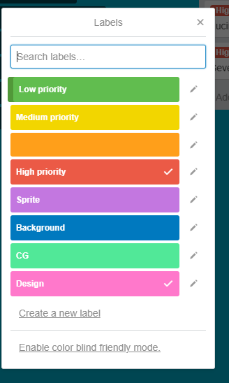
trello actually is set up by default so that the red/yellow/green labels are above all the other labels so they appear first on cards:


obviously you don't have to use this convention--but just a small suggestion for some even easier legibility at a glance.