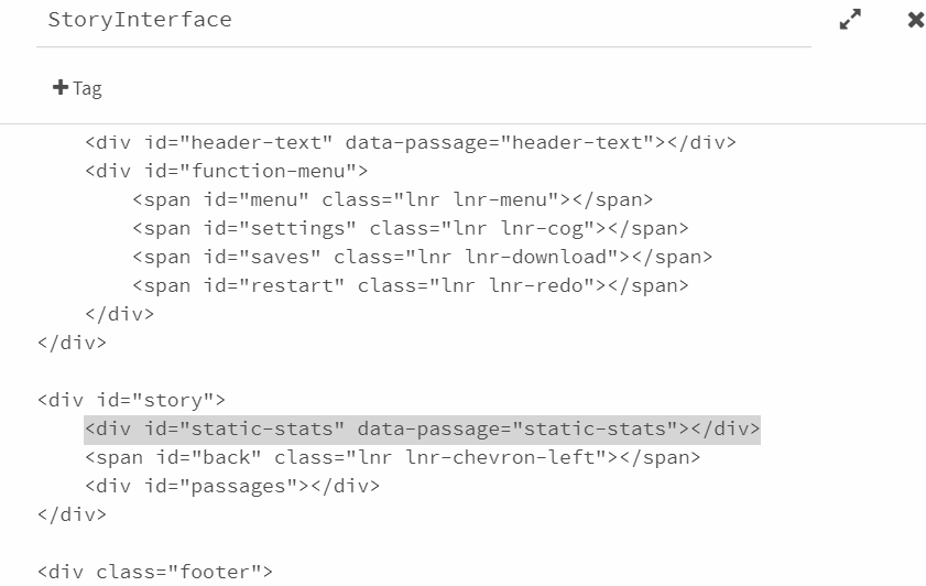
Thank you so much!! That's a good idea, and there are a couple things you could do. You could 1) opt to keep the bottom bar open at all times (instead of having it open on hover) and keep your real-time stats down there instead of in a separate stats page. To do that, you would need to adjust the footer height in the stylesheet - right now it's at 10% so just change that to whatever height you want and erase the .footer:hover section. Or 2) you could add in a whole new section altogether to store the stats in, but that'll take a lot more coding to make work. Off the top of my head, I'm thinking you could add a new div id to the StoryInterface passage like this:

You'll need to add a new passage to store your stats (so in my example the new passage would be titled static-stats), and you'll need to add styling for the new div in the stylesheet.
#static-stats {
  font-family: var(--sansserif);
  font-size: 80%;
  text-transform: uppercase;
  letter-spacing: .2em;
  line-height: 1.5;
  position: absolute;
  right: 0;
}
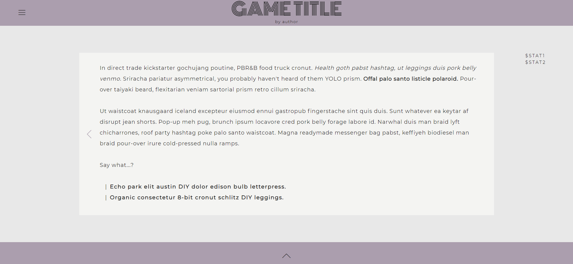
Totally depends on how you want the stats to look, but this is what I put for the example and it ends up looking like this:

You'd have to play around with mobile formatting though since the mobile version doesn't leave room for stats on the side like this. Maybe something like:
top: 10%;
left: 50%;
transform: translateX(-50%);
This would put the stats right in the middle above the passage, but it does interfere with the title a bit (and also just doesn't look great). But hopefully this is a good starting point for you to make it work!!

