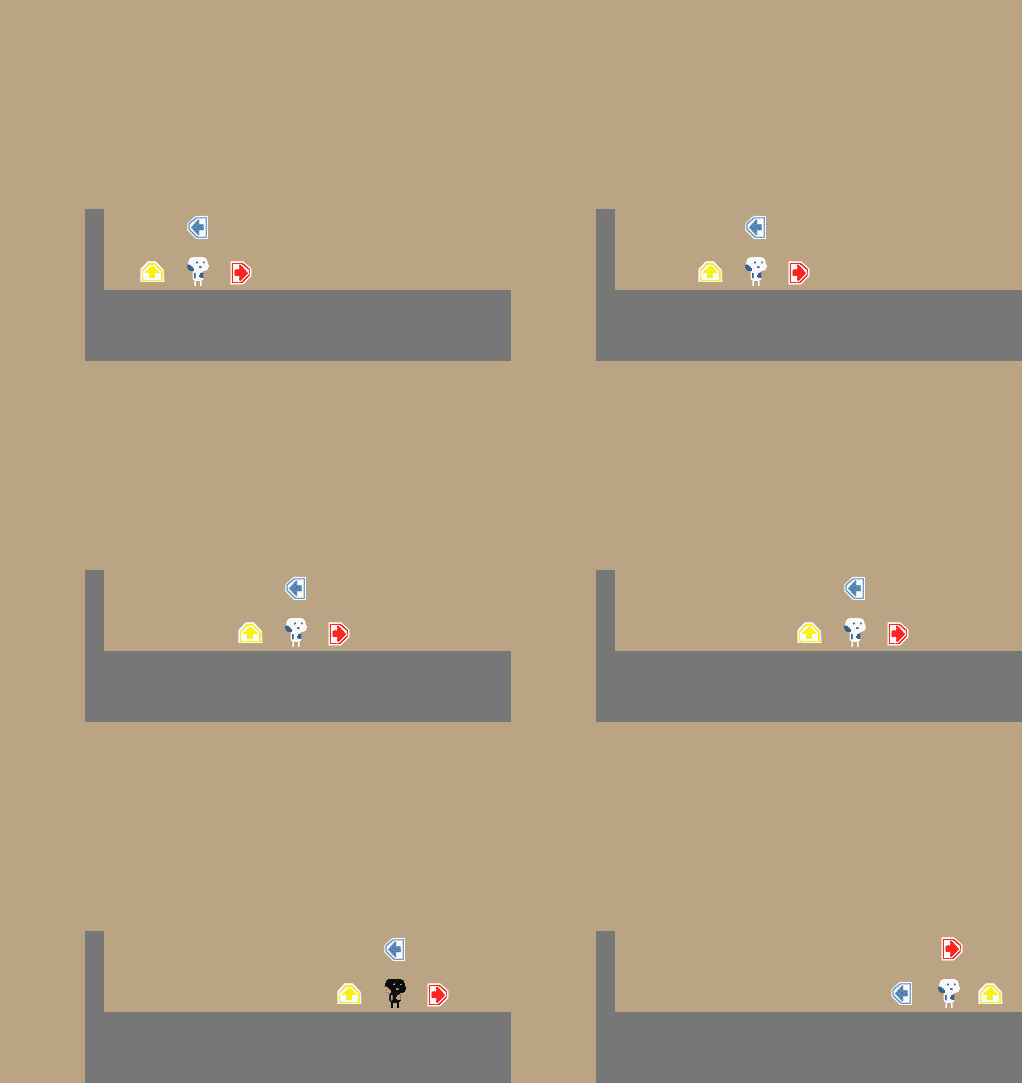
interesting concept, but way how you indicating what need to be pressed need some changing. First to see controls you need look away from characters whats slows player down. You need remember of peripheral vision, controls is too important and need analyzing (here more about it
its about vr, but still basic knowledge). Add more types of indications, reading is very complex task and in platformer you don't have time for this. Below i put my idea of hud, i left your arrow but i think better will be some more simplistic one or use symbls.

