End of a weekend of rest! Time for a little post challenge introspection.
To start with, I've released a post-challenge update version to fix one low impact UI bug, and one relatively high impact crash in the AI. Overall a pretty good outcome for stability to have just one known crash after 3-4 days of release :D
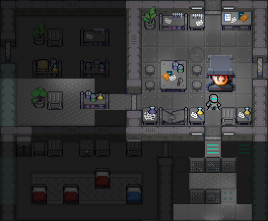
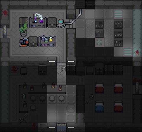
For atmosphere and style I think I nailed it - It's been a while since I've done this much pixel work, and I created loads of new terrain types for the sci-fi theme which I haven't done since 2017! There was a point where the gray on gray color scheme everything started looking "muddy" and confusing, especially once I started adding more ground stuff. Navigating rooms started being a bit difficult so I spent a few hours darkening non-passable terrain so at-a-glance the user can see where they can walk without having to visually identify each feature. For example, I went from this to this -


The effect is subtle (note, the walls, boxes and shelves), but makes faster play much easier.
On the downside, I don't think I did survivors very well. The game already has a bit of back-tracking due to the pipes and exploding pods, having to ferry survivors around is another annoyance on top. I had an idea after the submission period to add a keybinding to "send-home" so at least you can send them off and not have to worry. Alternatively they could be hardier to make keeping them on a better option, but they're kinda stupid around explosions...
Even though the pipes contributed to backtracking, it wasn't as bad - I liked them. They introduce hard decisions about completing exploration, it means not all ships can be completed unless you're willing to pay the price in health. I know some players won't like this, but knowing when to call it is an extremely roguelike skill.
As far as longer term improvements in my approach, I learned a lot from watching streams last year (and look forward to doing so again this year), and I was able to implement some simple straight forward improvements to fix troubles they were having...
First off, I found people having issues with difficulty - this is no surprise for a traditional roguelike in modern times, and with my games in particular (I'm pretty good at roguelikes myself so can't really match difficulty to my own skill). So, I supplied normal and easy new game versions, however no-one I saw play would ever take the easy game, even if they were dying over and over on normal - I think likely some form of gamer pride. This year's fix for this was to rebrand easy to normal, and normal to hard - pride issues fixed! The game is probably still too hard overall but at least people should take the easier route this year.
Next was keybindings - last year, despite having "Help" as a menu item, forcibly showing them the help screen on first game load, adding a message to "Press F1 for help", some people still ended up mashing the keyboard in confusion. This year, I repeat the "Press F1 for help" message every time an unbound key is pressed, there's no way to escape assistance now! In addition to that, keybindings are tricky in general. Some users obviously have less traditional RL experience and couldn't handle the numpad, insisting on WASD. I can't imagine how anyone would be comfortable with those wonky keys for diagonal movements, but each to their own - This year users get to change movement bindings right out of the gate (last year I made them available in a post-challenge update).
And I guess that's kind it!
I haven't seen my game on stream yet, but it's loaded up with Tiger J, hopefully to be run through on Wednesday 5.30 EST ;) See you there!

