Hello all!
Recently, I've been making music for the game with the amazing 1BitDragon software. Sadly I'm not sure how's best to upload music previews yet, so I'll have to show those off later.
I've also been working on making the titular Void Zone look nice. Which.. I admit I have been trying to do for a long while.
In the Alpha version, it looked....
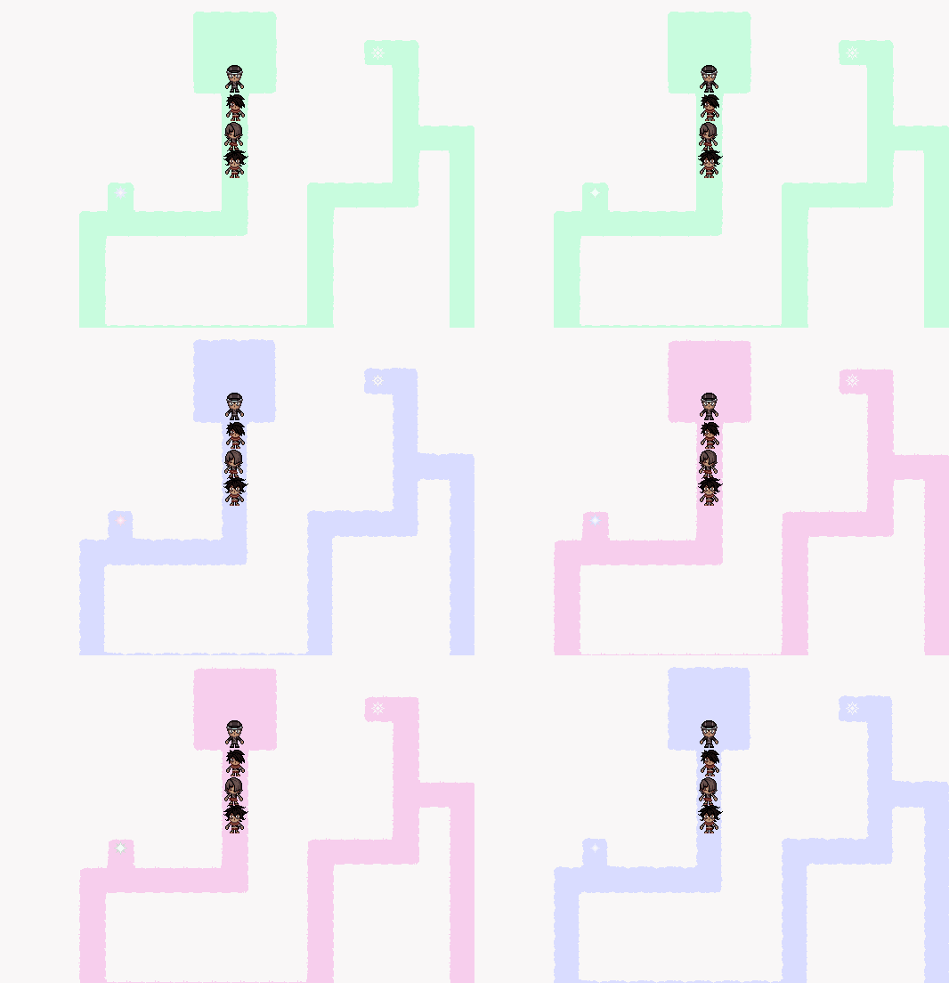
Umm.. yeah. Let's call this "not as good as it could be".
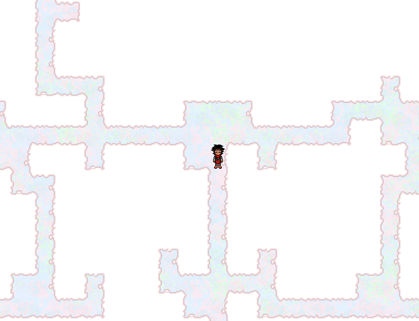
I've attempted quite a few different things since then. First was this one, which.. well, it's not horrible, but I don't think I would call it "good".
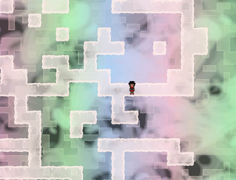
My most recent attempt has yielded this, which is still far from where I want it to be but looks maybe a bit better.
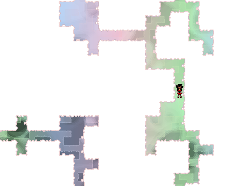
And I tried a hybrid of the two just to see how it looks. I think I might like this better actually, but.. not by much. I think if I went with something like this it would incorporate the "floor" pattern from the upper one, just with this white "blank area" and maybe with lower opacity.
I'm going to keep trying things to see how they look - the Void Zone is pretty important (as you may imagine), and the player will spend quite some time in it, so I would like it to be as visually appealing as possible while still maintaining the appearance of a sort of harsh, unforgiving light coming from a sort of nothingness.
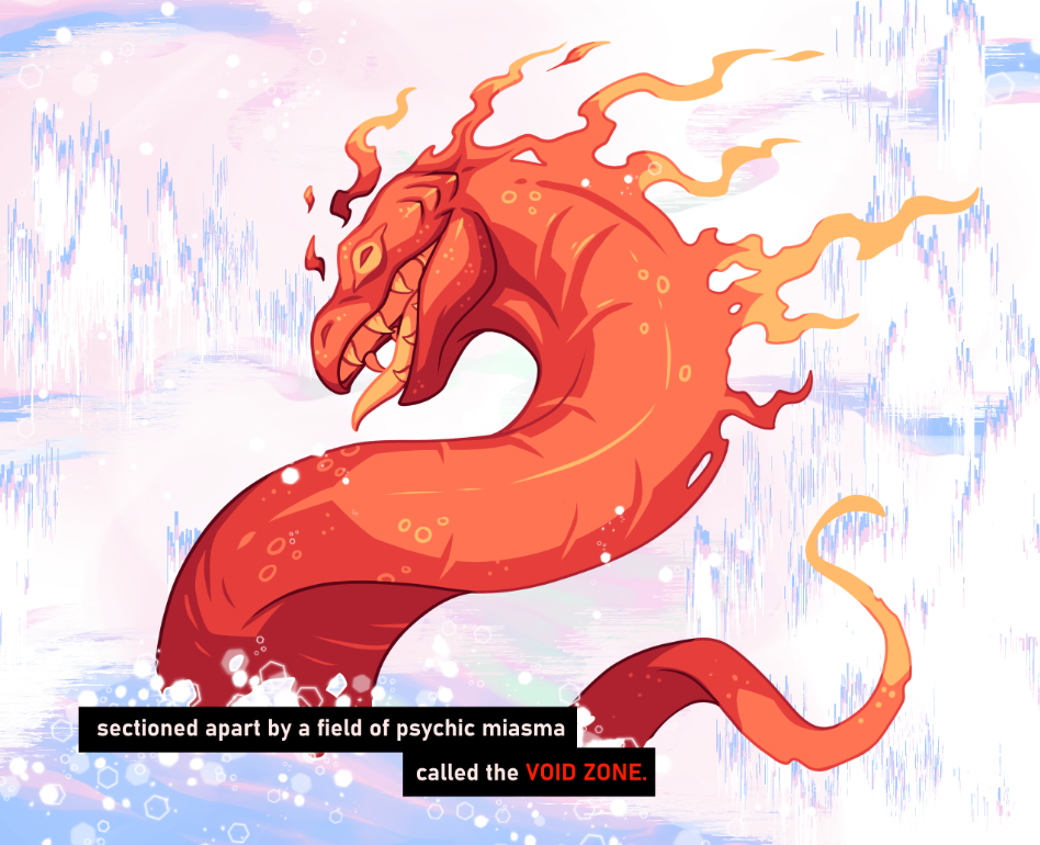
I thought maybe I had some older concept art that would help me. Here's what I had:
The most recent illustration of the Void is from before when I tried making VZ into a comic instead of remaking the Alpha (but then decided against it). And though I like this illustration, it doesn't have much structure to go off of.
Similarly, the two times the Void appeared in the Alpha's cutscenes, it was considerably un-detailed:
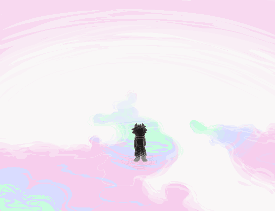
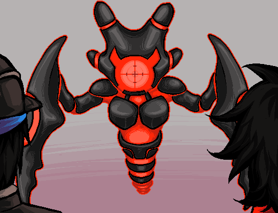
So, I really don't have much to draw from admittedly, other than an image in my head.
I'm not sure if I want the Void to appear as a sort of "layered platform" where you can see deeper and deeper into it beneath you, or as "shifting tunnels" of sorts. In either case, I want to maintain the theme of RGB light. I suppose I'll have to keep fiddling with it.
Oh - and since it showed up in that old comic art, here's the enemy featured in it:

That's all for now!

