Indie game storeFree gamesFun gamesHorror games
Game developmentAssetsComics
SalesBundles
Jobs
TagsGame Engines

Glad you enjoyed the game, and I hope your stomach gets better soon :)

Regarding the feedback:

  • Bonus levels are an ongoing struggle for ours in terms of presenting them to the player without also making them stray from the critical path. We have a new way of showing this in our upcoming game and we hope it'll work out better than what we did in Golf Peaks.
  • This effect of rising from the mist was actually our initial idea, but we ran into some technical issues with doing that due to how our shaders are set up, so we opted for the simpler camera effect you can see in the game today.
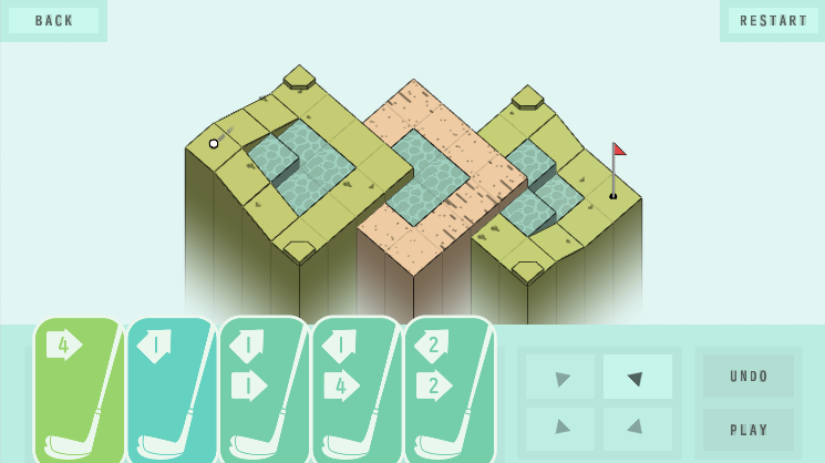
  • We actually had a "golf club" visual for the cards in the earlier version of the game (see attached image) but we opted out against them because the image took up too much space and took away the player's focus from what the card will actually do :)

Makes sense! Shaders'll get you. UI is just hard. I *do* kind of like the golf-club cards in the posted screenshot, but I can see why, as you say, they might have had to go for space. I understand this game has to play on phones, too, and I've been playing it on a laptop.

I wouldn't say that your presentation of the challenge levels was drastically off or anything. Even something like a little floating "Optional Challenge Levels:" text hanging over them might have been enough to eliminate any confusion, at least for me.

Lots of the presentation is really good! Again, I don't know if I said this, but I love how thematic water and sand traps and bank shots are. Those are the most 'interpreting golf as puzzle mechanics' elements, and they really make the whole experience. 

Oh. It might be interesting to note that I did encounter a level now that almost stumped me: 5-4. I admit I came close to giving up! It took me forever to realize what I could do with that chip2-roll2. Required a bit of lateral thinking. But I did get there.

That's also an important point - based on whether the game is in portrait mode (phones) or landscape (PC / tablets / consoles) we switch up the card orientation from vertical to horizontal in order to make them more legible, and the design had to account for that :)

Yeah, putting a label saying "bonus" on top of the challenge levels might've helped - at the time I was determined to put in as little text as I could (both for localization reasons, as well as making the game more approachable to young kids) but that probably wouldn't have hurt as much.

Thanks! We tried to make the mechanics easily understandable at a glance even for golf newbies like us :)

I'll agree that 5-4 is a bit of a difficulty spike, and we probably should've made the puzzle a bit easier in hindsight.