Here are some presentation suggestions.
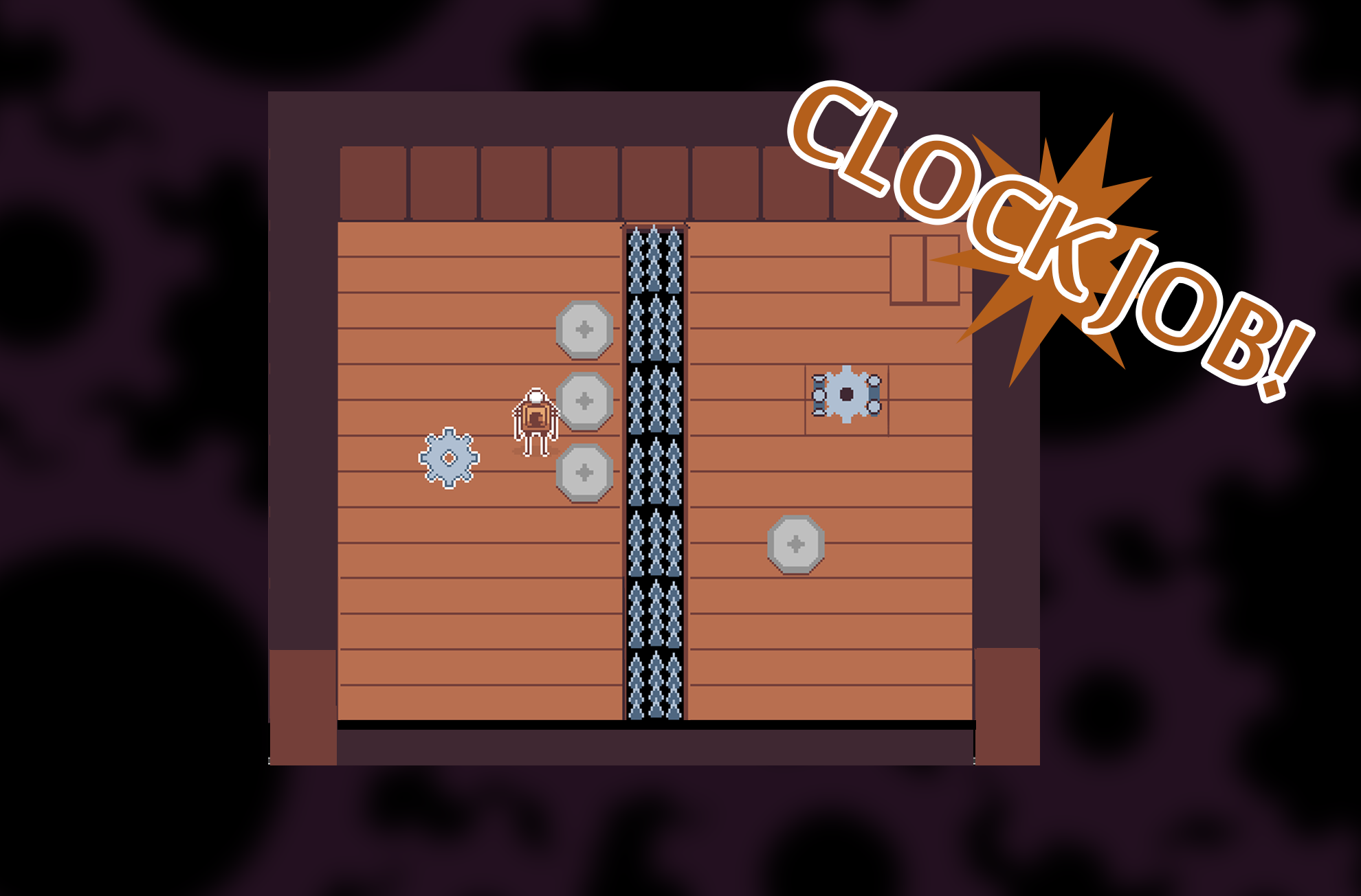
- Never obstruct the player in the puzzle space so dont have a lower wall at the bottom screen I managed to Hide the cog in this level specificly and it's not good. get rid of this wall and have us Xray trough so that game objects don't get obstructed.

- when you have finished a puzzle have a proper level transition something like GOOD JOB or in my example CLOCK JOB!
- The hook shot is weird. If i want to hook a cog i go to the cog while i still drag it towards me?? That's really strange you should set rules for this. why not just have the cogs come to you and you can hook shoot walls to go to them. make these different so the player clearly understands the limits of the design or else it feels super yank.
- The cogs final placement should be Automaticly adjusted at the end. If it hits the area it should Automaticly Glide into place and start spinning Should not be able to move it afterwards.
- make the screen space larger I dont like the scrolling it cant keep up with the player properly and i lose sight of a big part of the puzzle. if you can, fit the entire puzzle on one screen thats better. it feels like im looking trough binoculars when i move around right now.
- Keep the cogs reasonably the same. Im okay with the larger once but the smaller cogs i dont understand? you have opportunity to create puzzles with these like you cant hookgrab the gold ones but you can push them for example.
- The push mechanic is really SLOW it doesen't feel right.
- I think this game would work better on a grid system rather than a free movement.
- I find that a puzzle should be able to be finished quite quickly if you know what to do. You have some mechanics that slows down the flow a bit its not super bad but some stuff that you need to do that could be automatic would be better.
- I think the story is just fine i guess.
- the music could do with something a bit more pizzicato esque instead of this long droning Nes noises. Lolos adventure? I know you are going for a sad sort of tone but Maybe this could be more like an adventure
- I also think you need more audio to indicate what's going on in the game world to spice up the experience.
Good job though i think you just need to tighten things up.

