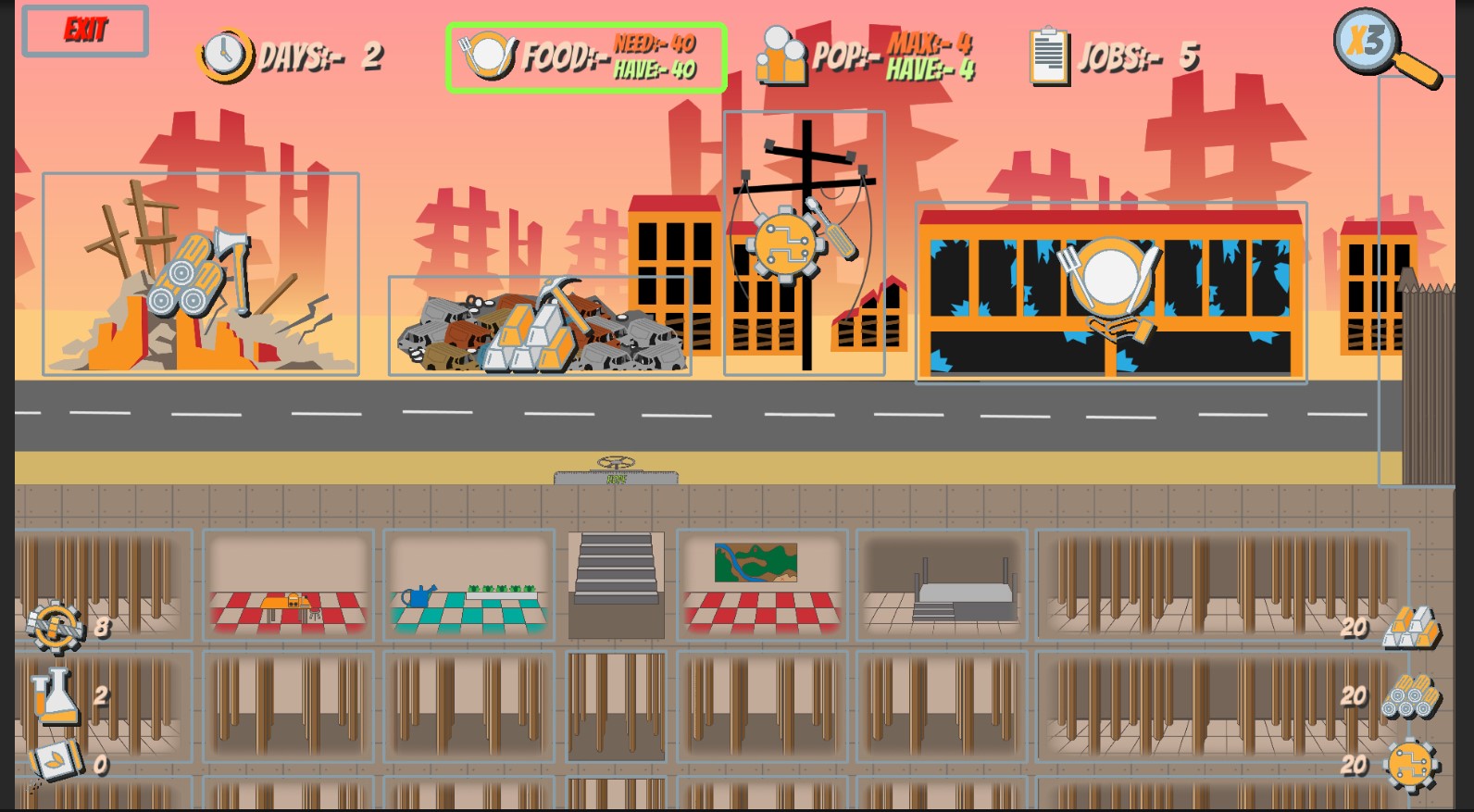
This is a decent prototype of a potentially good game. It was so confusing at the beginning, especially with all the icons looking so similar that I have to stare at it for a few seconds to know what I was looking at exactly. The music is alright, the story is humorous and I admire that you took the time to make some dialogue for this. Overall I think it needs more polish but is so far very good for the time constraints you had. You definitely deserve more ratings, but also, maybe you aren't rating and commenting on others' work enough? It would definitely help.
Viewing post in Hope jam comments
So the resource icons on the UI looks really similar and they don't stand out much from the game scene. It would help to make them look more distinct from each other. A good example I could think of are the resource icons in Age of Empire games where you could clearly tell gold, wood, stone, and food without having to look at it closely. I hope this helps :)


