25 JUN 2022:
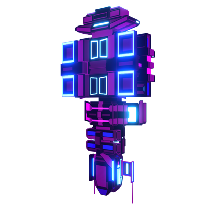
BEFORE
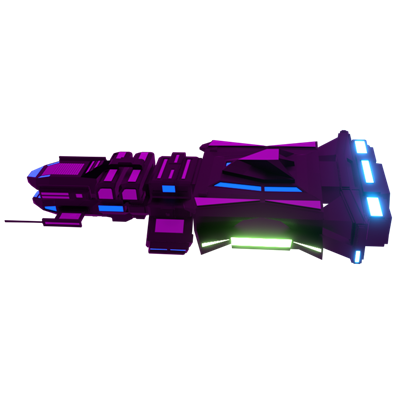
AFTER
Before I get knee-deep in coding again, I want to make sure that I'm absolutely happy with how the enemies look. The last one to need improvement was the Carrier. As you can see in the "BEFORE" picture, the original design has a lot of bright, highlighted sections that look cool, but don't make it obvious what their purpose is. Are the bright squares sections you can target? Where do the enemy fighters spawn from?
I started by seeing if I could get away with just making some slight modifications, but it quickly became apparent that would not be possible. I found that there were LOTS of vertices floating in space, disconnected planes and other chaotic geometry. To fix this, I deleted the "hull" section entirely and made heavy use of extrusion and insetting to get the new shape.
Colorwise, I felt it should be incredibly obvious where the enemy spaceships launch from. In the original version, I kinda arbitrarily picked a blue square and tried that out. As you can see now, the only highlighted sections are the hangar (glowing green) and the engines (glowing blue). All other colors have been toned down.
It felt really good to play around with Blender this week and I even learned some new techniques like push/pull.
QUOTE OF THE WEEK:
"The wise man does at once what the fool does finally." -- Machiavelli
Thanks for reading and have a great rest of your week!

