I know some art stuff that could easily be adapted to a pixel art context.
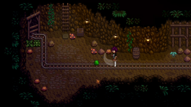
-Color is important, make the protagonist recognizable with a small, vivid but not too vibrant, color scheme. Think about it. "Castlevania", "Shantae", "shovel Knight", "Momodora: Reverie Under the Moonlight", these four use protagonists with two or three distinguishable sets of color. Coordinate your backgrounds and enemies with your protagonist's design.
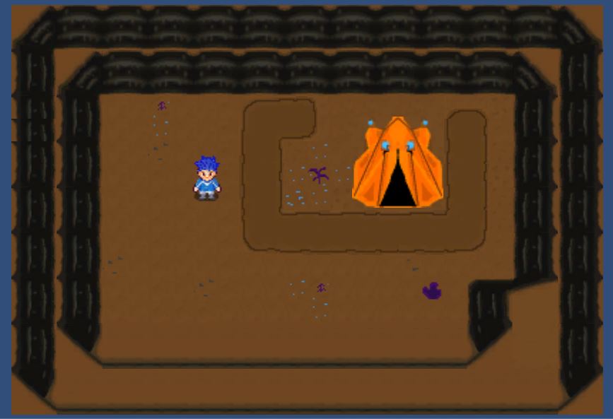
No one likes to play a game with blue backgrounds, blue enemies and a blue protagonist. Players want to know where their character is on the screen without actively having to search for them.
-Pixel art's not about correctly representing objects, it's about conveying them, keep that in mind. With two brown pixels and a pink pixel you can convey an open mouth, etc. Or not even open the mouths at all, people will still understand the character is talking.
-Don't overdo shading and don't resort to "pillow shading", search the term online for more info. It doesn't look appealing. Simple shading and some knowledge of color temperature is always nice.
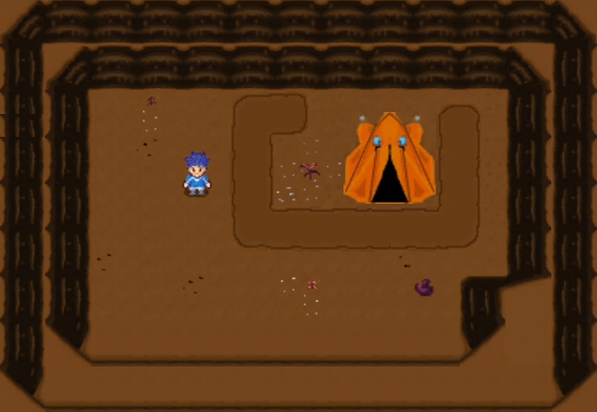
-Be conscient of the resolution you're using, I didn't use proper resolutions when making a test pixel art game and the result was, when scaled up, everything was twitching and vibrating when the camera moved. The software was trying to stretch every vertical line of one pixel to a pixel and a third basically.
"Momodora: reverie under the moonlight" is a solid game to use as reference on what feels right. The protagonist has a black shirt and white outfit to compensate for both dark and light backgrounds and the controls are comfortable even though the game might be hard at times.
"Iconoclasts" also has fun mechanics and nice character and boss design.
"Shantae and the Pirate's Curse" also looks nice, look up gameplay for these and study them for a few moments, maybe even speedruns of them to see later elements and levels of the games quickly.
Good luck!


