Indie game storeFree gamesFun gamesHorror games
Game developmentAssetsComics
SalesBundles
Jobs
TagsGame Engines
(1 edit) (+2)

As I have now seen some games that are comparable (but still not that many, I tried mostly non-puzzle games, ironically!), it will be interesting to make comparisons. :) Even though I wish each game could be judged independently, but when the concept is really close, it is useful to build on previous reviews and concentrate on the differences.

Various thoughts:

  1. A first remark: the core mechanic is akin to that from Marimbla, so several people had the same idea; I do not know if other games picked the exact same, I still have to see. Nevertheless, yours has different sub-mechanics, such as the value-changing tiles or the falling tiles, while Marimbla had the walls (on which you could collide to stop) as the main secondary mechanic (if ‘main secondary’ makes any sense :p).
    Interestingly, your value-changing tile concept resembles my stamp concept. Nevertheless, in your numbered/numerical context, a nice addition (! XD) is that you can either assign a value (with red dots) or increment a value (with black dots). You can also glide over such tiles and have to stop right on them to activate their effect.
    (It is fascinating to see how various people could arrive at such close concepts, yet still keep a difference. :))
  2. I like the falling animation with a cartoony sound. XD (I was thinking of doing either a similar thing or a straight funny vertical rock-like rapid fall, but ended up skipping that because single me got short on the time side.) Overall, the sound effects are great. Just like Edalbung, I think I would have preferred a bit of music as an addition, but this is a detail.
  3. I notice you used a non-standard numbered die! Which I find more interesting; nevertheless, this means that the user cannot use the simple ‘seven’s complement’ rule (ie the sum of any pair of opposite sides is 7) to know what the current global state of the die is. I think some way of telling the player would help. (For the record, I had the very same issue and decided on showing the configuration through a UI element.)
  4. I notice the perspective angle is not 45°, but slightly different; it looks like this choice was made accordingly to the keys, so that left-down-right-up keys are closer to the orientations of the die. Cunning, smart choice! :)
  5. As an element of comparison: Marimbla had the sweet idea of showing in advance where the die would be located depending on your possible choices. This could both be a helper or make the game too easy to your taste, so I am unsure if it would have been better here, but you may want to consider.
  6. I like that you made an implicit tutorial (as you state in your answer to JD3006). I think that works pretty well; also, the different colours for the tiles help cement the tiles’ behaviours in the player’s mind.
  7. I wish I had a zoom-out / camera functionality in some levels, such as in level 14’s ‘crossroads’, so that I could see the whole level and anticipate better. This was nothing serious here, though.
  8. Seeing the nice cube’s movement and sounds, and how some levels have a rather extended solving pathway, I am thinking a ‘run solution’ functionality (which would show the player a solution) would be nice; I have seen one implemented in Sokoban by Koce.
  9. Haha, that ‘floppy disk duck’ sound for forbidden movements! XD (Guess what? I wanted to put one too.)
  10. I like how the ‘movement restricting’ sides’ rotation has to be taken into account. (Actually, I wanted to do the same for my arrows, but ended up giving up on the idea for lack of time…)
  11. A small note on the interface: you used a simple, plain, functional one. This is totally fine to concentrate on the main game, but I find it ironic that this would be the choice for the larger team. ;)
  12. I see on the game page that you estimated the playing time at ‘[a] few seconds’; that may be true for the simpler levels, but I would advise switching to several minutes, considering the later ones. XD
  13. Up to now, your puzzle game is the one with the most levels I have seen, but I think this is somewhat of a quantitative detail — and you were four level designers, while all the others I saw only had only one, so it should be put into perspective (! Pun not intended XD).
    But qualitatively, it also has a high standard, and once again, the fact that you had four level designers surely explains it.
  14. Oh, by the way, I like your punny title. :)
  15. Oh, one last thing (I usually talk about this point firstly!): you apparently made the WASD controls layout-independent, as my AZERTY layout shows. :) Few games I tested do.

I thought your game had near the right balance between workable and ‘thought-provoking’. This may depend on people. For instance, I really solved several levels through level-headed analysis; some other bits I (shamefully) partially brute-forced (which precise route you should take in the lower-right yellow area in level 14, for example; to be honest, it was probably solvable thinking of the die’s orientation).

All in all, I think your game shines in the difficulty progression and level design categories (mindDie is another worthy contender for this last aspect).

Anyway, in itself, the game is great. :) Thank you! Checkmate!… Against myself.
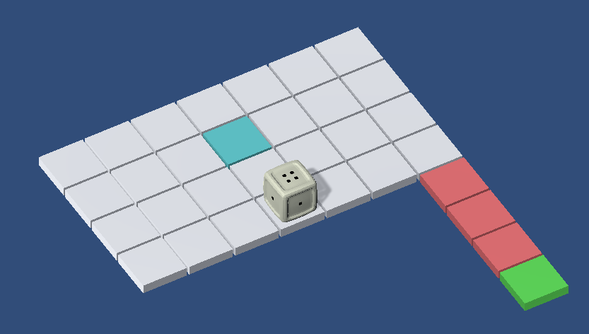
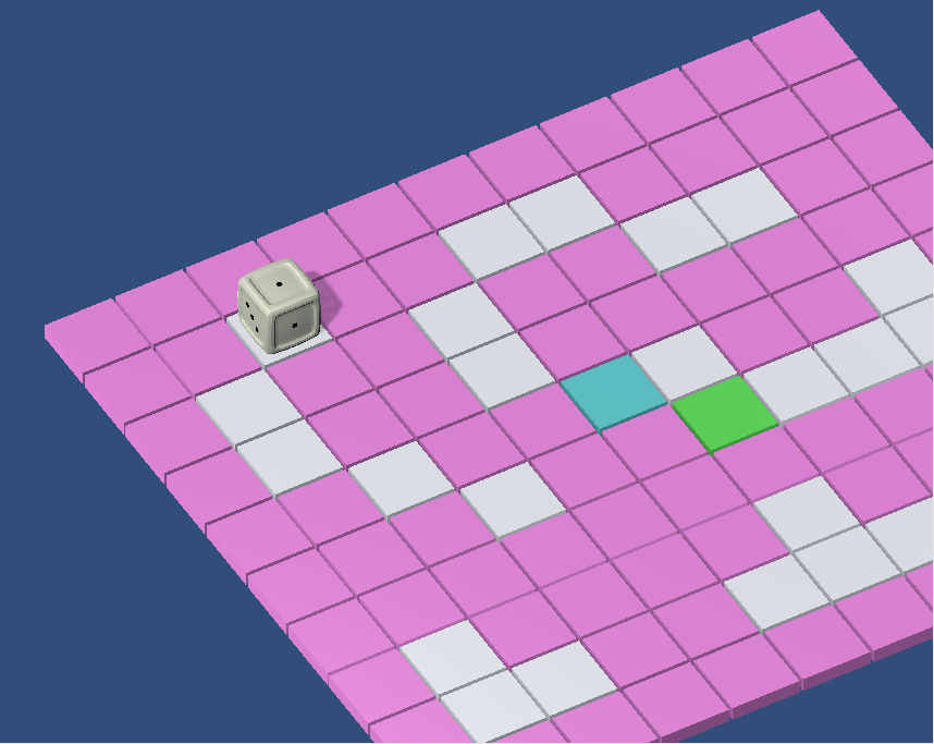
WOW! Thanks for the extensive feedback! I'm going to respond to your points a bit out of order so I can group similar topics and keep my response shorter.

1: It also surprises me how different the individual dice roller games actually are. By now, I've also played my fair share of Sokobans, and though there definitely are overlaps and shared mechanics, almost all of them have that one "main secondary" feature that sets them apart and completely changes the game. I've seen our falling platforms in Ice Dice (by Telaba) and DOS (by Frank Alfano et al.), which both have very unique win conditions. Rololol (by Nyfnkurfer) and Marimbla (by Tristan Mansfield et al.) also have our "dots = move distance" mechanic but change things up with walls and turn platforms. The one thing I have not seen done by others, is our sliding mechanic (regardless of how many tiles you move, you only do one turn).

One slight correction to a statement you made in 1: The red dots in our game actually decrease the dot-count on the respective face instead of overwriting it. You can also accidentally reduce the dots to 0, which then works like your blank stamp mechanic.

2, 9, and 11: Glad to hear you like the sounds :D 

We also cut the music due to time constraints. Our team is just a friend group of CS students, so none of us had much experience with art. This being our first game jam, we decided to keep it as simple as possible, get something running quickly, and then jam-pack it with levels ^^. My team members were also busy with other stuff during the weekend, so they regularly popped in and out of the group chat. Collectively I think we invested about as much time as a two- or three-person team would.

3 and 5: Yeah, we had a lot of discussion about that and ended up cutting a feature (due to time) where the player could lift up the cube to inspect it. With the different solutions I've found in the jam submissions so far, I think we'll go with something else in future releases. Thank you for mentioning Marimbla! I might have missed that game otherwise. I agree that displaying all possible next moves might reduce the difficulty, but I also think our later levels are pretty hard at the moment and players could use the help. Alternatively, one could only show where the cube ends up with a ground marker. That way, players no longer need to count tiles but still have to imagine the cube rotation themselves. 

4: That's exactly what happened. Nice to see that appreciated :)

6: Thanks :D I'm pretty happy how it turned out, especially for a game jam game. Though, as I said in the other reply, I think there is still a lot of unclarity. The fact that I had to correct you in my response to 1 shows me that the introduction level for the red dots still leaves some room for interpretation. And I realized that the tutorial for the pink tiles (lv 11) shows how they interact if the player slides over them, but not what happens if they stop on them.

7: Hard agree. We definitely need this.

8: Interesting Idea, that might be fun to watch ^^

12: Oops, I set that when I uploaded the minimum viable product to itch. Back then, the levels were no longer than a few obvious moves. Thanks for the notice! I adjusted it already.

13: Thanks! :D

The team really knocked it out of the park. I also think everyone took a very different approach in designing their levels, which helps give the game a bit of variety.

14: Thank you! It was a match between "Ice Dice" (due to the sliding mechanic) and "Face Value". But since we didn't have the icy visuals, we went for the latter. I'm really happy with our choice because otherwise, we'd have entered a fierce competition with the other "Ice Dice" games ^^

15: Oh wow, that was not intentional. By your ':)' I guess we did it correctly? So you control with ZQSD instead of WASD? Or do I misunderstand you, and you have to arrange your fingers in some twisted way?

Retracing my steps for answers after a hectic testing phase, thank you for your detailed reply! :)

et al.

Haha, this is starting to resemble a research article comparative analysis! XD (I actually asked semi-jokingly for a ‘state of the art’ in my comment for Marimbla; you do provide a part of it here! This is hilarious, in a good way.)

One slight correction to a statement you made in 1: The red dots in our game actually decrease the dot-count on the respective face instead of overwriting it.

Oops, sorry! :s Maybe I only stumbled upon cases that were equivalent to overwriting by coincidence? I am not sure. Seeing your remark on point 6, this could be.

You can also accidentally reduce the dots to 0, which then works like your blank stamp mechanic.

Cool! I don’t think that happened to me. (… Wait, are you saying you tried my game? While I am happy on the originality side, I feel ashamed because of my rushed levels seeing the level design at work in other games, incuding yours. XD)

We also cut the music due to time constraints. Our team is just a friend group of CS students, so none of us had much experience with art.

… but Kevin MacLeod has. ( ͡° ͜ʖ ͡°) I know it’s less original to take already made music, but it feels acceptable in a game jam, especially such a short one. (Actually, even a released game such as The Stanley Parable features the Kevin!) Alternatively, you can use some tools such as Beepbox or go full a cappella, especially since you are a five-manned team; I suggested the latter idea to Gadert from Dice Knight since these guys did all the funny sounds with their mouths, and he seemed to like it. :)
(I had considered making music solely out of voice for my second game jam, although I gave up on it for time reasons. Although I did make the bubble sounds myself. XD)

Collectively I think we invested about as much time as a two- or three-person team would.

Fair enough, I suspected it could be the case. On the other hand, individually, lone participants invested as much time as one person would — sometimes even less, I know I lost a few critical hours. ;))
(Just joking around, I have nothing against teams in themselves; I just think the game jam rules are a bit weird by not taking the manpower issue into account. I tend to think there should be a ‘team’ project category and a ‘loner’ project category, but this is up to debate!)

a feature (due to time) where the player could lift up the cube to inspect it. With the different solutions I've found in the jam submissions so far, I think we'll go with something else in future releases.

It turns out Roll Of The Dice had the smart idea of showing the hidden faces dynamically if the player presses a button; I could not help noticing this results in a display close to my own (static) UI element. ^^

(As a point of interest, I had also thought of the tile-painting idea during my initial brainstorming! But I’m still glad I changed it for something else. :) I realized it would force the player to change the terrain dramatically, and indeed, the goal of the game is to have the whole level painted a certain way, which would not go well with the possibility of having larger levels to explore adventurously which I intended if mine gets extended. Although stamping the tiles from time to time could still be interesting, as it would go well with the stamp concept. :))

It was a match between "Ice Dice" (due to the sliding mechanic) and "Face Value". […] I'm really happy with our choice because otherwise, we'd have entered a fierce competition with the other "Ice Dice" games ^^

I feel clueless, what is the pun behind ‘Ice Dice’? ^^' Is it merely an allusion to an ice cube? (I am not a native English speaker, which may be a valid excuse. Or not.) I cannot find a reference. Sorry for the silly question. XD

15: Oh wow, that was not intentional. By your ':)' I guess we did it correctly? So you control with ZQSD instead of WASD? Or do I misunderstand you, and you have to arrange your fingers in some twisted way?

You got it right, the game does work with an AZERTY’s ZQSD controls. That’s what I meant by ‘layout-independent’: the keys you chose are defined by position, not by symbolic value / letter.

According to Frank Alfano, Unity — which you used — may have switched its convention to automatically take this into account. Yet, he is not sure, and I think I have seen Unity games not provide this, but I would have to see how the game jam programmers fiddled with it to know what happened. :p

(Phew, that was a somewhat long answer to an answer! XD Hopefully, this should be enough.)