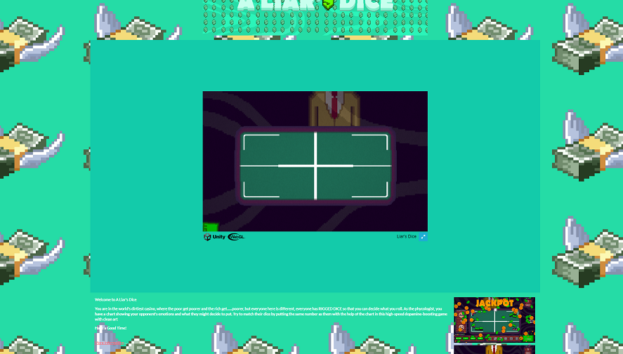
The premise is simple and the game easy to understand/get into which is great! However, the presentation made it challenging to engage. Let me explain, here's my view when not in full screen

Which has all the flying dollars moving, a giant itch.io window but a much smaller game window, and with the music it made it be information overload for my senses and made it hard to play.
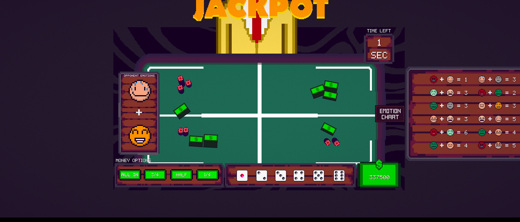
When I switched to full screen mode here is what it looks like (note: I have a 3440x1440 resolution)

Again, I suffer from the large empty void and small gameplay screen but at least I could see everything better/less distracting, except that the "emotion chart's" collider kept going in/out of my cursor causing it to jitter back and forth - lol :P so I had to leave it like that and hope I had all the emotions combinations visible to me.
Overall, I think it was a unique idea on the theme and an interesting math problem to solve but sadly the presentation made it really hard for me to enjoy it.

