How many years have you already spent on polishing the controls? It clearly can be seen that most of the effort so far went into the player controller and it shows. Responsive and slick, just the way I like it.
That being said I dont understand the implementation of the roll. Why it was necessary to have 2 separate buttons, why not just have single roll button that applies roll depending on the direction player is facing? I never encountered a moment in the demo where it would be crucial to have 2 separate buttons for 2 separate movement directions of roll. Not I can see how it is more useful and handy than classic approach. If you are so adamant on keeping it -at least give player a choice to set up alternative in controls.
Another thing worth noting is that I'm not sold on such deliberate walljump mechanic. I think it is way too cluttered - why the requirement to press down, why not just make walljump when player holds any direction (left/right) and just down-jump when no particular direction is being held?
And finally, thing that struck me very odd is when you skate you already move at max speed yet you STILL require player to hold "Run" so you can do long jump at the end - that seems unnecessary.
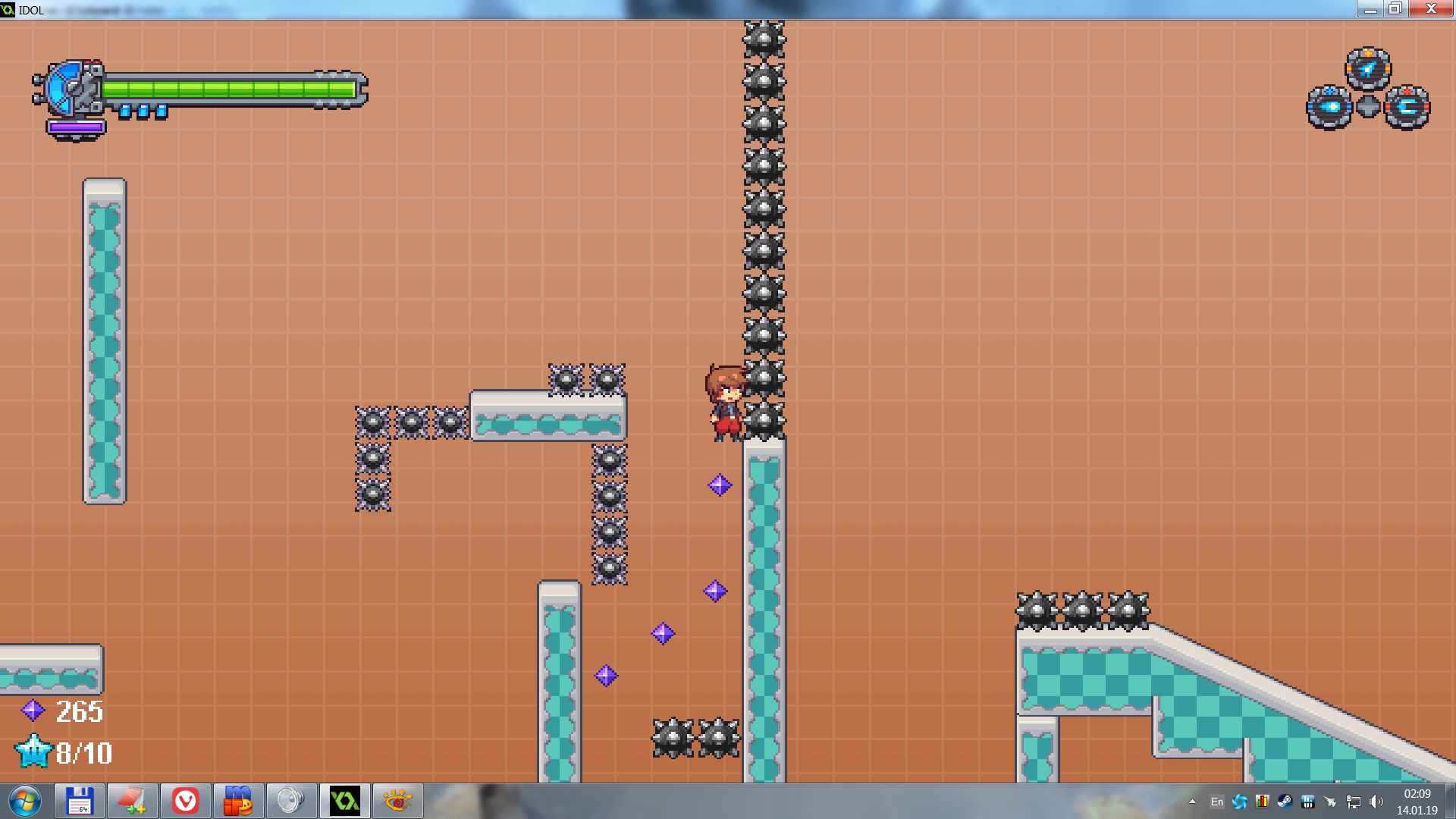
I'm not gonna provide any feedback on specific level design since I assume they are all playground and placeholders. However, my question is: do you really want it to me SMB clone when you already have bunch of complex moves and mechanics in place that do not particularly suit game of such genre (IWBTB, SMB, TEisN). If it is planned to be something else then I'm confused why make such playground that is not hugely relevant?
Overall it was super-fun so far.
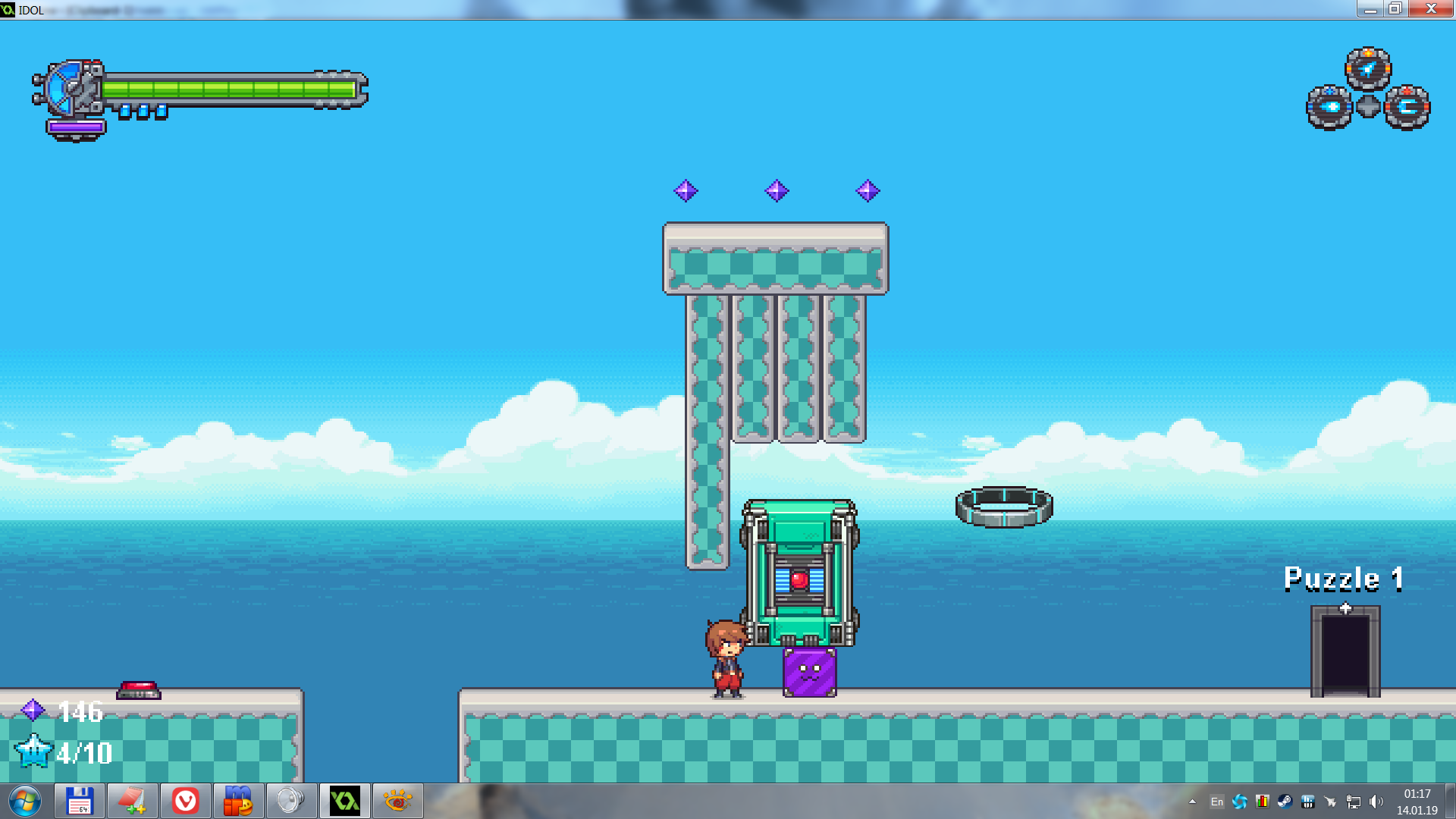
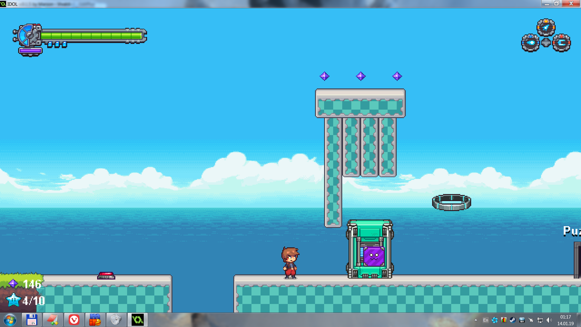
Attached few small things I found:


