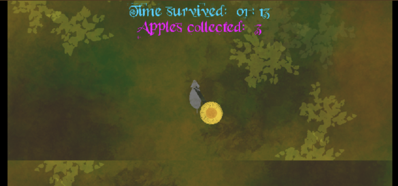
Great little entry for the jam, love the push and pull movement, you said the game sucks and i don't agree on that. There are only two things that I would change and it is not the beautiful watercolour graphics, it is not the perfectionised audio nor the nice movement. It is the overlap of the ground-sections and the font + it's colour. Light blue and pink doesn't melt very well in with the rest of the graphics and the font is sometimes difficult to read like the text saying "Press SPACEBAR to restart". Perhaps you can fix that in the last 8.5 minutes you have left? EDIT: Just wanted to say that the cover art is amazing too!

