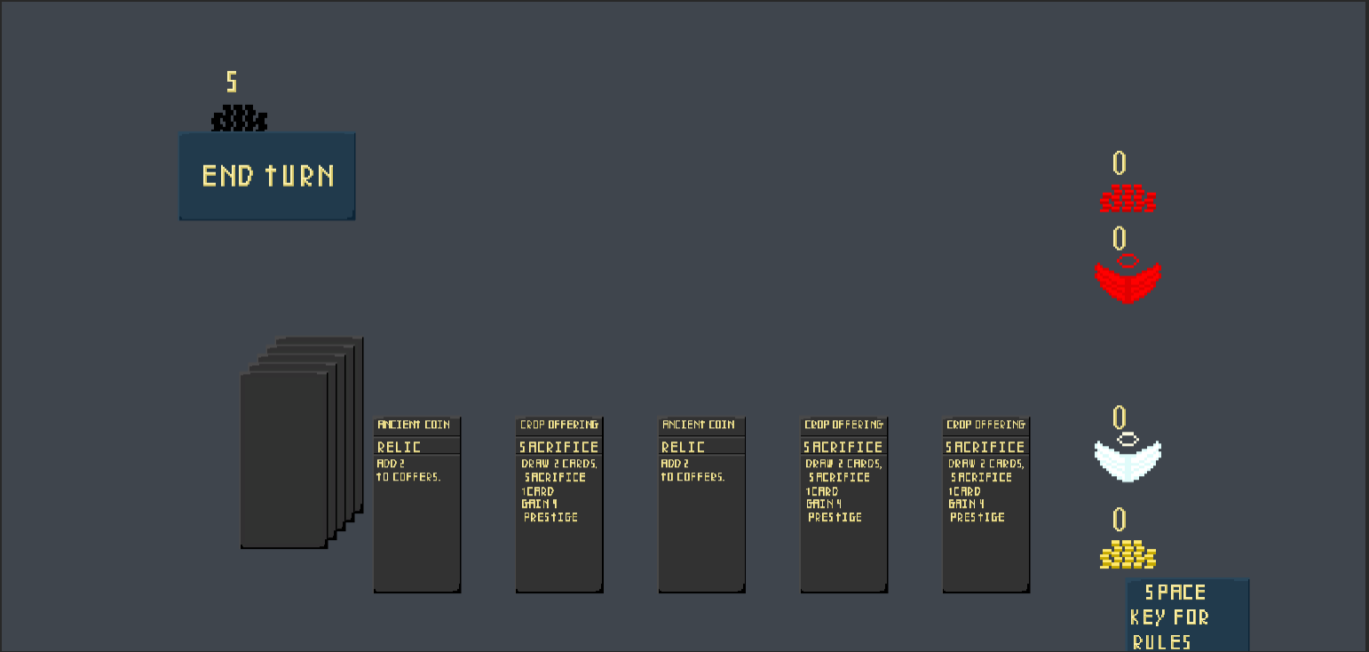
I'll try this in the editor, I was definitely struggling to get colors that made the text more readable. I'm thinking it's possible that the text itself is difficult to read. P.S. I made the cards look darker, and changed the background color, it won't be on the site until the voting ends, but what are your thoughts? 

