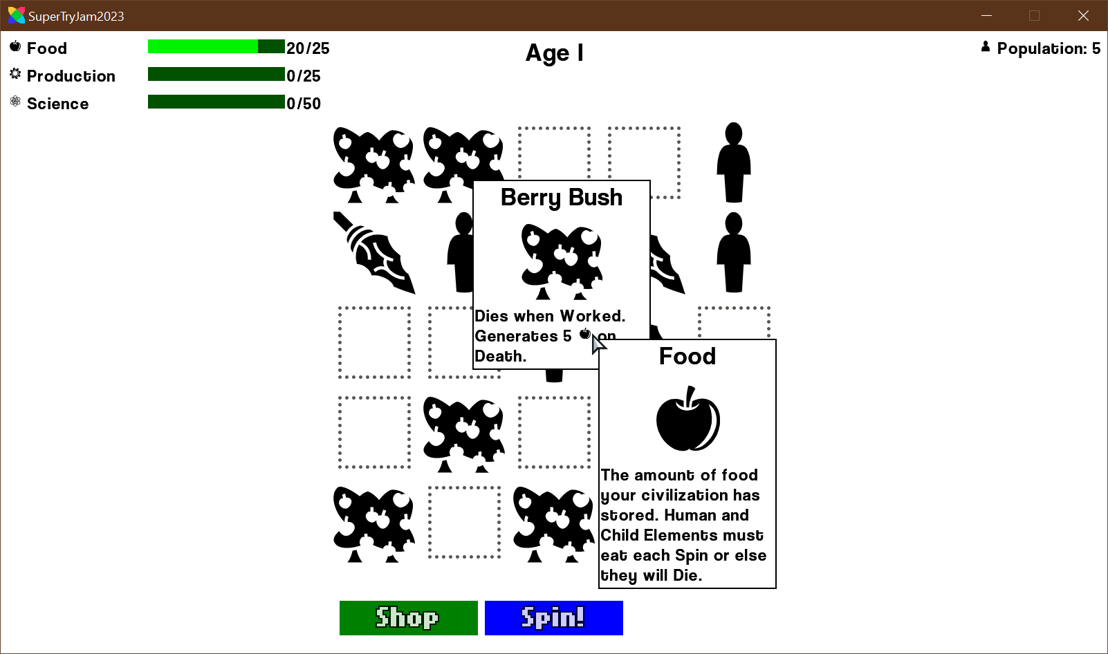
I couldn't sleep so I created a new BitmapFont for the game and implemented it.
I'm very happy with the font itself... but I'm not happy with anything else.
I am very bad at UI. I don't know how to space things out or add the 'right' amount of whitespace, or how to place things so they aren't crowded, etc...
I feel like everything is really badly laid out... I don't know...
I guess I'll just keep working on balancing the game for now...


