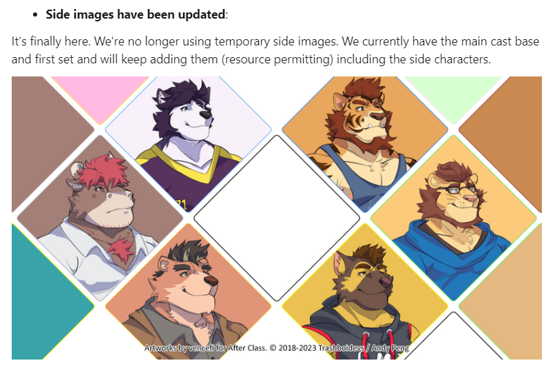
i don't think the new icons are bad or ugly, but i higly understand why people are upset, people wouldn't be as mad if the new icons art style was the one used from the start, most people don't accept changes so fast and there's really a big, BIG contrast between the art you see on screen and the icons, they just don't fit together....
i think if your'e not going to play (read) the update just because you don't like the icons it's understandable but don't let a tiny detail like icons ruin your experience.
if by any chance andy reads this, im sorry but the new icons just don't fit the style the game has overall, i know maybe you payed for this new icons but REALLY they just are a downgrade for most of the players, maybe they could be repourposed in some way, like for an alternate line or exclusive for chapters or something idk, but please just give us a way to see the old icons :/
personally, i prefeer these new icons :) they look cute for me and as an artist theyr'e much more pleasing to the eyes, i just wanted to talk for the rest of the community, i think the best option is to just be able to enable and able them whenever you want, this change was honestly kinda weird lmao
(sorry if this is badly redacted english is not my main language)


