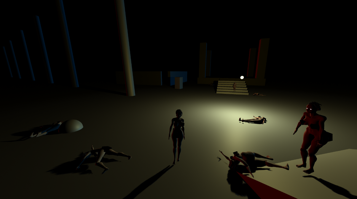
Gave it a play.
Though the animation is rough as understandable this early. The gameplay is fairly smooth and fun, I played a few waves fighting against the player.
Even though I'm not one for beat-em-ups/fighters I do like the flying kick you can do from a sprint and the attacks being assigned to the bumper and triggers
The camera kinda freaks out if you go between it and an obstacle like a pillar.
The lighting is a bit odd and harsh. from one side of the orb the lighting/shadow is so harsh that the player character might as well be a silhouette at times, which kind of defeats the purpose of them running around with huge tits and ass on show,.


