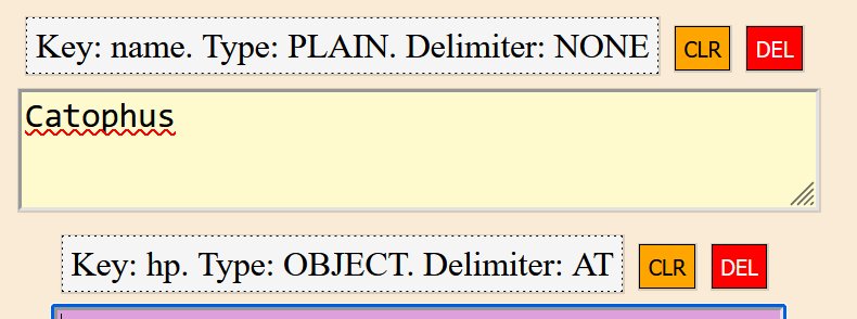
I like the colorful UI and buttons. There was clearly an attempt made to make everything follow certain design rules (e.g. “clear” = orange).
The key/value pairs here could use more work. For example you could split them into lines or bullet points, and make the labels bold or otherwise different.

See https://design.mindsphere.io/patterns/key-value.html
Edit: I just realized the “export strict” feature doesn’t generate valid JSON:
name=PLAIN=NONE%
tags=OBJECT=COMMA%

