Hey Strategy Game Enthusiasts!
This week I continued working on enhancing the visuals of Assembly RTS and added a fog of war effect.
Reducing Visual Clutter and Improving Immersion
Two important goals for Assembly RTS are to keep visual clutter to a minimum and to make the game as immersive as possible.
To achieve this, I originally envisioned most of the important information about units, such as their health to be part of the ‘physical’ world instead of the user interface. This is why I initially added two distinctively colored surface areas to each vehicle. One area for the team color and the other for the current health status.
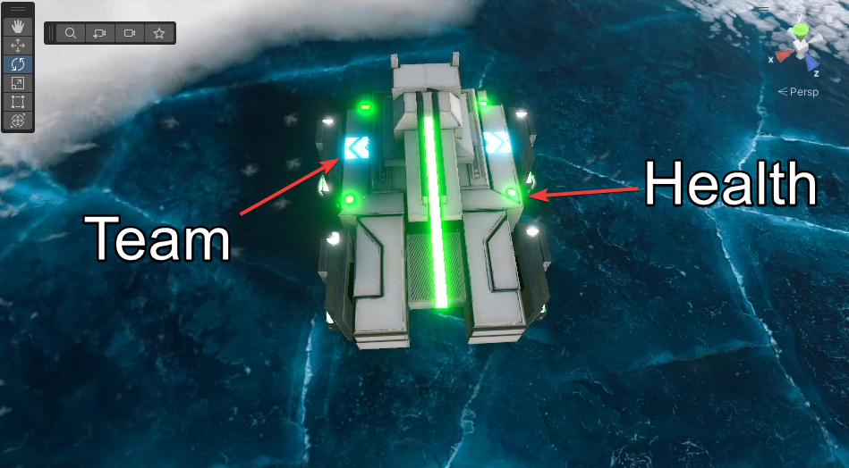
However, I later noticed that this introduces too much visual noise, especially when the camera is zoomed further out. So I decided to only highlight the team color on the surface of each vehicle.
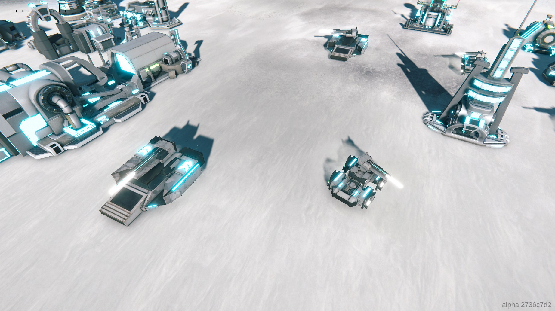
This looks more elegant and should be more easy on the eyes, even when a lot of units are visible on screen at the same time.
In the future, vehicles are going to emit different levels of smoke depending on how damaged they are.
Health is also going to be displayed by a health bar above each unit (toggleable).
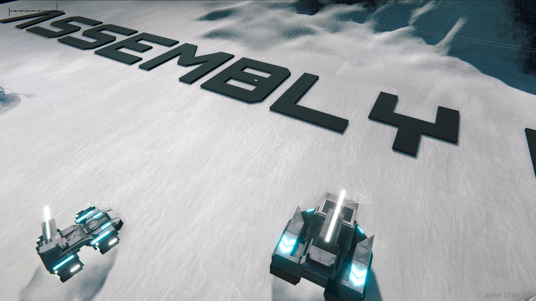
Here is what I’ve got so far:
Additional VFX
I had the idea to let the hovercraft not only distort the surrounding air due to their futuristic propulsion system, but to also kick up the surrounding snow. So I went to work in Unity’s VFX graph and came up with this effect. I think this turned out looking quite impressive! (As you can see I also integrated snow fall)
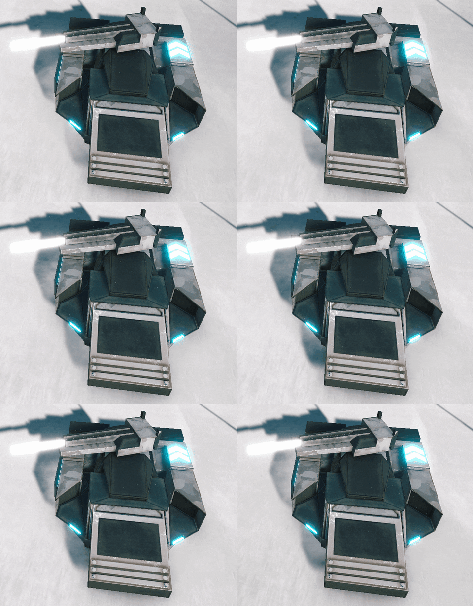
You’ll just have to imagine the hovercraft actually moving around for now. In this example the hover logic is disabled.
Fog of War
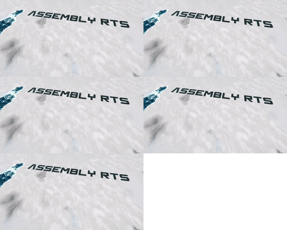
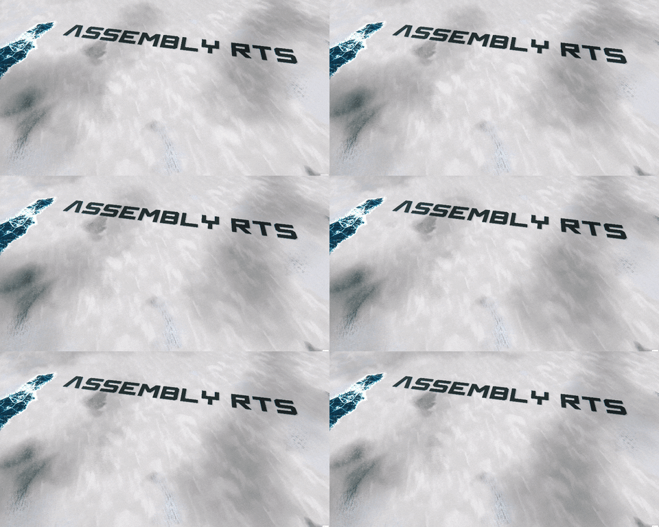
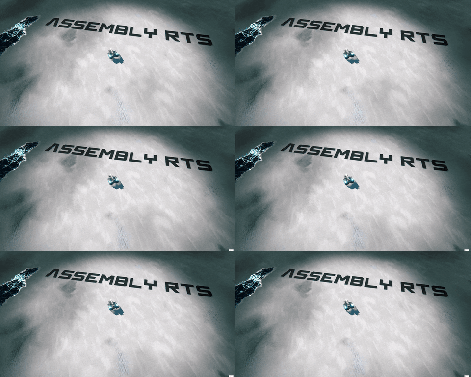
Next, I added fog of war and some animated cloud shadows. It’s all starting to come together!
Starting off Work on the In-Game UI
Before I make the Steam page for Assembly RTS public, I would also like being able to showcase close-to-production ready UI elements for the in-game scene. Unfortunately, the browser-based user interface solution I’m using for my main menu suffered from frame rate issues in this more graphically intensive scenario.
So after a little bit of research I set up OneJS for my in-game user interface. OneJS as a tool may be a bit overkill as the in-game user interface isn’t going to be very complicated, but it offers a workflow I’m already familiar with.
In Figma, a UI concepting tool, I had difficulty coming up with an attractive design that can keep up with the competition. What I came up with looked so mediocre that I’m not even going to show it here 😅
I’m better at 3D modeling than 2D visual design, so I tried using 3D models for the UI instead. But unfortunately post-processing caused me a lot of trouble. The rendering pipeline I’m using doesn’t support displaying objects with distinct post-processing settings. With that, this option is out of the window.
So instead, I started supplementing the OneJS-based user interface with a shader-graph-based solution. It’s very tedious to create UI with the help of Unity’s shader graph tool but it has the added benefit of supporting the bloom effect when you crank up the albedo intensity. And bloom, as you may be aware of, can make anything mundane look more interesting.
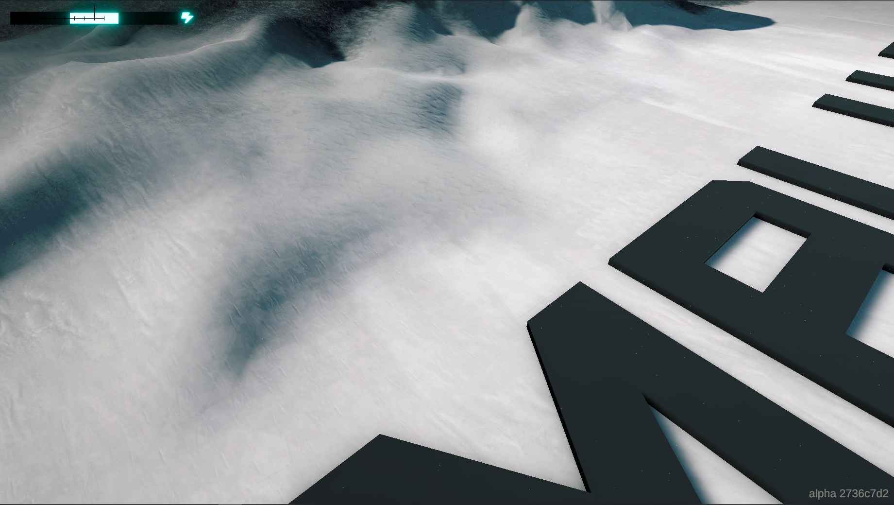

This is the energy bar showing the current power level your base is at. I think I’ll change it to go from left to right instead of originating from the center and I’ll further improve the visual clarity.
The rest of the in-game UI is still very rough around the edges. I’ll show it off in the next devlog, once it’s in a better state.
That’s it for this article. I’m looking forward to your thoughts! Please leave a comment if there is anything you want to add or have any questions or feedback.
If you would like to follow the development Assembly RTS consider following me on Twitter and YouTube!

