Game development Trembling Essence update:
Hello hello and welcome to my devlog, I am here with another update to share! :]
For the most part, I've been focusing on CG's! I've been looking over the routes and deciding what sections should get their own.
There were some suggestions from my play tester that I took into consideration as well. For certain scenes, if it's something that isn't too important (For example: Eating a small snack), I'll make it descriptive to make up for it or do a mini sprite that shows up on the screen if I can! :]
Between the CG's, I've also been adding/looking into more variables to reduce confusion on my end and balance some things.

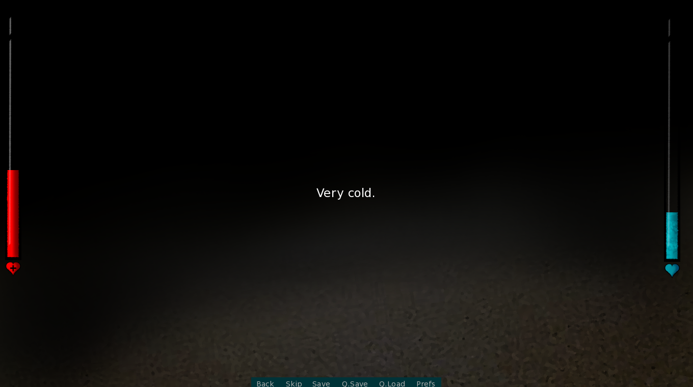
- I added a few new choices to explore a bit more around the cabin. Some depend on the route you go into along with some other requirements that are necessary for it to work. Here's a sneak peak of one. :]

- I also adjusted the variables in one route since it took more than what I wanted into the next scene. I was going to add an ending there but decided not to because I felt as though it was too early.
Somehow I ended up working on endings while doing CG's, I really can't explain how or why it happened. As far as that goes, the writing for maybe..three of them have been finished!
For the first one, I decided to keep it straightforward. I felt that adding choices would be too much and I want this one to have more of a story-like situation.
For the second one, I finished it some time ago and left it alone after that. I recently learned something new and gave the route a good amount of tweaking. I removed some of the old effects because they were outdated and it was over-kill. It'll have a CG at some point but I'm still brainstorming how it'll look.
Lastly, there is one new ending I added to even out certain variables, I'm still working through it but this one was ultimately approved by my play tester! When they finally played it, they thought it was very good in a scary/shocked way.
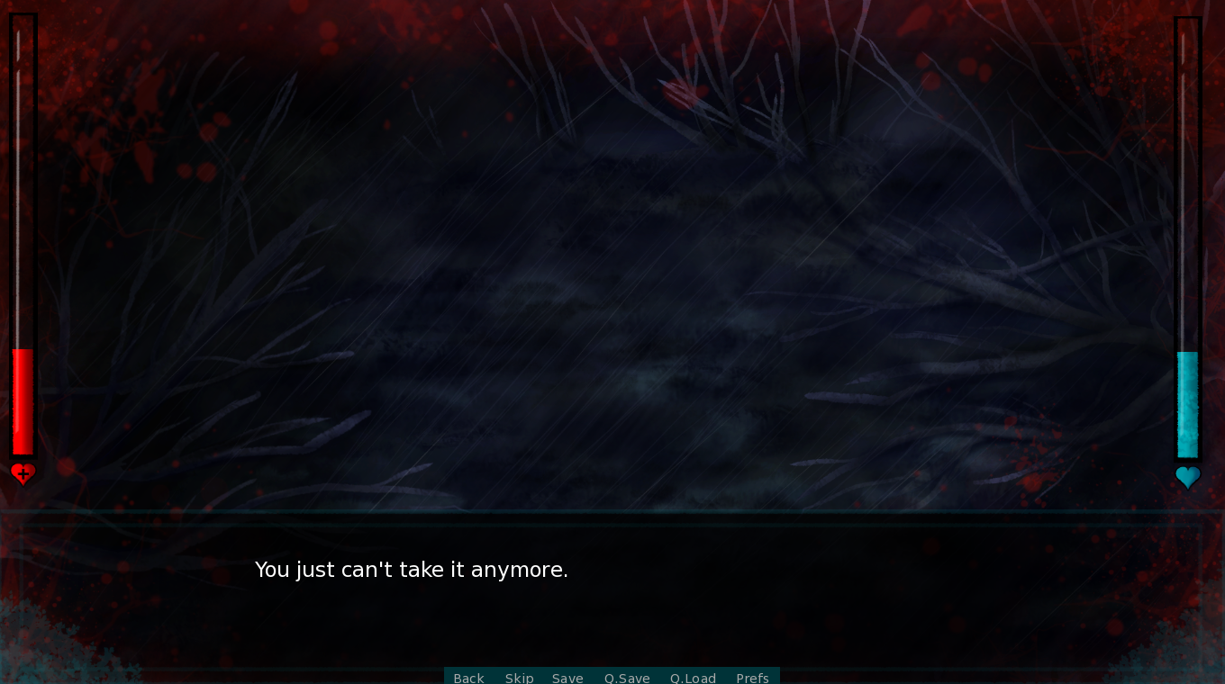
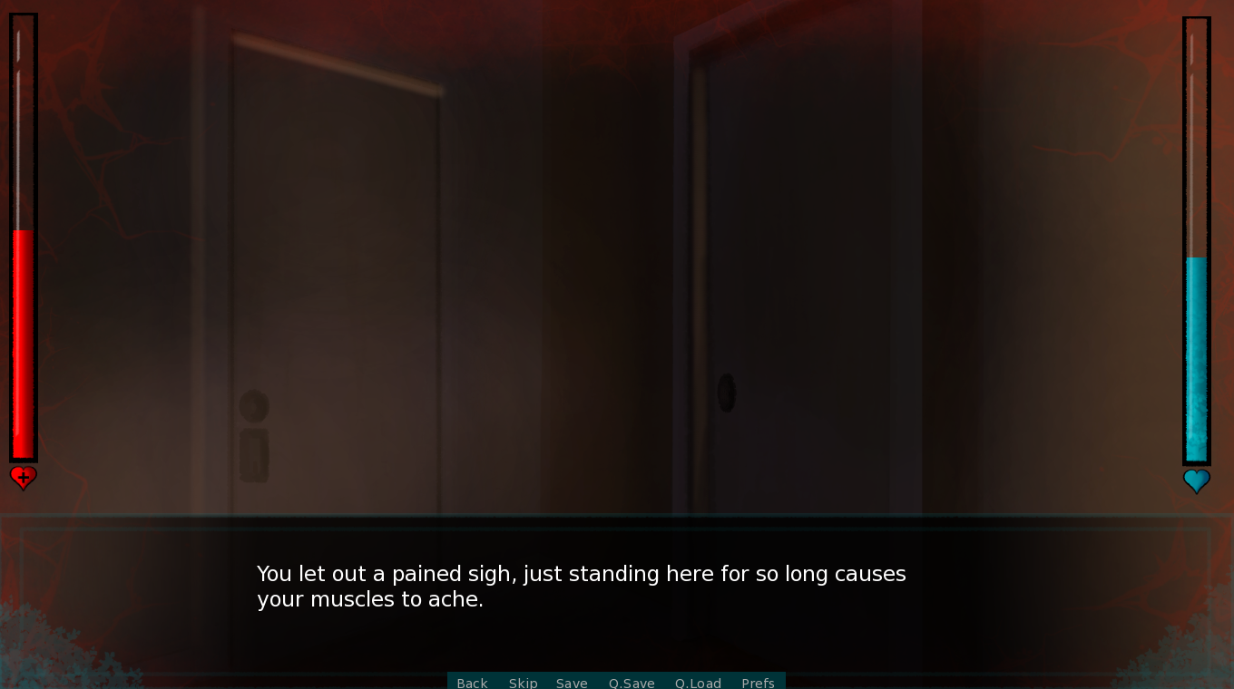
And finally, I went back and messed with the visual que's for a little bit and came up with a better idea to reduce confusion for the player. If you are losing HP versus the dialog describing something that doesn't effect your HP but still mentally effects the player, they'll have two different visual effects! The original way I did it was tedious and sometimes messed up other transitions. It was working at first and then it stopped so I'm still trying to figure out how to keep it on screen without it getting hidden by another image. If I can't figure it out I'll just go back to the tedious way. :,[

- Here's a mock up of what it'll look like if.. Let's say, you stepped on a sharp rock. It will display a sort of 'heartbeat effect' on the screen, and have a 'splatter look'. I lowered the opacity on it by half since it felt a bit too vibrant on the screen when it was at 100%.

- And here's what it'll look like if you just have a headache! I slightly reduced the opacity but it'll have more of a fadein/fadeout effect on the screen.
Here are some bugs I fixed along the way:
- Skipping through dialog too fast had the possibility to make the screen go black in certain scenes if there is a scene animation
- Grammar mistakes
- A certain dialog event activated incorrectly
- Animation transition error
- Evening to night in a route activated incorrectly
- An ending had an incorrect transition
And that's everything I have to report right now, thank you guys very much for all of your support and appreciation with this! :]

